
About
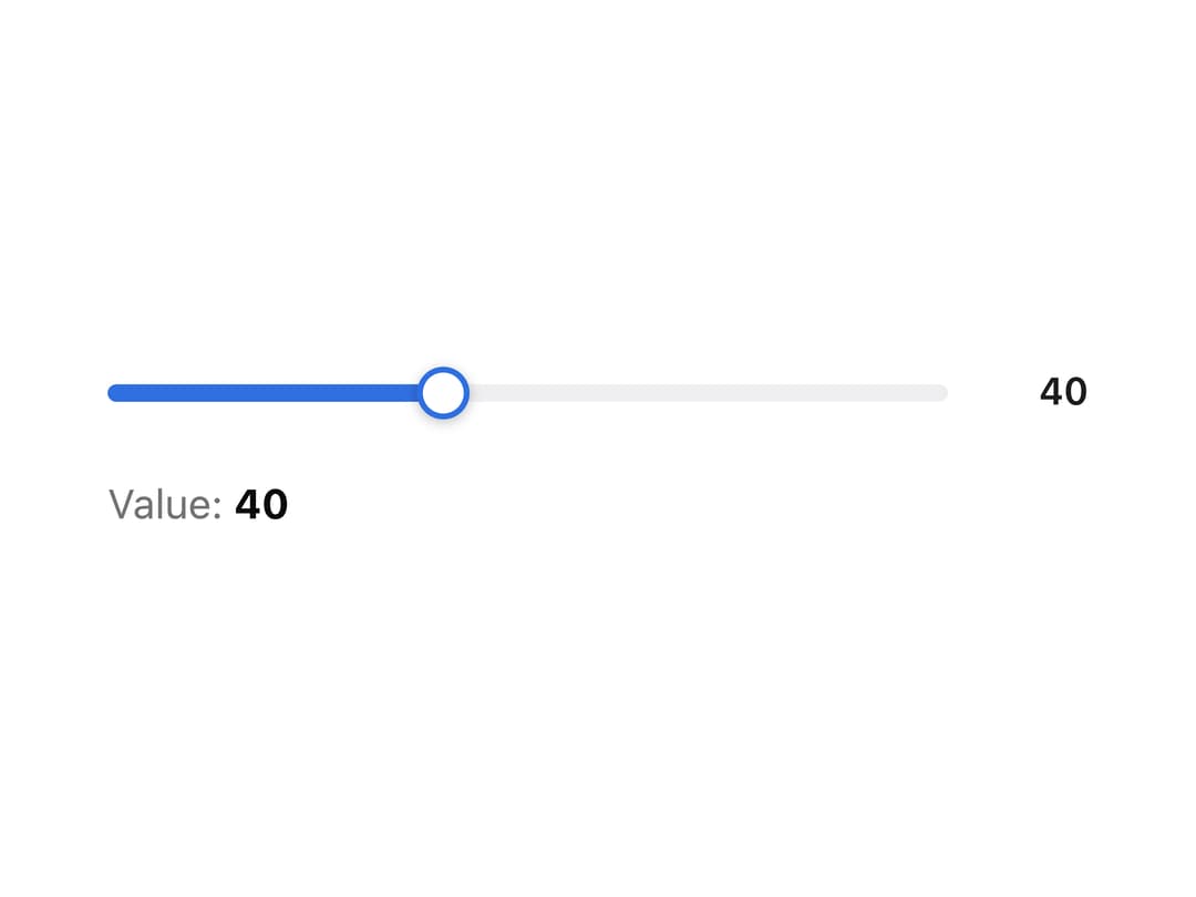
A draggable track-and-knob slider for picking a single value or a min/max range, with full keyboard and touch support.
Built with React and Tailwind. Copy the prompt and paste it into Claude Code, Cursor or Lovable: your agent adds Range Slider to your project and fits it to your theme.
Code
How Range Slider is used: the demo's code. The component's own source comes with a free account.
Usage.tsx
"use client";

import Slider from "@/components/ui/slider";
import { useState } from "react";

export default function SliderDemo() {
  const [vol, setVol] = useState(40);

  return (
    <div className="w-full max-w-sm mx-auto p-6">
      <Slider
        value={vol}
        onChange={setVol}
        min={0}
        max={100}
        step={5}
        showValue
        ariaLabel="Volume"
      />
      <div className="mt-3 text-sm text-muted-foreground">
        Value: <b className="text-foreground">{vol}</b>
      </div>
    </div>
  );
}
More by alexander-rukin
View all
Carousel
1
Combobox
Textarea
Tooltip
Card
Input
Date Picker
More in Forms
View all

Premium Auth
550

Contact Card
1.1K

Login 2
10

Form
17

Form
20

Book A Demo 3
96

Login 1
59
SignInPage
721
