
About
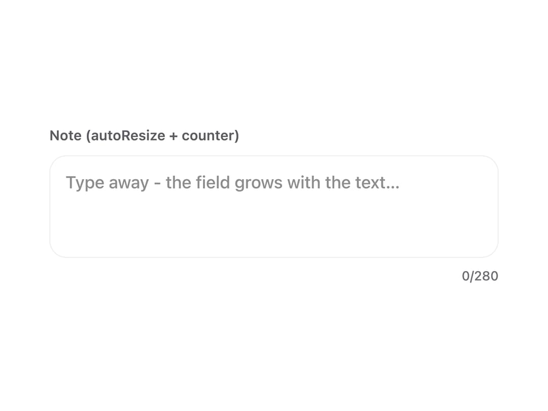
A multi-line text field with a focus ring, error state, disabled state, optional auto-growing height, and a live character counter for forms that collect longer text like notes or descriptions.
Built with React and Tailwind. Copy the prompt and paste it into Claude Code, Cursor or Lovable: your agent adds Textarea to your project and fits it to your theme.
Code
How Textarea is used: the demo's code. The component's own source comes with a free account.
Usage.tsx
"use client";

import { Textarea } from "@/components/ui/textarea";
import { useState } from "react";

export default function TextareaDemo() {
  const [note, setNote] = useState("");

  return (
    <div className="flex min-h-screen w-full items-center justify-center bg-background p-10 text-foreground">
      <div style={{ flex: "1 1 320px", maxWidth: 420, width: "100%" }}>
        <Textarea
          label="Note (autoResize + counter)"
          value={note}
          onChange={setNote}
          placeholder="Type away - the field grows with the text…"
          autoResize
          maxLength={280}
          showCount
        />
      </div>
    </div>
  );
}
More by alexander-rukin
View all
Combobox
Carousel
Tooltip
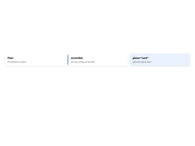
Card
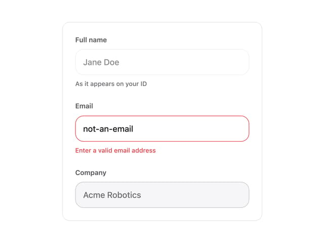
Input
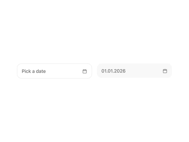
Date Picker
More in Forms
View all

Premium Auth
550

Contact Card
1.1K

Login 2
10

Form
17

Form
20

Login 1
59
SignInPage
721

Book A Demo 3
95
