
About
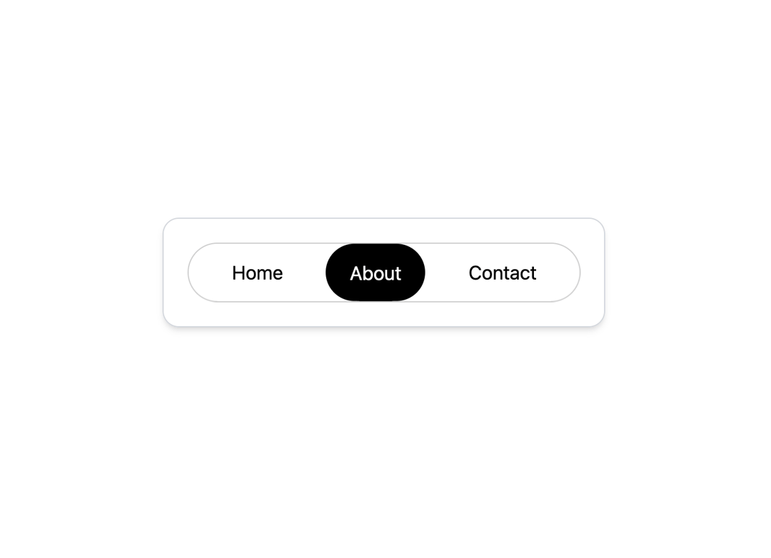
Minimalistic smooth navigation menu
Built with React and Tailwind. Copy the prompt and paste it into Claude Code, Cursor or Lovable: your agent adds Gooey Nav to your project and fits it to your theme.
Code
How Gooey Nav is used: the demo's code. The component's own source comes with a free account.
Usage.tsx
import React, { useState, useEffect } from "react";
import { GooeyNav } from "@/components/ui/gooey-nav";

const items = [
  { label: "Home", href: "#home" },
  { label: "About", href: "#about" },
  { label: "Contact", href: "#contact" },
];

const GooeyNavDemo = () => {
  const [isDark, setIsDark] = useState(true);

  useEffect(() => {
    if (isDark) {
      document.documentElement.classList.add("dark");
    } else {
      document.documentElement.classList.remove("dark");
    }
  }, [isDark]);

  const toggleTheme = () => {
    setIsDark(!isDark);
  };

  return (
    <div className="flex w-full min-h-screen flex-col justify-center items-center p-4 transition-colors duration-300 bg-black dark:bg-white">
      <div className="absolute top-4 right-4">
        <button
          onClick={toggleTheme}
          className="p-2 rounded-full border border-gray-700 dark:border-gray-300 bg-gray-900 dark:bg-gray-100 text-white dark:text-black"
        >
        </button>
      </div>

      <div className="relative flex justify-center items-center p-5 rounded-xl border border-gray-700 dark:border-gray-300 bg-black dark:bg-white shadow-xl dark:shadow-md"
           style={{ height: 'auto', minHeight: '100px' }}>
        <GooeyNav
          items={items}
          particleCount={15}
          particleDistances={[90, 10]}
          particleR={100}
          initialActiveIndex={1} // Set to 'About' for the initial active item as per image
          animationTime={600}
          timeVariance={300}
        />
      </div>
    </div>
  );
};

export { GooeyNavDemo };More by deleted
View all

Splash Cursor
1.3K
Star Border
728
Tilted Scroll
433
Waves Background
362
Squares Background
326
Prism
218
Grid Motion
183
Circular Gallery
173
More in Navigation
View all

Sidebar
223

Tabs
51
Navbar with Theme Toggle
40
Nav List Card
29

Breadcrumb
12
Pagination Ant
3

Pagination
85
Pagination
9


