
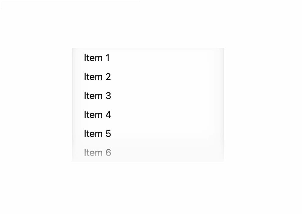
About
A scrollable container built on native overflow scrolling with a stable scrollbar gutter, restyled scrollbar colors, and an optional edge shadow/fade that appears only where there is more content to scroll toward.
Built with React and Tailwind. Copy the prompt and paste it into Claude Code, Cursor or Lovable: your agent adds Scroll Area to your project and fits it to your theme.
Code
How Scroll Area is used: the demo's code. The component's own source comes with a free account.
Usage.tsx
import { ScrollArea } from "@/components/ui/scroll-area";

const items = Array.from({ length: 18 }, (_, i) => `Item ${i + 1}`);

export default function ScrollAreaDemo() {
  return (
    <ScrollArea maxBlockSize="12rem" edgeShadow style={{ inlineSize: "16rem" }}>
      <ul style={{ margin: 0, padding: "0 0 0 1.25rem" }}>
        {items.map((item) => (
          <li key={item} style={{ padding: "0.25rem 0" }}>
            {item}
          </li>
        ))}
      </ul>
    </ScrollArea>
  );
}
More by kemiljk
View all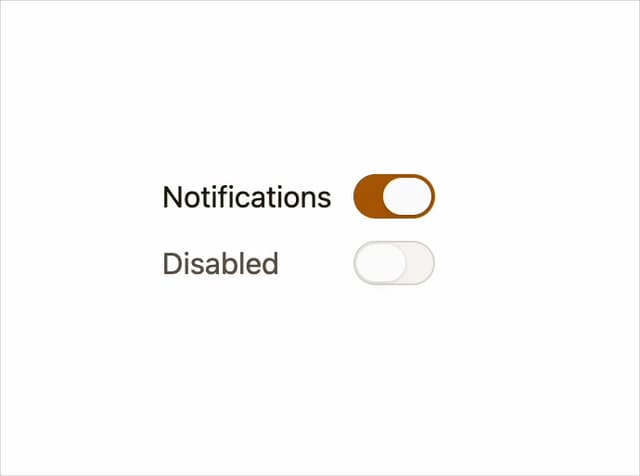
Switch
1
Avatar
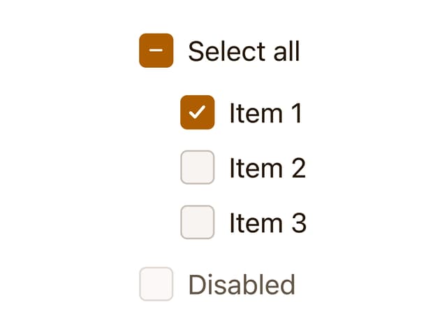
Checkbox
Skeleton