
About
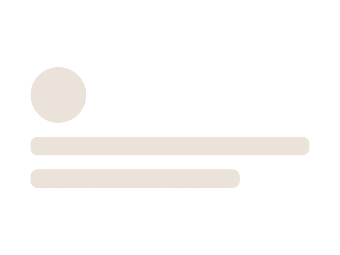
A loading placeholder div with an animated shimmer, sized to match the real content it stands in for while that content is still loading.
Built with React and Tailwind. Copy the prompt and paste it into Claude Code, Cursor or Lovable: your agent adds Skeleton to your project and fits it to your theme.
Code
How Skeleton is used: the demo's code. The component's own source comes with a free account.
Usage.tsx
import { Skeleton } from "@/components/ui/skeleton";

export default function SkeletonDemo() {
  return (
    <div className="flex w-full h-full items-center justify-center p-10">
      <div className="flex flex-col gap-3 w-[280px]">
        <Skeleton style={{ width: 48, height: 48, borderRadius: 999 }} />
        <Skeleton style={{ width: 240, height: 16, borderRadius: 6 }} />
        <Skeleton style={{ width: 180, height: 16, borderRadius: 6 }} />
      </div>
    </div>
  );
}
More by kemiljk
View all
Switch
1
Avatar
Checkbox
Scroll Area