
About
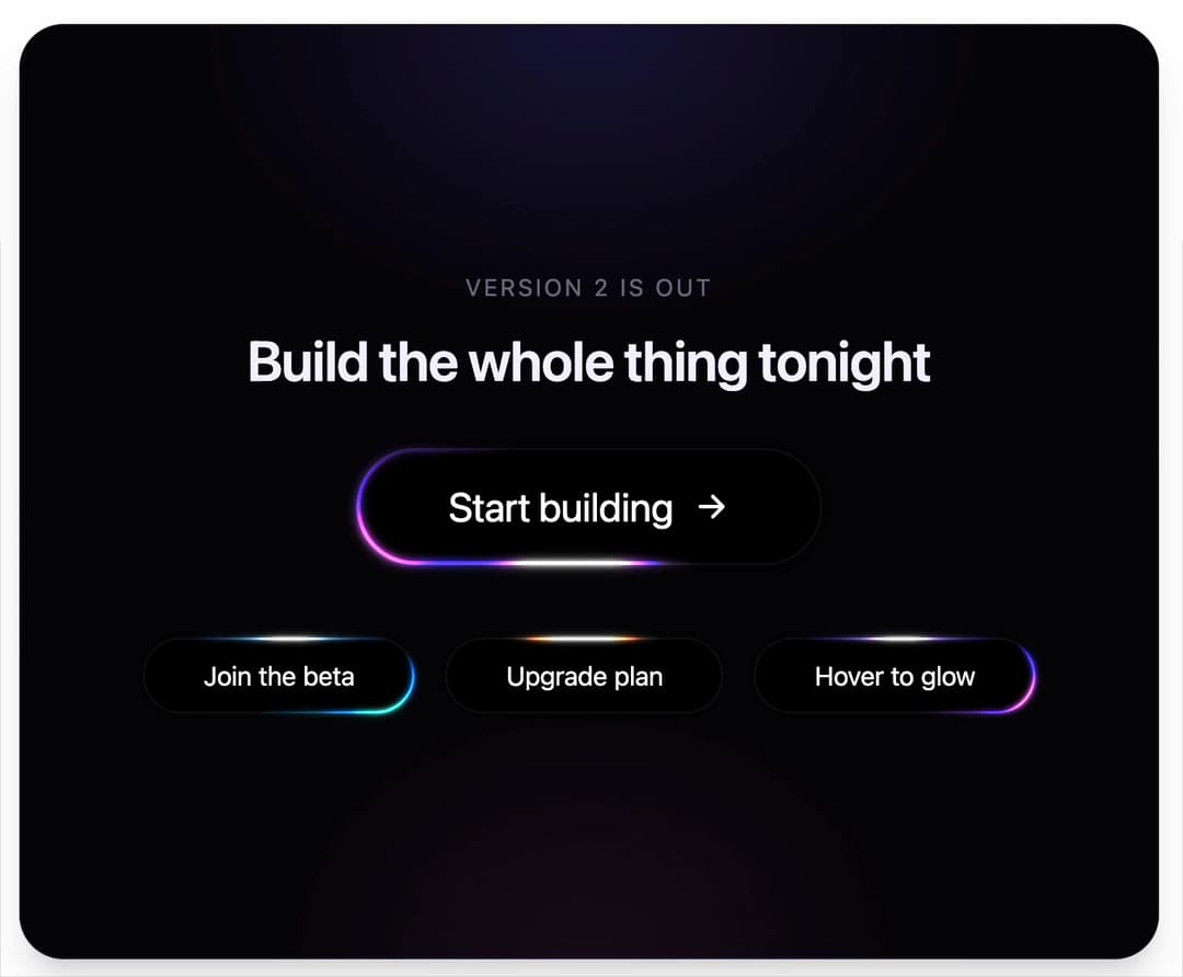
Black pill button with soft white, blue and magenta highlights that sweep around its rim, bloom past the edge and settle at the top. More like this, plus a designer your coding agent can use, at studios.lou15.com/?ref=21st
Built with React and Tailwind. Copy the prompt and paste it into Claude Code, Cursor or Lovable: your agent adds Glow Button to your project and fits it to your theme.
Code
How Glow Button is used: the demo's code. The component's own source comes with a free account.
Usage.tsx
"use client"

import * as React from "react"
import { GlowButton } from "@/components/ui/glow-button"

// The layout is drawn for a fixed box and every size is multiplied by one scale, so the buttons
// keep their proportions and nothing spills past the frame.
const WIDE = { w: 620, h: 380 }
const TALL = { w: 340, h: 560 }

function useFit() {
  const [fit, setFit] = React.useState({ scale: 1, tall: false })
  React.useEffect(() => {
    const measure = () => {
      const tall = window.innerHeight > window.innerWidth * 1.2
      const box = tall ? TALL : WIDE
      setFit({ tall, scale: Math.max(0.55, Math.min(window.innerWidth / box.w, window.innerHeight / box.h, 1.8)) })
    }
    measure()
    window.addEventListener("resize", measure)
    return () => window.removeEventListener("resize", measure)
  }, [])
  return fit
}

function Arrow() {
  return (
    <svg viewBox="0 0 16 16" width="0.9em" height="0.9em" aria-hidden>
      <path d="M3 8h9.5M8.5 3.5 13 8l-4.5 4.5" fill="none" stroke="currentColor" strokeWidth={1.6} strokeLinecap="round" strokeLinejoin="round" />
    </svg>
  )
}

/**
 * One button, five settings: a large looping call to action, then smaller ones with their own
 * colours, loop speed and a hover trigger. Every difference is a prop.
 */
export default function GlowButtonDemo() {
  const { scale, tall } = useFit()
  const s = (n: number) => Math.round(n * scale)

  return (
    <main className="relative min-h-screen w-full bg-background">
      <section
        className="absolute flex items-center justify-center overflow-hidden shadow-xl"
        style={{
          inset: "clamp(10px, 2.6vmin, 26px)",
          borderRadius: "clamp(18px, 4.5vmin, 34px)",
          border: "1px solid rgba(200, 170, 255, 0.1)",
          backgroundColor: "#050507",
          backgroundImage:
            "radial-gradient(50% 45% at 50% 0%, rgba(90, 60, 255, 0.22), rgba(90, 60, 255, 0) 70%), radial-gradient(40% 40% at 50% 100%, rgba(240, 80, 255, 0.08), rgba(240, 80, 255, 0) 70%)",
        }}
      >
        <div style={{ display: "flex", flexDirection: "column", alignItems: "center", textAlign: "center", color: "#f5f3ff", fontSize: s(15) }}>
          <p style={{ margin: 0, fontSize: "0.8em", letterSpacing: "0.12em", textTransform: "uppercase", color: "rgba(226, 220, 255, 0.5)" }}>
            Version 2 is out
          </p>
          <h2 style={{ margin: "0.45em 0 0", fontSize: "1.9em", fontWeight: 600, letterSpacing: "-0.02em", lineHeight: 1.1 }}>
            Build the whole thing tonight
          </h2>

          <GlowButton style={{ fontSize: s(21), marginTop: s(30) }}>
            Start building <Arrow />
          </GlowButton>

          <div
            style={{
              display: "flex",
              flexDirection: tall ? "column" : "row",
              alignItems: "center",
              gap: s(tall ? 20 : 16),
              marginTop: s(tall ? 34 : 38),
            }}
          >
            <GlowButton colors={["#0a6cff", "#2fe0c4"]} duration={4} style={{ fontSize: s(14) }}>
              Join the beta
            </GlowButton>
            <GlowButton colors={["#ff4d2e", "#ffc23d"]} duration={7} style={{ fontSize: s(14) }}>
              Upgrade plan
            </GlowButton>
            <GlowButton trigger="hover" style={{ fontSize: s(14) }}>
              Hover to glow
            </GlowButton>
          </div>
        </div>
      </section>
    </main>
  )
}
More by Louis Studios
View all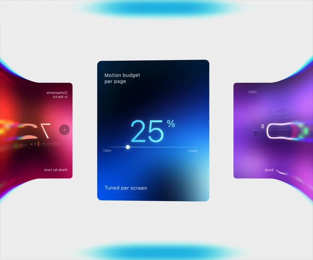

Warp Carousel
683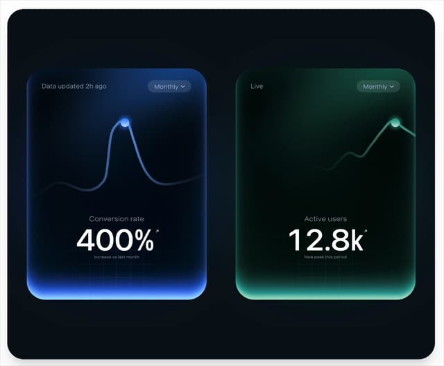
Peak Chart
165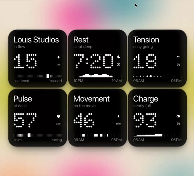
Dot Tiles
136
Chapter Player
91
Glow Rocker
73
LED Badges
68
Chrome Arcs
55
Lens Clock
51
More in Buttons
View all
Texture Button
104
Button
11
Button
78

Button
19
Native Button
27

HeroUI Button Group
5

Button
67
Button
1


