
About
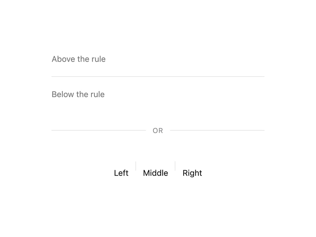
A horizontal or vertical separator rule for splitting content groups, with an optional centred label for an "or" break between two paths.
Built with React and Tailwind. Copy the prompt and paste it into Claude Code, Cursor or Lovable: your agent adds Divider to your project and fits it to your theme.
Code
How Divider is used: the demo's code. The component's own source comes with a free account.
Usage.tsx
import { Divider } from "@/components/ui/divider";

export default function DividerDemo() {
  return (
    <div className="w-full max-w-md mx-auto flex flex-col gap-6 p-10 bg-background text-foreground">
      <div>
        <p className="text-sm text-muted-foreground">Above the rule</p>
        <Divider />
        <p className="text-sm text-muted-foreground">Below the rule</p>
      </div>
      <Divider label="or" />
      <div
        className="flex items-center justify-center"
        style={{ minHeight: 40 }}
      >
        <span className="text-sm text-foreground">Left</span>
        <Divider orientation="vertical" spacing="sm" />
        <span className="text-sm text-foreground">Middle</span>
        <Divider orientation="vertical" spacing="sm" />
        <span className="text-sm text-foreground">Right</span>
      </div>
    </div>
  );
}
More by murad-sinatra
View all
Event Calendar
50
Table
7
Drawer
5
Combobox
3
Toggles
3
Command Palette
2
Mors Card
2
Token Field
2