
About
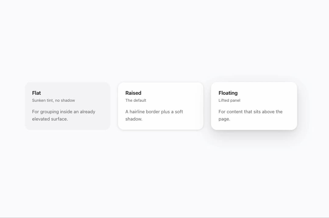
A rounded content card with header, body, footer and media subcomponents for grouping related information in a panel or grid.
Built with React and Tailwind. Copy the prompt and paste it into Claude Code, Cursor or Lovable: your agent adds Mors Card to your project and fits it to your theme.
Code
How Mors Card is used: the demo's code. The component's own source comes with a free account.
Usage.tsx
import { Card, CardHeader, CardBody } from "@/components/ui/mors-card";

export default function CardDemo() {
  return (
    <div
      className="mors-scope flex min-h-screen w-full items-center justify-center p-10"
      style={{
        background: "var(--mors-color-canvas)",
        color: "var(--mors-color-text)",
      }}
    >
      <div className="grid w-full max-w-4xl gap-6 sm:grid-cols-3">
        <Card elevation="flat">
          <CardHeader title="Flat" subtitle="Sunken tint, no shadow" />
          <CardBody>For grouping inside an already elevated surface.</CardBody>
        </Card>
        <Card elevation="raised">
          <CardHeader title="Raised" subtitle="The default" />
          <CardBody>A hairline border plus a soft shadow.</CardBody>
        </Card>
        <Card elevation="floating">
          <CardHeader title="Floating" subtitle="Lifted panel" />
          <CardBody>For content that sits above the page.</CardBody>
        </Card>
      </div>
    </div>
  );
}
More by murad-sinatra
View all
Number Field
1
Table
Command Palette
Tooltip
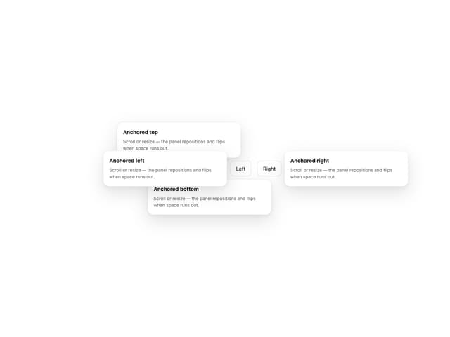
Popover
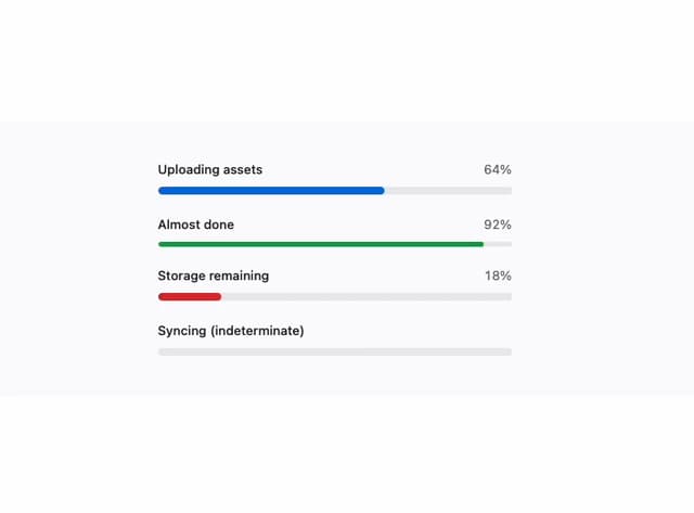
Loaders
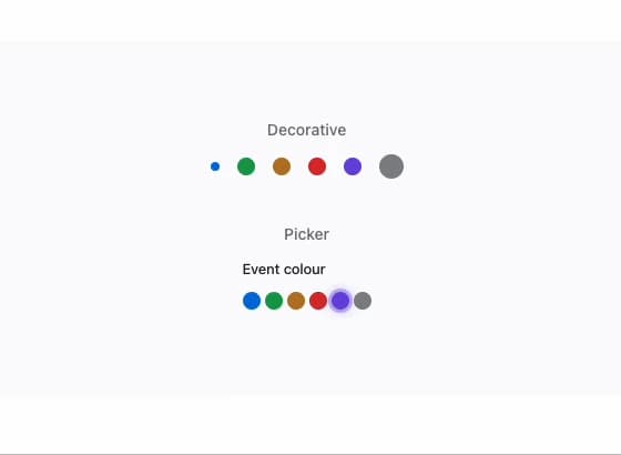
Swatch
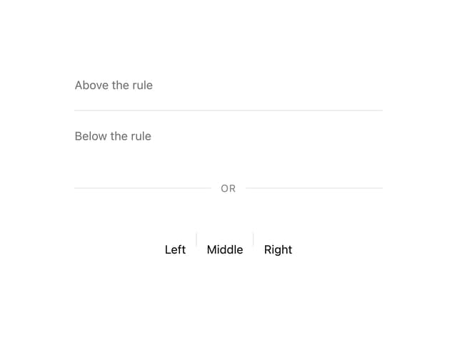
Divider
More in Cards
View all

Statistics Card 7
294

Course Design Cards
1.1K

Interactive Tech Stack Bento Grid with Hover Effects
70
The Item one
3
Stats cards with links
81
Statistics Card 2
268
Card
56

Weather Card
54
