
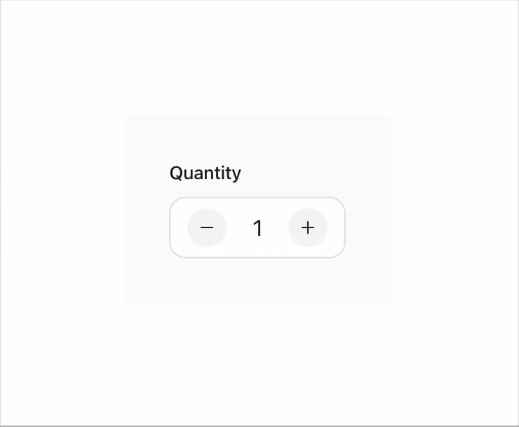
About
A numeric text input with plus/minus stepper buttons that clamps entered values to a min/max range and works controlled or uncontrolled.
Built with React and Tailwind. Copy the prompt and paste it into Claude Code, Cursor or Lovable: your agent adds Number Field to your project and fits it to your theme.
Code
How Number Field is used: the demo's code. The component's own source comes with a free account.
Usage.tsx
import NumberField from "@/components/ui/number-field";

export default function NumberFieldDemo() {
  return (
    <div
      className="mors-scope"
      style={{
        background: "var(--mors-color-canvas)",
        color: "var(--mors-color-text)",
        padding: "2rem",
        display: "flex",
        justifyContent: "center",
      }}
    >
      <div style={{ maxWidth: 320, width: "100%" }}>
        <NumberField label="Quantity" defaultValue={2} min={0} max={12} />
      </div>
    </div>
  );
}
More by murad-sinatra
View all
Event Calendar
47
Table
7
Drawer
4
Combobox
2
Toggles
2
Command Palette
1
Loaders
1
Mors Card
1
More in Forms
View all

Premium Auth
567

Login 2
12

Form
139

Book A Demo 1
90
Authentication Card
51

Contact Card
1.1K

Card Studio
46

Login 1
62
