
About
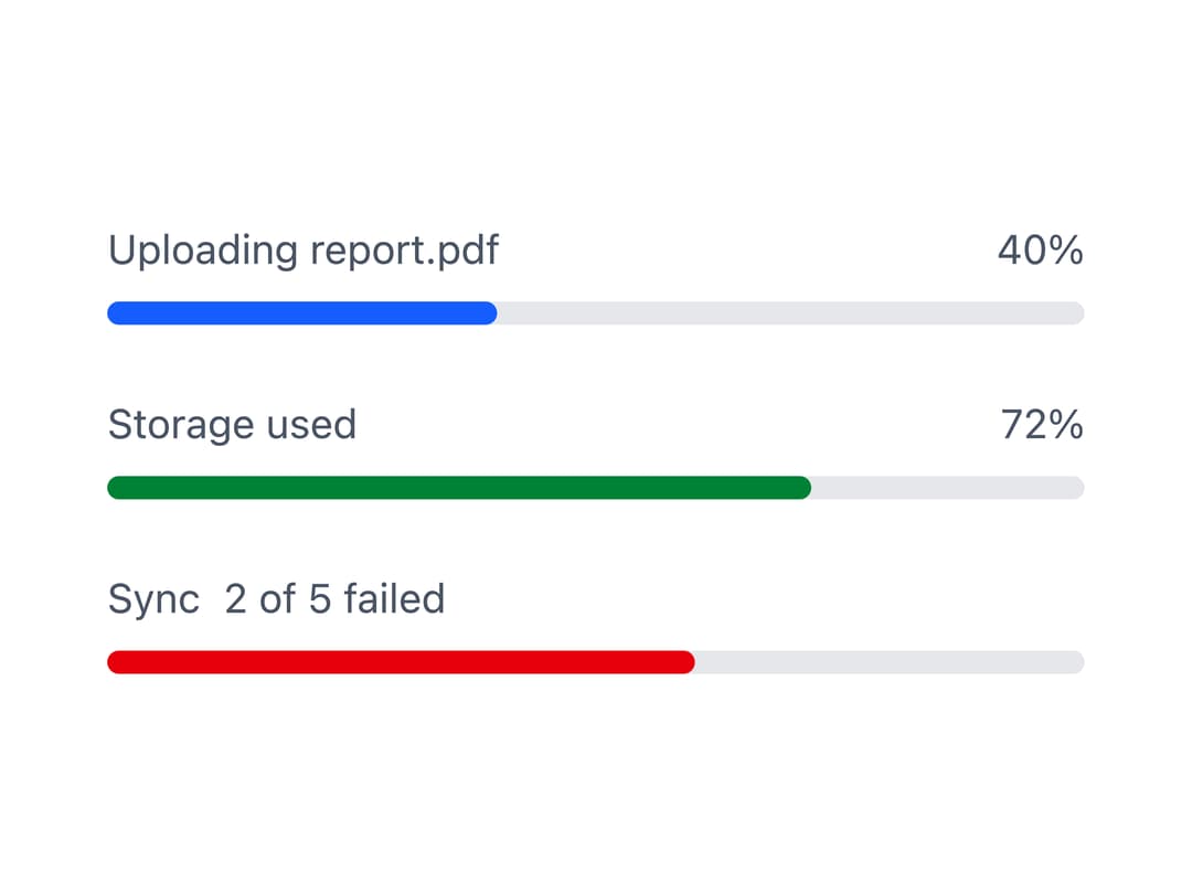
A linear and circular progress indicator for showing how far a task has completed, including an indeterminate loading state for work of unknown length.
Built with React and Tailwind. Copy the prompt and paste it into Claude Code, Cursor or Lovable: your agent adds Progress Indicator to your project and fits it to your theme.
Code
How Progress Indicator is used: the demo's code. The component's own source comes with a free account.
Usage.tsx
import Progress from "@/components/ui/progress";

export default function ProgressDemo() {
  return (
    <div className="flex w-full max-w-sm flex-col gap-6 p-6">
      <Progress label="Uploading report.pdf" showPercentage value={40} />
      <Progress
        color="success"
        label="Storage used"
        showPercentage
        value={72}
      />
      <Progress
        color="danger"
        description="2 of 5 failed"
        label="Sync"
        value={60}
      />
    </div>
  );
}
More by robertlib
View all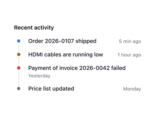
Timeline
1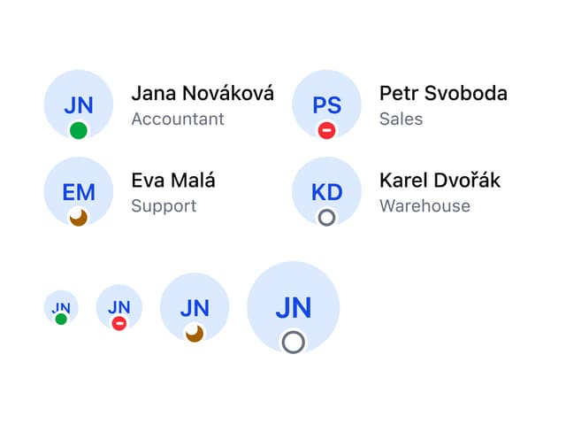
Avatar
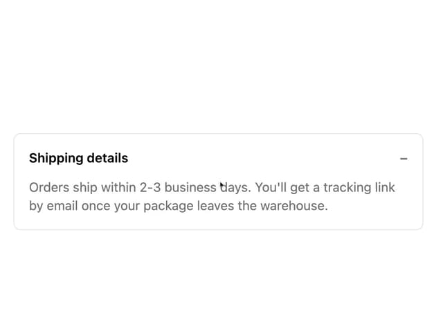
Collapsible Content
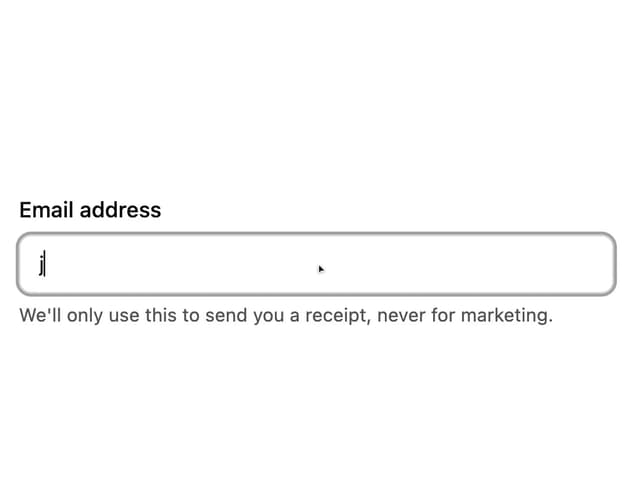
Form Description
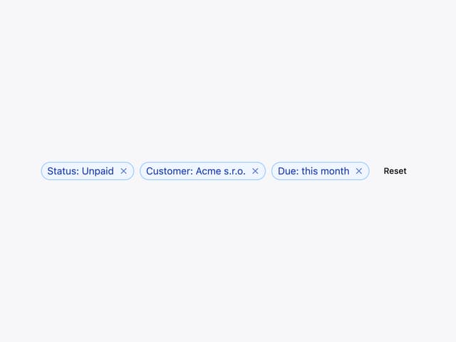
Chip
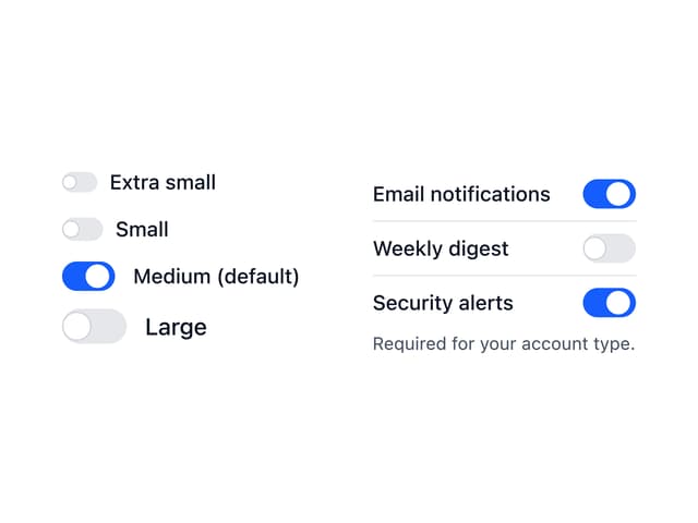
Switch

Form Error
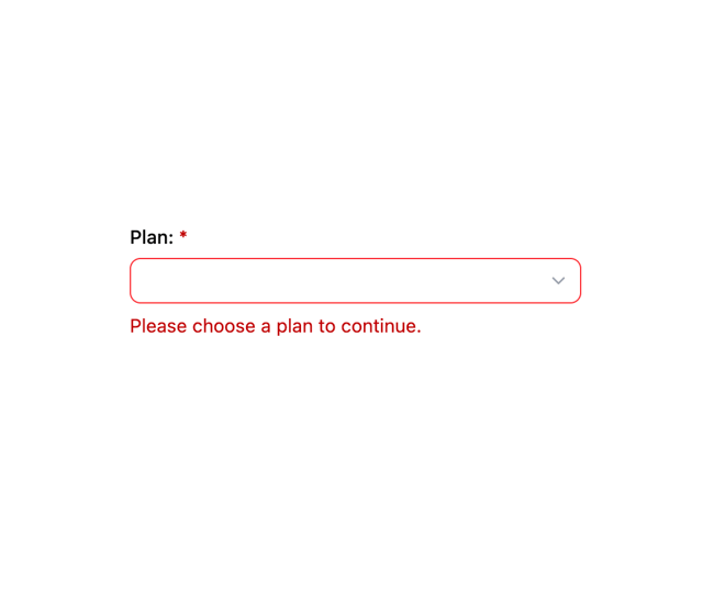
Select