
About
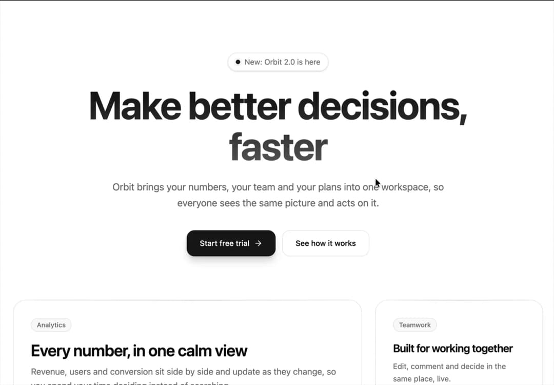
A modern, structured hero section pairing crisp value-proposition copy with an asymmetric bento grid of interactive feature cards, live status badges, and staggered Framer Motion animations.
Built with React and Tailwind. Copy the prompt and paste it into Claude Code, Cursor or Lovable: your agent adds Bento Grid Product Hero with Live Metric Cards to your project and fits it to your theme.
Code
How Bento Grid Product Hero with Live Metric Cards is used: the demo's code. The component's own source comes with a free account.
Usage.tsx
// This is a file with a demo for your component
// That's what users will see in the preview
// Create new files in this directory to add more demos

import { useState } from "react";
import { Check, MessageSquare, ShieldCheck } from "lucide-react";
import { Component } from "@/components/ui/bento-grid-product-hero-with-live-metric-cards";
import type { BentoItem } from "@/components/ui/bento-grid-product-hero-with-live-metric-cards";

/* ==========================================================================
   Card visuals
   ========================================================================== */

const STATS = [
  { label: "Revenue", value: "$84.2k", change: "+12.8%" },
  { label: "Active users", value: "24,582", change: "+8.2%" },
  { label: "Conversion", value: "6.84%", change: "+2.4%" },
];

const BARS = [38, 52, 44, 63, 58, 72, 66, 81, 74, 90, 84, 96];

// A small mock of the product's dashboard
function DashboardPreview() {
  return (
    <div className="flex h-full flex-col gap-4 rounded-2xl border border-border bg-background/70 p-4 backdrop-blur">
      <div className="grid grid-cols-1 gap-3 sm:grid-cols-3">
        {STATS.map((stat) => (
          <div key={stat.label} className="rounded-xl border border-border bg-card p-3">
            <p className="text-xs text-muted-foreground">{stat.label}</p>
            <p className="mt-1 text-xl font-semibold tracking-tight">{stat.value}</p>
            <p className="mt-0.5 text-xs font-medium text-emerald-600 dark:text-emerald-400">{stat.change}</p>
          </div>
        ))}
      </div>

      <div className="flex min-h-[120px] flex-1 items-end gap-1.5 rounded-xl border border-border bg-card p-3 sm:gap-2" role="img" aria-label="Bar chart showing steady growth over twelve months">
        {BARS.map((height, i) => (
          <div
            key={i}
            className="flex-1 rounded-t-md bg-gradient-to-t from-primary/20 to-primary/80 transition-opacity duration-200 hover:opacity-70"
            style={{ height: `${height}%` }}
          />
        ))}
      </div>
    </div>
  );
}

const PEOPLE = [
  { initials: "MC", className: "bg-violet-500" },
  { initials: "JL", className: "bg-sky-500" },
  { initials: "SD", className: "bg-emerald-500" },
  { initials: "AO", className: "bg-amber-500" },
];

function CollaborationPreview() {
  return (
    <div className="flex h-full flex-col justify-between gap-5">
      <div className="flex items-center">
        {PEOPLE.map((person, i) => (
          <span
            key={person.initials}
            aria-hidden="true"
            className={`flex h-10 w-10 items-center justify-center rounded-full border-2 border-card text-xs font-semibold text-white ${person.className} ${i > 0 ? "-ml-2.5" : ""}`}
          >
            {person.initials}
          </span>
        ))}
        <span className="ml-3 text-sm text-muted-foreground">4 people editing now</span>
      </div>

      <div className="space-y-2.5">
        <div className="flex items-start gap-2.5 rounded-2xl rounded-tl-md border border-border bg-background/70 p-3 text-sm">
          <MessageSquare size={15} aria-hidden="true" className="mt-0.5 shrink-0 text-primary" />
          <span>“Moved the launch review to Thursday. Updated the board.”</span>
        </div>
        <div className="flex items-center gap-1.5 pl-1 text-xs text-muted-foreground" aria-live="polite">
          <span className="flex gap-1" aria-hidden="true">
            <span className="h-1.5 w-1.5 animate-pulse rounded-full bg-muted-foreground" />
            <span className="h-1.5 w-1.5 animate-pulse rounded-full bg-muted-foreground [animation-delay:200ms]" />
            <span className="h-1.5 w-1.5 animate-pulse rounded-full bg-muted-foreground [animation-delay:400ms]" />
          </span>
          Jules is typing
        </div>
      </div>
    </div>
  );
}

const SECURITY = ["Single sign-on and SAML", "Full audit logs", "99.99% uptime promise"];

function SecurityPreview() {
  return (
    <div className="flex h-full flex-col justify-between gap-5">
      <span className="flex h-12 w-12 items-center justify-center rounded-2xl border border-border bg-background/70 text-primary">
        <ShieldCheck size={24} aria-hidden="true" />
      </span>
      <ul className="space-y-2.5">
        {SECURITY.map((item) => (
          <li key={item} className="flex items-center gap-2.5 text-sm">
            <span aria-hidden="true" className="flex h-5 w-5 shrink-0 items-center justify-center rounded-full bg-primary/10 text-primary">
              <Check size={12} strokeWidth={3} />
            </span>
            {item}
          </li>
        ))}
      </ul>
    </div>
  );
}

const BENTO_ITEMS: BentoItem[] = [
  {
    id: "insights",
    badge: "Analytics",
    title: "Every number, in one calm view",
    description: "Revenue, users and conversion sit side by side and update as they change, so you spend your time deciding instead of searching.",
    colSpan: 2,
    content: <DashboardPreview />,
  },
  {
    id: "teamwork",
    badge: "Teamwork",
    title: "Built for working together",
    description: "Edit, comment and decide in the same place, live.",
    content: <CollaborationPreview />,
  },
  {
    id: "security",
    badge: "Security",
    title: "Safe from day one",
    description: "The controls your security team asks for, already switched on.",
    content: <SecurityPreview />,
  },
];

// end of card visuals


/* ==========================================================================
   Demo
   ========================================================================== */

// ONLY DEFAULT EXPORT WILL BE TREATED AS A DEMO
export default function DemoOne() {
  const [started, setStarted] = useState(false);

  return (
    <Component
      badge="New: Orbit 2.0 is here"
      title="Make better decisions, faster"
      subtitle="Orbit brings your numbers, your team and your plans into one workspace, so everyone sees the same picture and acts on it."
      primaryAction={{
        label: started ? "Trial started. Check your inbox" : "Start free trial",
        onClick: () => setStarted(true),
        icon: started ? <Check size={16} aria-hidden="true" /> : undefined,
      }}
      secondaryAction={{ label: "See how it works", href: "#bento-grid" }}
      bentoItems={BENTO_ITEMS}
    />
  );
}

// end of demo
Dependencies
More by themeocean
View all

Interactive Tech Stack Bento Grid with Hover Effects
503
Mac-Style Floating Dock
64
Nexus 3D Animated Login - Futuristic Authentication UI
31
Sleek AI Command Menu (CMDK) with Fuzzy Search
11
3D Animated Tilt & Dynamic Glow Card
9
Interactive AI Agent Workflow Node Card
8
Split Developer Hero with Interactive Code Terminal
6
Floating Glassmorphic Navbar with Morphing Pill Indicator
5
More in Heroes
View all

Responsive Hero Banner
2.1K

SaaS Template
2.6K

Hero
1.3K
Centered Hero with Image Fan
1K
Editorial Collage Hero
485

Hero 03
358

Aero Hero-3
607

Minimalist Hero Fashion
309