
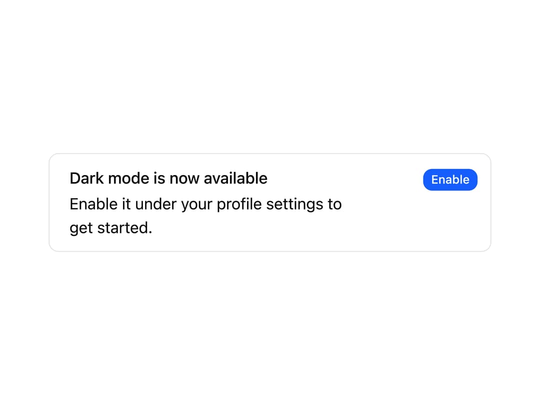
About
A dismissible-style alert banner with a title, description, and an inline call-to-action button for prompting the user to take an action.
Built with React and Tailwind. Copy the prompt and paste it into Claude Code, Cursor or Lovable: your agent adds Alert Action to your project and fits it to your theme.
Code
How Alert Action is used: the demo's code. The component's own source comes with a free account.
Usage.tsx
import AlertAction from "@/components/ui/alert-action";

export default function AlertActionDemo() {
  return <AlertAction />;
}
More by uiable
View all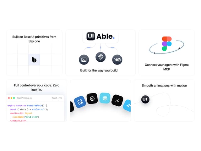

Feature Highlights Grid
414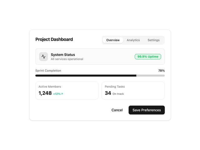
Card Tabs
111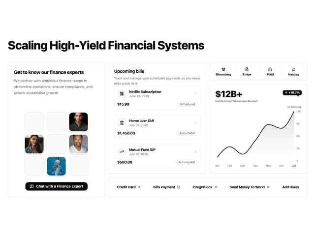
Financial Bento Grid
92
Chart Tooltip
75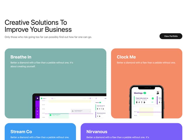
Portfolio Showcase Grid
69
Marketing Hero Section
68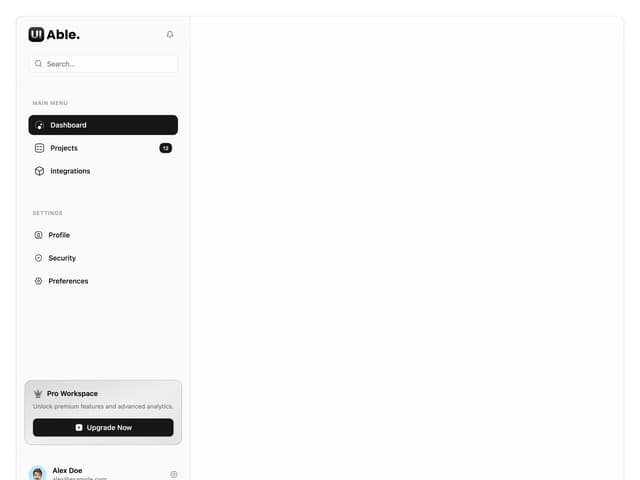
Sidebar with Search and Profile
56
Position Sonner
48
More in Buttons
View all
Texture Button
98

Button
34

HeroUI Button Group


Button
49

Eclipse Button
39
Base Button
4
Button


App Store Button
463

