
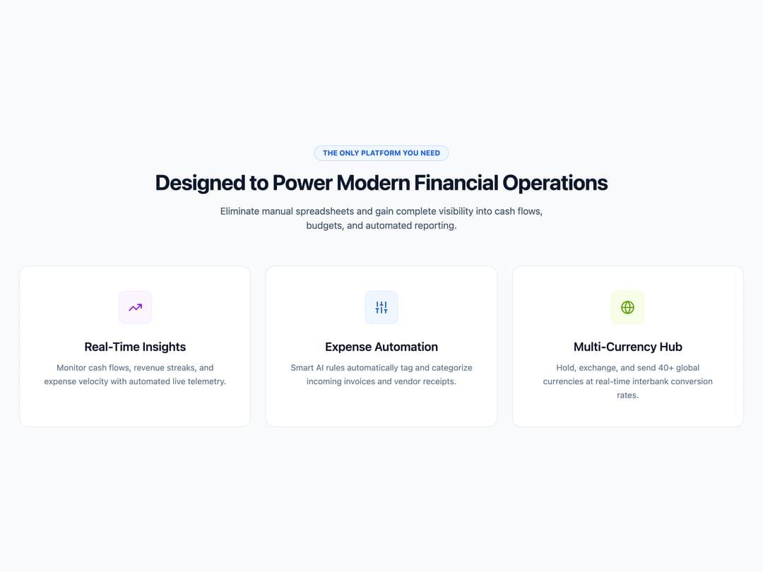
About
A three-column feature section with icon cards, a mouse-tracking spotlight border effect, and scroll-triggered fade-in animations, used to highlight product capabilities on a landing page.
Built with React and Tailwind. Copy the prompt and paste it into Claude Code, Cursor or Lovable: your agent adds Financial Platform Feature Grid to your project and fits it to your theme.
Code
How Financial Platform Feature Grid is used: the demo's code. The component's own source comes with a free account.
Usage.tsx
import Feature32 from "@/components/ui/block-feature-32";

export default function Feature32Demo() {
  return <Feature32 />;
}
Dependencies
More by uiable
View all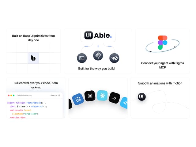

Feature Highlights Grid
396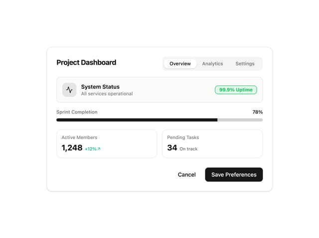
Card Tabs
110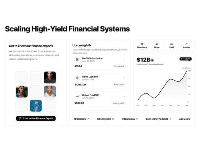
Financial Bento Grid
87
Chart Tooltip
73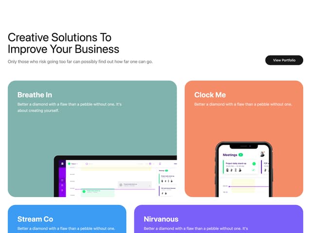
Portfolio Showcase Grid
68
Marketing Hero Section
65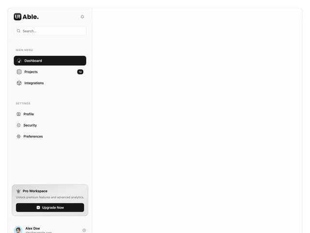
Sidebar with Search and Profile
55
Position Sonner
48
More in Features
View all

Feature Sections
40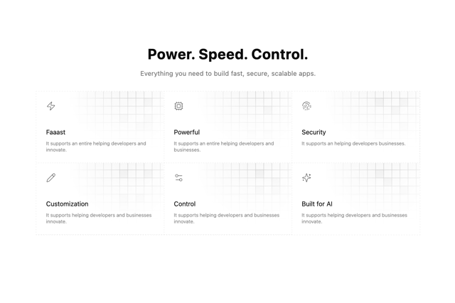

Grid Feature Cards
1.9K
Feature with advantages
284

Features 8
3.1K
Features Card
216

Features Grid
80
Features 2
326
Features 4
375

