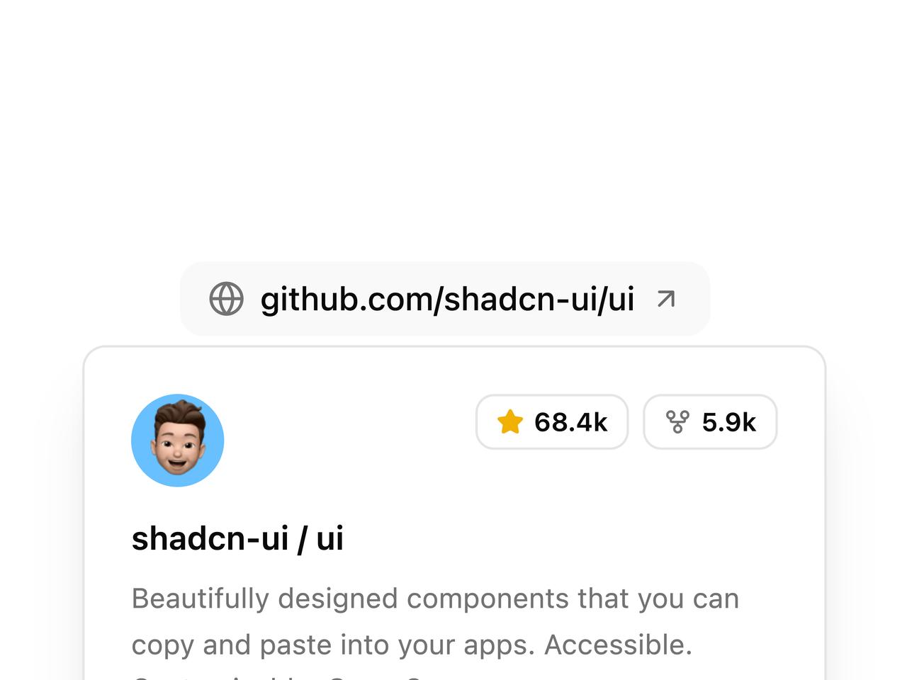
import {
Avatar,
AvatarFallback,
AvatarImage,
} from "@/components/ui/hover-card-link-preview-utils/avatar";
import { Badge } from "@/components/ui/badge";
import {
HoverCard,
HoverCardContent,
HoverCardTrigger,
} from "@/components/ui/hover-card-link-preview-utils/hover-card";
import { ArrowUpRight, GitFork, Globe, Star } from "lucide-react";
export default function HoverCardLinkPreviewDemo() {
return (
<div className="flex items-center justify-center py-6">
<HoverCard defaultOpen>
<HoverCardTrigger
delay={200}
closeDelay={150}
render={
<a
href="https://github.com/shadcn-ui/ui"
target="_blank"
rel="noreferrer noopener"
className="group inline-flex items-center gap-1.5 rounded-lg bg-muted/60 px-3 py-1.5 text-sm font-medium text-foreground transition-colors hover:bg-primary/10 hover:text-primary"
/>
}
>
<Globe className="size-4 text-muted-foreground transition-colors group-hover:text-primary" />
<span className="underline-offset-4 group-hover:underline">
github.com/shadcn-ui/ui
</span>
<ArrowUpRight className="size-3.5 opacity-60 transition-transform duration-200 group-hover:translate-x-0.5 group-hover:-translate-y-0.5 group-hover:opacity-100" />
</HoverCardTrigger>
<HoverCardContent className="w-80 p-5 shadow-xl">
<div className="flex justify-between space-x-4">
<Avatar className="size-10 rounded-lg after:border-none">
<AvatarImage
src="https://cdn.21st.dev/assets/localized/1c076ea7a3864b2bd954edf44e9dbe45c8d893884da090bb4027af9e44166116.jpg"
alt="shadcn avatar"
/>
<AvatarFallback className="rounded-lg bg-primary/10 text-primary">
SC
</AvatarFallback>
</Avatar>
<div className="flex gap-1.5">
<Badge variant="outline" className="h-6 gap-1 px-2 text-[11px]">
<Star className="size-3 fill-yellow-500 text-yellow-500" />
<span>68.4k</span>
</Badge>
<Badge variant="outline" className="h-6 gap-1 px-2 text-[11px]">
<GitFork className="size-3 text-muted-foreground" />
<span>5.9k</span>
</Badge>
</div>
</div>
<div className="mt-3 space-y-1.5">
<h4 className="text-sm font-semibold text-foreground">
shadcn-ui / ui
</h4>
<p className="text-xs leading-relaxed text-muted-foreground">
Beautifully designed components that you can copy and paste into
your apps. Accessible. Customizable. Open Source.
</p>
</div>
<div className="mt-4 flex flex-wrap items-center gap-x-2 gap-y-1.5 text-xs text-muted-foreground">
<div className="flex items-center gap-1.5 font-medium text-foreground">
<span className="size-2 shrink-0 rounded-full bg-primary" />
<span>TypeScript</span>
</div>
<span className="text-muted-foreground/40">•</span>
<span>MIT License</span>
<span className="text-muted-foreground/40">•</span>
<span>Updated yesterday</span>
</div>
</HoverCardContent>
</HoverCard>
</div>
);
}