

About
A group of labeled toggle switches, each tinted a semantic color (success, info, warning, danger) to signal its meaning in a settings or preferences form.
Built with React and Tailwind. Copy the prompt and paste it into Claude Code, Cursor or Lovable: your agent adds Switch Color Options to your project and fits it to your theme.
Code
How Switch Color Options is used: the demo's code. The component's own source comes with a free account.
Usage.tsx
import SwitchColorOptions from "@/components/ui/switch-color-options";

export default function SwitchColorOptionsDemo() {
  return (
    <div className="flex w-full items-center justify-center p-10">
      <SwitchColorOptions />
    </div>
  );
}
More by uiable
View all

Feature Highlights Grid
419
Card Tabs
113
Financial Bento Grid
95
Chart Tooltip
75
Portfolio Showcase Grid
71
Marketing Hero Section
69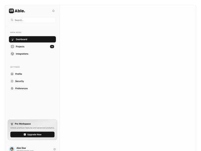
Sidebar with Search and Profile
58
Position Sonner
48
More in Forms
View all

Premium Auth
531

Contact Card
1K

Card Studio
43

Book A Demo 1
77

Form
17

Login 2
8

Modern & Stunning sign in
1.6K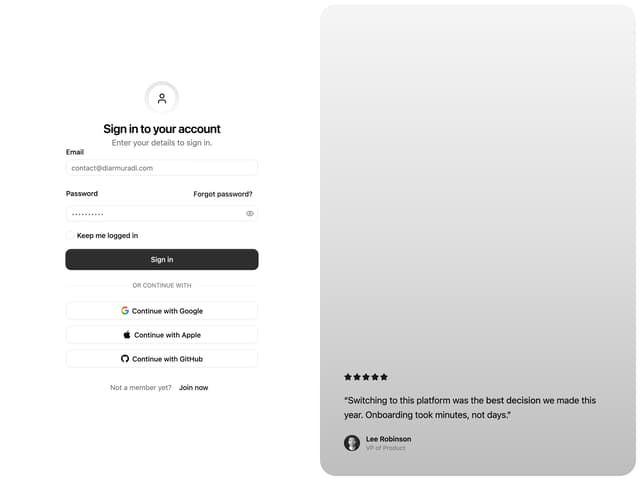

Split Sign In Form
73