About
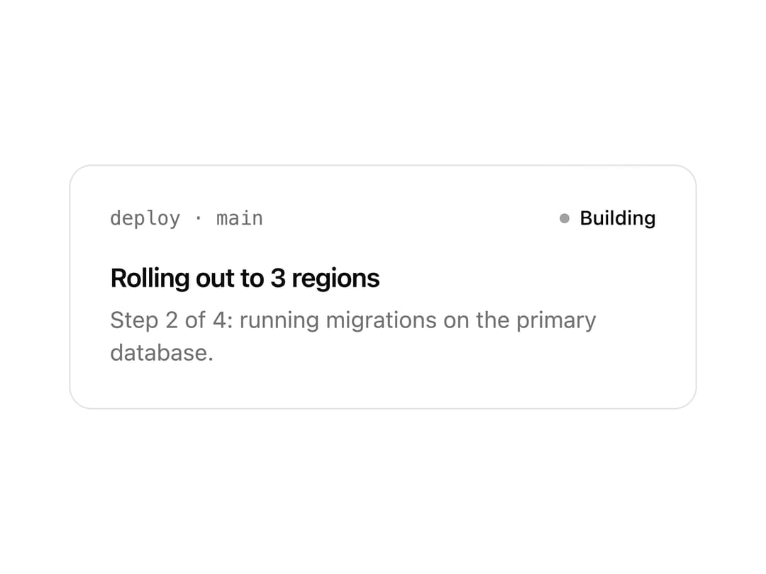
A thin animated beam of light that travels around the inside edge of an element's border, used to highlight a featured card or call-to-action button.
Built with React and Tailwind. Copy the prompt and paste it into Claude Code, Cursor or Lovable: your agent adds Border Beam to your project and fits it to your theme.
Code
How Border Beam is used: the demo's code. The component's own source comes with a free account.
Usage.tsx
import { BorderBeam } from "@/components/ui/border-beam";

export default function BorderBeamDemo() {
  return (
    <div className="relative w-full max-w-sm rounded-xl border bg-card p-6 text-card-foreground">
      <div className="flex items-center justify-between">
        <span className="font-mono text-xs text-muted-foreground">
          deploy · main
        </span>
        <span className="inline-flex items-center gap-1.5 text-xs font-medium">
          <span className="size-1.5 rounded-full bg-ring" aria-hidden="true" />
          Building
        </span>
      </div>
      <p className="mt-4 text-base font-semibold tracking-tight">
        Rolling out to 3 regions
      </p>
      <p className="mt-1 text-sm text-muted-foreground">
        Step 2 of 4: running migrations on the primary database.
      </p>
      <BorderBeam />
    </div>
  );
}
Dependencies
More by vamsiy78
View all

Segmented Control
7
HUD
Bar List
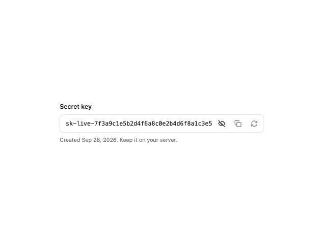
API Key Field
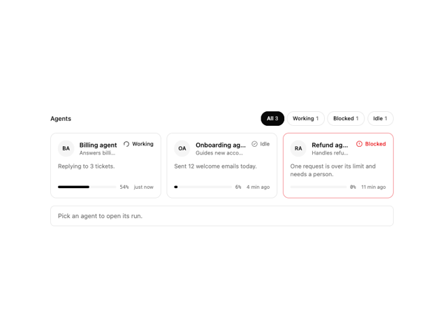
Agent Roster
More in Cards
View all

Course Design Cards
1.3K

Statistics Card 7
327
Statistics Card 2
305

Interactive Tech Stack Bento Grid with Hover Effects
625

Card Studio
5
The Item one
4

Weather Card
65

Card
9