
About
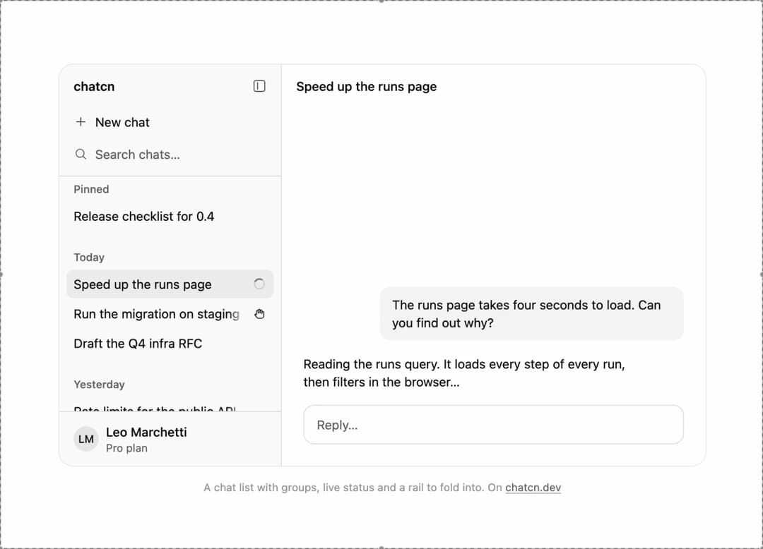
A chat list sidebar with pinned and day groups, live status per thread, rename, delete with undo and a collapsed rail.
Built with React and Tailwind. Copy the prompt and paste it into Claude Code, Cursor or Lovable: your agent adds Chat Sidebar to your project and fits it to your theme.
Code
How Chat Sidebar is used: the demo's code. The component's own source comes with a free account.
Usage.tsx
"use client"

import * as React from "react"
import { cn } from "@/lib/utils"
import { Tooltip as TooltipPrimitive } from "@base-ui/react/tooltip"
import { Button, ChatSidebar, ChatSidebarAccount, ChatThread, EllipsisIcon, Icon, IconNode, Menu, MenuContent, MenuTrigger, PanelLeftIcon, PlusIcon, ShareIcon, Tooltip, createIcon, formatHotkey, hotkeyAria, toggleSourceOf, useChatcnShellLayout } from "@/components/ui/chat-sidebar"

const reducedMotion = () => window.matchMedia("(prefers-reduced-motion: reduce)").matches

/** The tour: switch chats, start a new one that names itself, fold to the rail and back. */
type Beat = { active: string; withNew: boolean; named: boolean; collapsed: boolean; ms: number }

const BEATS: Beat[] = [
  { active: "runs", withNew: false, named: false, collapsed: false, ms: 2400 },
  { active: "staging", withNew: false, named: false, collapsed: false, ms: 2400 },
  { active: "new", withNew: true, named: false, collapsed: false, ms: 1300 },
  { active: "new", withNew: true, named: true, collapsed: false, ms: 2200 },
  { active: "new", withNew: true, named: true, collapsed: true, ms: 1800 },
  { active: "new", withNew: true, named: true, collapsed: false, ms: 1400 },
]

const NEW_TITLE = "Plan the passkeys rollout"

/** A fixed afternoon, so the day groups read the same on every load. */
const NOW = new Date(2026, 9, 21, 15, 10)

const ago = (days: number, hours = 0) => new Date(NOW.getTime() - days * 86_400_000 - hours * 3_600_000)

const THREADS: ChatThread[] = [
  { id: "release", title: "Release checklist for 0.4", updatedAt: ago(2), pinned: true },
  { id: "runs", title: "Speed up the runs page", updatedAt: ago(0, 0.1), status: "streaming" },
  { id: "staging", title: "Run the migration on staging", updatedAt: ago(0, 1), status: "needs-input" },
  { id: "rfc", title: "Draft the Q4 infra RFC", updatedAt: ago(0, 3) },
  { id: "limits", title: "Rate limits for the public API", updatedAt: ago(1, 2) },
  { id: "bench", title: "Summarize the search benchmarks", updatedAt: ago(1, 5), status: "unread" },
  { id: "pool", title: "Tune the database pool", updatedAt: ago(4) },
  { id: "docker", title: "Slimmer image for the API", updatedAt: ago(6) },
]

/** What each chat shows on the right: the last question and where the reply stands. */
const PANES: Record<string, { ask: string; reply: string }> = {
  runs: {
    ask: "The runs page takes four seconds to load. Can you find out why?",
    reply: "Reading the runs query. It loads every step of every run, then filters in the browser…",
  },
  staging: {
    ask: "Add the archived flag to runs and backfill it.",
    reply: "The migration is ready. It locks the runs table for about two seconds. Run it on staging now?",
  },
  new: {
    ask: "Help me plan moving sign in to passkeys, with a fallback for old devices.",
    reply: "Starting with who signs in today and on which devices…",
  },
}

const FIT_CSS = "html,body{overflow:hidden}[data-fit-small] [data-fit-hide]{display:none!important}"

/**
 * 21st shows a demo in a small frame: about 674 by 421 on a component page, 358 by 224 on a
 * phone and 245 by 139 on a profile card. A demo taller than its frame gets scrollbars, which
 * render white on dark pages. FitFrame fills the frame exactly instead.
 *
 * - "scale": the content shrinks until it fits, centered. For visuals such as orbs.
 * - "crop": the content stays at full size from the top and fades out at the bottom. For text
 *   that streams in, where a changing scale would make the page breathe.
 *
 * `minWidth` lays out a wide demo (a table, a two column panel) at that width and scales it down
 * to the frame, instead of letting it collapse to a narrow layout. The frame centers it, so it
 * shrinks evenly on both sides.
 *
 * Anything marked `data-fit-hide` (state buttons, the chatcn.dev line) drops out in frames
 * shorter than `hideBelow`, so a profile card shows the visual alone.
 */
function FitFrame({
  children,
  mode = "scale",
  hideBelow = 360,
  minWidth,
}: {
  children: React.ReactNode
  mode?: "scale" | "crop"
  hideBelow?: number
  minWidth?: string
}) {
  const content = React.useRef<HTMLDivElement>(null)
  const [cropped, setCropped] = React.useState(false)

  React.useLayoutEffect(() => {
    const el = content.current
    if (!el) return
    const measure = () => {
      const vw = window.innerWidth
      const vh = window.innerHeight
      el.toggleAttribute("data-fit-small", vh < hideBelow)
      // Layout sizes ignore the transform, so measuring never feeds back.
      const w = Math.max(el.offsetWidth, el.scrollWidth)
      const h = Math.max(el.offsetHeight, el.scrollHeight)
      const scale = mode === "scale" ? Math.min(1, vw / w, vh / h) : 1
      el.style.transform = scale < 1 ? `scale(${scale})` : ""
      setCropped(mode === "crop" && h > vh + 1)
    }
    measure()
    const observer = new ResizeObserver(measure)
    observer.observe(el)
    // Content that changes inside a fixed width box (a headline that cycles words) never resizes
    // the box itself, so changes below it measure again on the next frame.
    let frame = 0
    const mutations = new MutationObserver(() => {
      cancelAnimationFrame(frame)
      frame = requestAnimationFrame(measure)
    })
    mutations.observe(el, { subtree: true, childList: true, characterData: true })
    window.addEventListener("resize", measure)
    return () => {
      observer.disconnect()
      mutations.disconnect()
      cancelAnimationFrame(frame)
      window.removeEventListener("resize", measure)
    }
  }, [mode, hideBelow])

  const fade = "linear-gradient(to bottom, #000 calc(100% - 40px), transparent)"
  return (
    <div
      className="flex w-full justify-center overflow-hidden"
      style={{
        height: "100dvh",
        alignItems: mode === "crop" ? "flex-start" : "center",
        maskImage: cropped ? fade : undefined,
        WebkitMaskImage: cropped ? fade : undefined,
      }}
    >
      <style>{FIT_CSS}</style>
      <div
        ref={content}
        className="w-full shrink-0"
        style={{ transformOrigin: mode === "crop" ? "top center" : "center", minWidth }}
      >
        {children}
      </div>
    </div>
  )
}

/**
 * Wrap the app once. After the first tooltip opens, the next ones open instantly, the way
 * native toolbars behave.
 */
function TooltipProvider({
  delay = 500,
  ...props
}: React.ComponentProps<typeof TooltipPrimitive.Provider>) {
  return <TooltipPrimitive.Provider delay={delay} closeDelay={0} {...props} />
}

/* -------------------------------------------------------------------------------------------------
 * ChatHeader
 * -----------------------------------------------------------------------------------------------*/

interface ChatHeaderProps extends Omit<React.ComponentProps<"header">, "title"> {
  title?: string
  /** Shown while `title` is empty. Default "New chat". */
  placeholder?: string
  /** Click the title to rename. Default true when `onTitleChange` is set. */
  editable?: boolean
  onTitleChange?: (title: string) => void
  /** A model control, usually a `ModelPicker` with `size="sm"`. Sits after the title. */
  model?: React.ReactNode
  /** Shows the Temporary badge. */
  temporary?: boolean
  temporaryDescription?: string
  /** Shows Share. */
  onShare?: () => void
  /** `MenuItem`s for the More menu. No menu without them. */
  menu?: React.ReactNode
  /** Extra controls before Share, for example a panel toggle. */
  actions?: React.ReactNode
  /**
   * Show the sidebar toggle (and New chat, when `onNewChat` is set) at the start. `auto`
   * (default) shows them inside a `ChatLayout` on mobile, where the sidebar is a drawer.
   */
  sidebarToggle?: "auto" | boolean
  /** Toggle handler outside a `ChatLayout`. Inside one, the layout handles it. */
  onSidebarToggle?: () => void
  /** New chat button at the start, next to the sidebar toggle. */
  onNewChat?: () => void
  newChatHotkey?: string
  sidebarHotkey?: string
  /**
   * The bottom hairline. `auto` (default) draws it only while the thread below is scrolled, so the
   * header stays quiet at the top. `true` always, `false` never.
   */
  bordered?: boolean | "auto"
}

/**
 * Watches the scroll containers next to the header (the thread, a page) and reports whether the
 * main one is scrolled away from the top. Small scrollers, such as a code block, are ignored.
 */
function useScrolledBelow(ref: React.RefObject<HTMLElement | null>, enabled: boolean) {
  const [scrolled, setScrolled] = React.useState(false)
  React.useEffect(() => {
    const header = ref.current
    const scope = header?.parentElement
    if (!enabled || !header || !scope) return
    const isMain = (node: Element): node is HTMLElement =>
      node instanceof HTMLElement &&
      !header.contains(node) &&
      node.scrollHeight > node.clientHeight + 1 &&
      node.clientHeight >= scope.clientHeight / 2
    const onScroll = (event: Event) => {
      const target = event.target
      if (target instanceof Element && isMain(target)) setScrolled(target.scrollTop > 0)
    }
    // A thread that opens already scrolled (pinned to the newest message) starts with the line.
    // Only the first few levels: a thread's scroller sits right beside the header.
    const walk = (node: Element, depth: number): boolean =>
      (isMain(node) && node.scrollTop > 0) ||
      (depth < 3 && Array.from(node.children).some((child) => walk(child, depth + 1)))
    if (Array.from(scope.children).some((child) => walk(child, 0))) setScrolled(true)
    // Scroll events do not bubble, but they do pass through ancestors on the way down.
    scope.addEventListener("scroll", onScroll, { capture: true, passive: true })
    return () => scope.removeEventListener("scroll", onScroll, { capture: true })
  }, [ref, enabled])
  return scrolled
}

/* -------------------------------------------------------------------------------------------------
 * Editable title
 * -----------------------------------------------------------------------------------------------*/

interface TitleProps {
  title: string
  placeholder: string
  editable: boolean
  onTitleChange?: (title: string) => void
}

/**
 * The title as a quiet button. Click (or Enter) turns it into a field of the same size: Enter
 * saves, Escape cancels, blur saves. A new title, such as the generated one replacing "New chat",
 * fades in once.
 */
function ChatHeaderTitle({ title, placeholder, editable, onTitleChange }: TitleProps) {
  const [editing, setEditing] = React.useState(false)
  const [draft, setDraft] = React.useState(title)
  const inputRef = React.useRef<HTMLInputElement>(null)
  const buttonRef = React.useRef<HTMLButtonElement>(null)
  const composing = React.useRef(false)
  const [titleKey, setTitleKey] = React.useState(0)
  const previous = React.useRef(title)

  React.useEffect(() => {
    if (previous.current !== title) setTitleKey((k) => k + 1)
    previous.current = title
  }, [title])

  React.useLayoutEffect(() => {
    if (!editing) return
    inputRef.current?.focus({ preventScroll: true })
    inputRef.current?.select()
  }, [editing])

  const shown = title || placeholder
  const textClass = "text-[0.875rem]/[1.25rem] tracking-[-0.003em] font-medium tracking-[-0.003em]"

  if (editing) {
    const finish = (save: boolean) => {
      setEditing(false)
      const next = draft.trim()
      if (save && next && next !== title) onTitleChange?.(next)
      requestAnimationFrame(() => buttonRef.current?.focus({ preventScroll: true }))
    }
    return (
      <input
        ref={inputRef}
        data-slot="chat-header-title-input"
        aria-label="Chat title"
        value={draft}
        maxLength={200}
        onChange={(event) => setDraft(event.target.value)}
        onCompositionStart={() => {
          composing.current = true
        }}
        onCompositionEnd={() => {
          window.setTimeout(() => {
            composing.current = false
          }, 0)
        }}
        onKeyDown={(event) => {
          if (event.nativeEvent.isComposing || composing.current || event.keyCode === 229) return
          if (event.key === "Enter") {
            event.preventDefault()
            finish(true)
          } else if (event.key === "Escape") {
            event.preventDefault()
            finish(false)
          }
        }}
        onBlur={() => finish(true)}
        className={cn(
          textClass,
          "rounded-(--chatcn-radius-md) bg-(color:--chatcn-card) text-(color:--chatcn-fg) h-8 w-[min(28rem,100%)] min-w-0 px-2 outline-none",
          "shadow-[0_0_0_1px_var(--chatcn-gray-900),0_0_0_4px_var(--chatcn-alpha-300)]",
          "pointer-coarse:text-[1rem]/[1.5rem] pointer-coarse:tracking-[-0.01em]",
        )}
      />
    )
  }

  const text = (
    <span
      key={titleKey}
      className={cn(
        "min-w-0 truncate",
        !title && "text-(color:--chatcn-fg-subtle)",
        titleKey > 0 && "ease-(--chatcn-ease-out) transition-opacity duration-200 starting:opacity-0",
      )}
    >
      {shown}
    </span>
  )

  if (!editable) {
    return (
      <h1
        data-slot="chat-header-title"
        className={cn(textClass, "text-(color:--chatcn-fg) flex min-w-0 px-2")}
      >
        {text}
      </h1>
    )
  }

  return (
    <h1 data-slot="chat-header-title" className="flex min-w-0">
      <button
        ref={buttonRef}
        type="button"
        aria-label={`Rename chat: ${shown}`}
        onClick={() => {
          setDraft(title)
          setEditing(true)
        }}
        className={cn(
          textClass,
          "chatcn-focus rounded-(--chatcn-radius-md) text-(color:--chatcn-fg) flex h-8 min-w-0 items-center px-2 outline-none",
          "ease-(--chatcn-ease-standard) hover:bg-(color:--chatcn-fill) transition-[background-color] duration-150",
          "pointer-coarse:h-11",
        )}
      >
        {text}
      </button>
    </h1>
  )
}

/* -------------------------------------------------------------------------------------------------
 * Temporary chat badge
 * -----------------------------------------------------------------------------------------------*/

interface ChatHeaderTemporaryBadgeProps {
  /** Tooltip copy. Say what happens to the chat. */
  description?: string
  className?: string
}

const iconNode: IconNode = [
  ["path", {"d":"M20.85 13.64a9 9 0 0 1-1.43 3.46"}],
  ["path", {"d":"M17.1 19.42a9 9 0 0 1-3.46 1.43"}],
  ["path", {"d":"M10.36 20.85a9 9 0 0 1-3.46-1.43"}],
  ["path", {"d":"M4.58 17.1a9 9 0 0 1-1.43-3.46"}],
  ["path", {"d":"M3.15 10.36A9 9 0 0 1 4.58 6.9"}],
  ["path", {"d":"M6.9 4.58a9 9 0 0 1 3.46-1.43"}],
  ["path", {"d":"M13.64 3.15a9 9 0 0 1 3.46 1.43"}],
  ["path", {"d":"M19.42 6.9a9 9 0 0 1 1.43 3.46"}],
]

const CircleDashedIcon: Icon = /* @__PURE__ */ createIcon("circle-dashed", iconNode)

/** Marks a chat that is not saved to history. A dashed ring: the same chat, without a trace. */
function ChatHeaderTemporaryBadge({
  description = "Not saved to history or used to update memory. Deleted after 30 days.",
  className,
}: ChatHeaderTemporaryBadgeProps) {
  return (
    <Tooltip content={description}>
      <span
        // biome-ignore lint/a11y/noNoninteractiveTabindex: the tooltip holds the explanation, so keyboard users need to reach it
        tabIndex={0}
        data-slot="chat-header-temporary"
        className={cn(
          "chatcn-focus text-[0.75rem]/[1rem] text-(color:--chatcn-fg-muted) shadow-(--chatcn-shadow-border) inline-flex h-6 shrink-0 items-center gap-1 rounded-full ps-1.5 pe-2 font-medium outline-none",
          className,
        )}
      >
        <CircleDashedIcon aria-hidden="true" className="size-3.5" />
        Temporary
      </span>
    </Tooltip>
  )
}

/**
 * The bar above a thread: an editable title, the model, a Temporary badge, Share and a More
 * menu. Inside `ChatLayout` it also carries the sidebar toggle on mobile. 48 px tall, 44 px
 * touch targets on coarse pointers, safe-area aware through the layout.
 */
function ChatHeader({
  title = "",
  placeholder = "New chat",
  editable,
  onTitleChange,
  model,
  temporary = false,
  temporaryDescription,
  onShare,
  menu,
  actions,
  sidebarToggle = "auto",
  onSidebarToggle,
  onNewChat,
  newChatHotkey = "mod+shift+o",
  sidebarHotkey = "mod+b",
  bordered = "auto",
  className,
  ref,
  ...props
}: ChatHeaderProps) {
  const headerRef = React.useRef<HTMLElement>(null)
  const scrolled = useScrolledBelow(headerRef, bordered === "auto")
  const showBorder = bordered === "auto" ? scrolled : bordered
  const layout = useChatcnShellLayout()
  const showToggle =
    (sidebarToggle === true && Boolean(layout || onSidebarToggle)) ||
    (sidebarToggle === "auto" && Boolean(layout?.mobile))
  const canEdit = editable ?? Boolean(onTitleChange)
  const touchIcon = "pointer-coarse:size-11"

  return (
    <header
      ref={(node) => {
        headerRef.current = node
        if (typeof ref === "function") ref(node)
        else if (ref) ref.current = node
      }}
      data-slot="chat-header"
      data-bordered={showBorder ? "" : undefined}
      className={cn(
        "bg-(color:--chatcn-bg) relative z-10 flex h-12 shrink-0 items-center gap-1 px-2",
        "after:bg-(color:--chatcn-border) after:pointer-events-none after:absolute after:inset-x-0 after:bottom-0 after:h-px after:opacity-0",
        "after:transition-opacity after:duration-150",
        showBorder && "after:opacity-100",
        "pointer-coarse:h-14",
        className,
      )}
      {...props}
    >
      {showToggle ? (
        <>
          <Tooltip content="Open sidebar" shortcut={formatHotkey(sidebarHotkey)}>
            <Button
              size="icon-md"
              variant="ghost"
              aria-label="Open sidebar"
              aria-controls={layout?.sidebarId}
              aria-expanded={
                layout ? (layout.mobile ? layout.sidebarOpen : !layout.sidebarCollapsed) : undefined
              }
              aria-keyshortcuts={hotkeyAria(sidebarHotkey)}
              className={touchIcon}
              onClick={(event) =>
                layout ? layout.toggleSidebar(toggleSourceOf(event)) : onSidebarToggle?.()
              }
            >
              <PanelLeftIcon className="rtl:-scale-x-100" />
            </Button>
          </Tooltip>
          {onNewChat ? (
            <Tooltip content="New chat" shortcut={formatHotkey(newChatHotkey)}>
              <Button
                size="icon-md"
                variant="ghost"
                aria-label="New chat"
                aria-keyshortcuts={hotkeyAria(newChatHotkey)}
                className={touchIcon}
                onClick={onNewChat}
              >
                <PlusIcon />
              </Button>
            </Tooltip>
          ) : null}
        </>
      ) : null}

      <div className="flex min-w-0 flex-1 items-center gap-1">
        <ChatHeaderTitle
          title={title}
          placeholder={placeholder}
          editable={canEdit}
          onTitleChange={onTitleChange}
        />
        {temporary ? (
          <ChatHeaderTemporaryBadge description={temporaryDescription} className="ms-1" />
        ) : null}
        {model ? (
          <div className="ms-1 flex min-w-0 shrink-0 items-center max-sm:hidden">{model}</div>
        ) : null}
      </div>

      <div className="flex shrink-0 items-center gap-1">
        {actions}
        {onShare ? (
          <Button
            size="sm"
            variant="ghost"
            onClick={onShare}
            className="max-sm:hidden pointer-coarse:h-11"
          >
            <ShareIcon />
            Share
          </Button>
        ) : null}
        {onShare ? (
          <Tooltip content="Share">
            <Button
              size="icon-md"
              variant="ghost"
              aria-label="Share"
              onClick={onShare}
              className={cn(touchIcon, "sm:hidden")}
            >
              <ShareIcon />
            </Button>
          </Tooltip>
        ) : null}
        {menu ? (
          <Menu>
            <Tooltip content="More">
              <MenuTrigger
                render={
                  <Button
                    size="icon-md"
                    variant="ghost"
                    aria-label="More"
                    className={cn(
                      touchIcon,
                      "data-[popup-open]:bg-(color:--chatcn-fill-hover) data-[popup-open]:text-(color:--chatcn-fg)",
                    )}
                  />
                }
              >
                <EllipsisIcon />
              </MenuTrigger>
            </Tooltip>
            <MenuContent align="end" className="w-56">
              {menu}
            </MenuContent>
          </Menu>
        ) : null}
      </div>
    </header>
  )
}

/** The line under each 21st demo that points back to the kit. */
function MoreOn({ slug, children }: { slug: string; children: React.ReactNode }) {
  return (
    <p data-fit-hide className="text-[0.75rem]/[1rem] text-(color:--chatcn-fg-faint) text-center text-balance">
      {children}{" "}
      <a
        href={`https://chatcn.dev/docs/components/${slug}`}
        target="_blank"
        rel="noopener"
        className="text-(color:--chatcn-fg-subtle) hover:text-(color:--chatcn-fg) underline underline-offset-2"
      >
        chatcn.dev
      </a>
    </p>
  )
}

/**
 * The chat list beside a conversation: pinned and day groups, live status on each row, a new
 * chat that names itself, and the fold to an icon rail. The tour walks through it; click a
 * chat, rename one or fold the sidebar yourself and the tour stops.
 */
export default function ChatSidebarPreview() {
  const [beat, setBeat] = React.useState(0)
  const [own, setOwn] = React.useState<{ threads: ChatThread[]; active: string; collapsed: boolean } | null>(null)

  React.useEffect(() => {
    if (own || reducedMotion()) return
    const id = window.setTimeout(() => setBeat((n) => (n + 1) % BEATS.length), BEATS[beat]!.ms)
    return () => window.clearTimeout(id)
  }, [beat, own])

  const b = BEATS[beat]!
  const fresh: ChatThread = b.named
    ? { id: "new", title: NEW_TITLE, updatedAt: NOW, status: "streaming" }
    : { id: "new", title: "", updatedAt: NOW }
  const tourThreads = (b.withNew ? [fresh, ...THREADS] : THREADS).map((t) =>
    t.id === "runs" && b.withNew ? { ...t, status: "unread" as const } : t,
  )
  const threads = own?.threads ?? tourThreads
  const active = own?.active ?? b.active
  const collapsed = own?.collapsed ?? b.collapsed

  const take = (patch: Partial<NonNullable<typeof own>>) =>
    setOwn((o) => ({ threads: o?.threads ?? tourThreads, active: o?.active ?? active, collapsed: o?.collapsed ?? collapsed, ...patch }))
  const update = (id: string, patch: Partial<ChatThread>) =>
    take({ threads: threads.map((t) => (t.id === id ? { ...t, ...patch } : t)) })

  const current = threads.find((t) => t.id === active)
  const pane = PANES[active] ?? {
    ask: current?.title ? `${current.title}.` : "",
    reply: "Picking this back up where we left off.",
  }
  const blank = active === "new" && !b.named && !own

  return (
    <FitFrame minWidth="48rem">
      <div className="flex w-full flex-col items-center justify-center gap-4 p-6">
        <TooltipProvider>
          <div className="rounded-(--chatcn-radius-xl) shadow-(--chatcn-shadow-border) bg-(color:--chatcn-bg) flex h-[28rem] w-[45rem] shrink-0 overflow-hidden">
            <ChatSidebar
              threads={threads}
              activeId={active}
              grouping={{ now: NOW }}
              hotkeys={false}
              resizable={false}
              defaultWidth={248}
              collapsed={collapsed}
              onCollapsedChange={(c) => take({ collapsed: c })}
              onSelect={(id) => {
                const t = threads.find((x) => x.id === id)
                take({
                  active: id,
                  threads: t?.status === "unread" ? threads.map((x) => (x.id === id ? { ...x, status: "idle" } : x)) : threads,
                })
              }}
              onNewChat={() => {
                const id = `own-${Date.now()}`
                take({ active: id, threads: [{ id, title: "", updatedAt: NOW }, ...threads] })
              }}
              onRename={(id, title) => update(id, { title })}
              onPinChange={(id, pinned) => update(id, { pinned })}
              onDelete={(id) => take({ threads: threads.filter((t) => t.id !== id) })}
              brand="chatcn"
              footer={<ChatSidebarAccount name="Leo Marchetti" detail="Pro plan" />}
              railFooter={<ChatSidebarAccount name="Leo Marchetti" compact />}
            />
            <div className="flex min-w-0 flex-1 flex-col">
              <ChatHeader title={current?.title ?? ""} placeholder="New chat" editable={false} />
              <div className="flex min-h-0 flex-1 flex-col justify-end gap-4 px-6 pb-6">
                {blank ? (
                  <p className="text-[1rem]/[1.5rem] tracking-[-0.01em] text-(color:--chatcn-fg-muted) self-center pb-16">What are we working on?</p>
                ) : (
                  <>
                    <p className="bg-(color:--chatcn-fill) rounded-(--chatcn-radius-lg) text-[0.875rem]/[1.25rem] tracking-[-0.003em] text-(color:--chatcn-fg) max-w-[80%] self-end px-3.5 py-2.5 text-pretty">
                      {pane.ask}
                    </p>
                    <p className="text-[0.875rem]/[1.25rem] tracking-[-0.003em] text-(color:--chatcn-fg) max-w-[92%] text-pretty">{pane.reply}</p>
                  </>
                )}
                <div className="border-(color:--chatcn-border) rounded-(--chatcn-radius-lg) text-[0.875rem]/[1.25rem] tracking-[-0.003em] text-(color:--chatcn-fg-subtle) flex h-11 items-center border px-3.5">
                  Reply…
                </div>
              </div>
            </div>
          </div>
        </TooltipProvider>
        <MoreOn slug="chat-sidebar">A chat list with groups, live status and a rail to fold into. On</MoreOn>
      </div>
    </FitFrame>
  )
}
Dependencies
More by Aadi
View all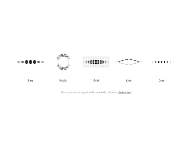
Audio Visualizer
29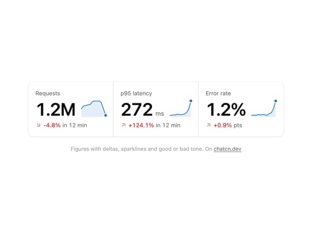
Stat Card
24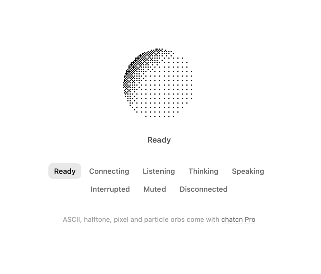
Dither Orb
23
Voice Orb
17
Waveform
13
Message Feedback
12
Agent Lanes
11
Voice Controls
10
More in AI chats
View all

AI Actions
349

Aquarium Prompt
95
Generation Stats

Chat Bubble
202
Commit
36
Color Picker
190
Environment Variables
27

Message With Header And Delivery Status
57

