
About
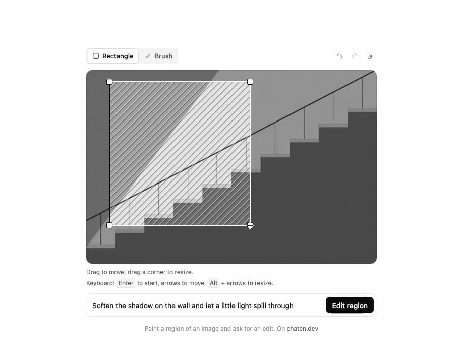
Mark the part of an image to change, then describe the edit: a rectangle or a brush mask with handles, undo and clear, keyboard moves and resizes, and the prompt with Edit region beneath.
Built with React and Tailwind. Copy the prompt and paste it into Claude Code, Cursor or Lovable: your agent adds Image Edit Region to your project and fits it to your theme.
Code
How Image Edit Region is used: the demo's code. The component's own source comes with a free account.
Usage.tsx
"use client"
import * as React from "react"
import { cn } from "@/lib/utils"
import { Dialog as DialogPrimitive } from "@base-ui/react/dialog"
import { Button, ButtonProps, Icon, IconNode, ImageEditRegion, Spinner, Tooltip, buttonVariants, createIcon } from "@/components/ui/image-edit-region"
const FIT_CSS = "html,body{overflow:hidden}[data-fit-small] [data-fit-hide]{display:none!important}"
/**
* 21st shows a demo in a small frame: about 674 by 421 on a component page, 358 by 224 on a
* phone and 245 by 139 on a profile card. A demo taller than its frame gets scrollbars, which
* render white on dark pages. FitFrame fills the frame exactly instead.
*
* - "scale": the content shrinks until it fits, centered. For visuals such as orbs.
* - "crop": the content stays at full size from the top and fades out at the bottom. For text
* that streams in, where a changing scale would make the page breathe.
*
* `minWidth` lays out a wide demo (a table, a two column panel) at that width and scales it down
* to the frame, instead of letting it collapse to a narrow layout. The frame centers it, so it
* shrinks evenly on both sides.
*
* Anything marked `data-fit-hide` (state buttons, the chatcn.dev line) drops out in frames
* shorter than `hideBelow`, so a profile card shows the visual alone.
*/
function FitFrame({
children,
mode = "scale",
hideBelow = 360,
minWidth,
}: {
children: React.ReactNode
mode?: "scale" | "crop"
hideBelow?: number
minWidth?: string
}) {
const content = React.useRef<HTMLDivElement>(null)
const [cropped, setCropped] = React.useState(false)
React.useLayoutEffect(() => {
const el = content.current
if (!el) return
const measure = () => {
const vw = window.innerWidth
const vh = window.innerHeight
el.toggleAttribute("data-fit-small", vh < hideBelow)
// Layout sizes ignore the transform, so measuring never feeds back.
const w = Math.max(el.offsetWidth, el.scrollWidth)
const h = Math.max(el.offsetHeight, el.scrollHeight)
const scale = mode === "scale" ? Math.min(1, vw / w, vh / h) : 1
el.style.transform = scale < 1 ? `scale(${scale})` : ""
setCropped(mode === "crop" && h > vh + 1)
}
measure()
const observer = new ResizeObserver(measure)
observer.observe(el)
// Content that changes inside a fixed width box (a headline that cycles words) never resizes
// the box itself, so changes below it measure again on the next frame.
let frame = 0
const mutations = new MutationObserver(() => {
cancelAnimationFrame(frame)
frame = requestAnimationFrame(measure)
})
mutations.observe(el, { subtree: true, childList: true, characterData: true })
window.addEventListener("resize", measure)
return () => {
observer.disconnect()
mutations.disconnect()
cancelAnimationFrame(frame)
window.removeEventListener("resize", measure)
}
}, [mode, hideBelow])
const fade = "linear-gradient(to bottom, #000 calc(100% - 40px), transparent)"
return (
<div
className="flex w-full justify-center overflow-hidden"
style={{
height: "100dvh",
alignItems: mode === "crop" ? "flex-start" : "center",
maskImage: cropped ? fade : undefined,
WebkitMaskImage: cropped ? fade : undefined,
}}
>
<style>{FIT_CSS}</style>
<div
ref={content}
className="w-full shrink-0"
style={{ transformOrigin: mode === "crop" ? "top center" : "center", minWidth }}
>
{children}
</div>
</div>
)
}
interface JobOptions {
/** Queue positions to step through before generating. Empty skips the queue. */
queue?: number[]
queueStepMs?: number
/** Time from 0 to 100 percent. */
durationMs?: number
/** Where the job ends. Default "done". */
outcome?: "done" | "failed" | "blocked"
/** Percent at which a failed or blocked job stops. */
stopAt?: number
/** Start on mount. Default true. */
autoStart?: boolean
}
type JobStatus = "queued" | "generating" | "done" | "failed" | "blocked"
/** Small seeded PRNG (mulberry32): same seed, same picture. */
function random(seed: number) {
let a = seed >>> 0
return () => {
a = (a + 0x6d2b79f5) >>> 0
let t = a
t = Math.imul(t ^ (t >>> 15), t | 1)
t ^= t + Math.imul(t ^ (t >>> 7), t | 61)
return ((t ^ (t >>> 14)) >>> 0) / 4294967296
}
}
/**
* A scripted generation job for demos: walks the queue, then reports progress in uneven steps
* every 240 ms, the way real providers do, and lands on the outcome. `run()` starts it again.
*/
function useGenerationJob({
queue = [2, 1],
queueStepMs = 900,
durationMs = 5600,
outcome = "done",
stopAt = 46,
autoStart = true,
}: JobOptions = {}) {
const [state, setState] = React.useState<{
status: JobStatus
progress?: number
queuePosition?: number
}>({ status: "queued", queuePosition: queue[0] })
const [runId, setRunId] = React.useState(autoStart ? 1 : 0)
const options = React.useRef({ queue, queueStepMs, durationMs, outcome, stopAt })
options.current = { queue, queueStepMs, durationMs, outcome, stopAt }
React.useEffect(() => {
if (runId === 0) return
const { queue, queueStepMs, durationMs, outcome, stopAt } = options.current
const timers: number[] = []
const rand = random(runId * 31)
const at = (ms: number, fn: () => void) => timers.push(window.setTimeout(fn, ms))
setState({ status: "queued", queuePosition: queue[0] })
queue.forEach((position, i) => {
at(i * queueStepMs, () => setState({ status: "queued", queuePosition: position }))
})
const start = queue.length * queueStepMs
at(start, () => setState({ status: "generating", progress: 0 }))
const steps = Math.max(4, Math.round(durationMs / 240))
let p = 0
let t = start
for (let i = 1; i <= steps; i++) {
t += 240
p = Math.min(100, p + (100 / steps) * (0.4 + rand() * 1.2))
const value = i === steps ? 100 : Math.min(99, Math.round(p))
if (outcome !== "done" && value >= stopAt) {
at(t, () => setState({ status: outcome, progress: value }))
break
}
at(t, () => setState({ status: "generating", progress: value }))
if (i === steps) at(t + 280, () => setState({ status: "done", progress: 100 }))
}
return () => {
for (const id of timers) window.clearTimeout(id)
}
}, [runId])
const run = React.useCallback(() => setRunId((id) => id + 1), [])
return { ...state, run }
}
type Scene = "dunes" | "peaks" | "sphere" | "ripples" | "stairs" | "moon"
interface SceneOptions {
/** Seed for the shapes. Different seeds give different variations of one scene. */
seed?: number
/** Width over height. Default 1. */
ratio?: number
/** Long edge in px. Default 1200. */
size?: number
}
const r1 = (n: number) => Math.round(n * 10) / 10
/** A smooth ridge line across the frame, closed down to the bottom edge. */
function ridge(
w: number,
h: number,
base: number,
amp: number,
rand: () => number,
jagged = false,
) {
const steps = jagged ? 9 : 5
const pts: [number, number][] = []
for (let i = 0; i <= steps; i++) {
const x = (i / steps) * w
const y = base + (rand() - 0.5) * amp * (jagged && i % 2 ? 1.6 : 1)
pts.push([x, y])
}
let d = `M0 ${h} L0 ${r1(pts[0]?.[1] ?? base)}`
for (let i = 1; i < pts.length; i++) {
const [x0, y0] = pts[i - 1] ?? [0, base]
const [x1, y1] = pts[i] ?? [w, base]
if (jagged) d += ` L${r1(x1)} ${r1(y1)}`
else {
const cx = (x0 + x1) / 2
d += ` C${r1(cx)} ${r1(y0)} ${r1(cx)} ${r1(y1)} ${r1(x1)} ${r1(y1)}`
}
}
return `${d} L${w} ${h} Z`
}
function grain(w: number, h: number, seed: number, opacity = 0.16) {
return `<filter id="g" x="0" y="0" width="100%" height="100%"><feTurbulence type="fractalNoise" baseFrequency="0.85" numOctaves="2" seed="${seed}" stitchTiles="stitch"/><feColorMatrix type="saturate" values="0"/></filter><rect width="${w}" height="${h}" filter="url(#g)" opacity="${opacity}"/>`
}
function draw(scene: Scene, w: number, h: number, seed: number) {
const rand = random(seed * 7919 + scene.length)
const parts: string[] = []
const m = Math.min(w, h)
switch (scene) {
case "dunes": {
parts.push(`<rect width="${w}" height="${h}" fill="white"/>`)
parts.push(`<rect width="${w}" height="${h}" fill="black" opacity="0.06"/>`)
const sunX = w * (0.25 + rand() * 0.5)
parts.push(`<circle cx="${r1(sunX)}" cy="${r1(h * 0.3)}" r="${r1(m * 0.07)}" fill="white"/>`)
const layers = [0.1, 0.2, 0.34, 0.52, 0.72, 0.86]
layers.forEach((alpha, i) => {
const base = h * (0.42 + i * 0.1)
parts.push(
`<path d="${ridge(w, h, base, h * 0.12, rand)}" fill="black" opacity="${alpha}"/>`,
)
})
break
}
case "peaks": {
parts.push(`<rect width="${w}" height="${h}" fill="white"/>`)
parts.push(`<rect width="${w}" height="${h}" fill="black" opacity="0.04"/>`)
const layers = [0.08, 0.15, 0.26, 0.42, 0.66]
layers.forEach((alpha, i) => {
const base = h * (0.36 + i * 0.12)
parts.push(
`<path d="${ridge(w, h, base, h * 0.28, rand, true)}" fill="black" opacity="${alpha}"/>`,
)
// Fog banks between the ranges.
parts.push(
`<rect y="${r1(base + h * 0.06)}" width="${w}" height="${r1(h * 0.05)}" fill="white" opacity="0.35" filter="url(#b)"/>`,
)
})
parts.unshift(
`<filter id="b" x="-10%" y="-200%" width="120%" height="500%"><feGaussianBlur stdDeviation="${r1(m * 0.03)}"/></filter>`,
)
break
}
case "sphere": {
const cx = w * (0.4 + rand() * 0.2)
const r = m * (0.18 + rand() * 0.06)
const floor = h * 0.68
const cy = floor - r
parts.push(
`<defs><radialGradient id="bg" cx="50%" cy="38%" r="75%"><stop offset="0" stop-color="white"/><stop offset="1" stop-color="black" stop-opacity="0.9"/></radialGradient>`,
`<radialGradient id="s" cx="34%" cy="30%" r="80%"><stop offset="0" stop-color="white"/><stop offset="0.55" stop-color="black" stop-opacity="0.55"/><stop offset="1" stop-color="black" stop-opacity="0.95"/></radialGradient>`,
`<filter id="b" x="-50%" y="-200%" width="200%" height="500%"><feGaussianBlur stdDeviation="${r1(r * 0.18)}"/></filter></defs>`,
)
parts.push(`<rect width="${w}" height="${h}" fill="black"/>`)
parts.push(`<rect width="${w}" height="${h}" fill="url(#bg)" opacity="0.92"/>`)
parts.push(
`<rect y="${r1(floor)}" width="${w}" height="${r1(h - floor)}" fill="black" opacity="0.18"/>`,
)
parts.push(
`<ellipse cx="${r1(cx + r * 0.25)}" cy="${r1(floor + r * 0.04)}" rx="${r1(r * 1.25)}" ry="${r1(r * 0.16)}" fill="black" opacity="0.7" filter="url(#b)"/>`,
)
parts.push(`<circle cx="${r1(cx)}" cy="${r1(cy)}" r="${r1(r)}" fill="url(#s)"/>`)
break
}
case "ripples": {
parts.push(`<rect width="${w}" height="${h}" fill="black"/>`)
parts.push(`<rect width="${w}" height="${h}" fill="white" opacity="0.06"/>`)
const cx = w * (0.35 + rand() * 0.3)
const cy = h * (0.45 + rand() * 0.15)
const rings = 9 + Math.floor(rand() * 4)
for (let i = rings; i > 0; i--) {
const rx = (i / rings) * w * 0.75
parts.push(
`<ellipse cx="${r1(cx)}" cy="${r1(cy)}" rx="${r1(rx)}" ry="${r1(rx * 0.32)}" fill="none" stroke="white" stroke-width="${r1(1 + (rings - i) * 0.35)}" opacity="${r1((1 - i / rings) * 0.75 + 0.18)}"/>`,
)
}
parts.push(
`<ellipse cx="${r1(cx)}" cy="${r1(cy)}" rx="${r1(m * 0.012)}" ry="${r1(m * 0.005)}" fill="white" opacity="0.9"/>`,
)
break
}
case "stairs": {
parts.push(`<rect width="${w}" height="${h}" fill="white"/>`)
parts.push(`<rect width="${w}" height="${h}" fill="black" opacity="0.08"/>`)
const n = 8 + Math.floor(rand() * 4)
const sw = w / n
const sh = (h * 0.78) / n
const base = h * 0.98
// Risers: the solid mass under the zigzag.
let pts = `0,${h}`
for (let i = 0; i < n; i++) {
pts += ` ${r1(i * sw)},${r1(base - i * sh)} ${r1(i * sw)},${r1(base - (i + 1) * sh)} ${r1((i + 1) * sw)},${r1(base - (i + 1) * sh)}`
}
pts += ` ${w},${h}`
parts.push(`<polygon points="${pts}" fill="black" opacity="0.5"/>`)
// Treads catch the sun as thin bright strips.
for (let i = 0; i < n; i++) {
parts.push(
`<rect x="${r1(i * sw)}" y="${r1(base - (i + 1) * sh)}" width="${r1(sw)}" height="${r1(sh * 0.22)}" fill="white" opacity="0.7"/>`,
)
}
// Hand rail and balusters, parallel to the flight.
const lift = sh * 2.6
parts.push(
`<line x1="0" y1="${r1(base - lift)}" x2="${w}" y2="${r1(base - n * sh - lift)}" stroke="black" stroke-width="${r1(m * 0.006)}" opacity="0.75"/>`,
)
for (let i = 0; i < n; i++) {
const x = i * sw + sw * 0.5
const y = base - (i + 1) * sh
parts.push(
`<line x1="${r1(x)}" y1="${r1(y)}" x2="${r1(x)}" y2="${r1(y - lift + sh * 0.5)}" stroke="black" stroke-width="${r1(m * 0.003)}" opacity="0.6"/>`,
)
}
// A hard shadow wedge from the wall above.
const s0 = w * (0.45 + rand() * 0.15)
parts.push(
`<polygon points="0,0 ${r1(s0)},0 ${r1(s0 - w * 0.5)},${h} 0,${h}" fill="black" opacity="0.28"/>`,
)
break
}
case "moon": {
parts.push(`<rect width="${w}" height="${h}" fill="black"/>`)
parts.push(`<rect width="${w}" height="${h}" fill="white" opacity="0.05"/>`)
const cx = w * (0.3 + rand() * 0.4)
const horizon = h * 0.6
const r = m * 0.11
parts.push(
`<filter id="b" x="-100%" y="-100%" width="300%" height="300%"><feGaussianBlur stdDeviation="${r1(r * 0.5)}"/></filter>`,
)
parts.push(
`<circle cx="${r1(cx)}" cy="${r1(h * 0.3)}" r="${r1(r * 1.5)}" fill="white" opacity="0.12" filter="url(#b)"/>`,
)
parts.push(
`<circle cx="${r1(cx)}" cy="${r1(h * 0.3)}" r="${r1(r)}" fill="white" opacity="0.92"/>`,
)
parts.push(
`<rect y="${r1(horizon)}" width="${w}" height="${r1(h - horizon)}" fill="white" opacity="0.04"/>`,
)
// The reflection breaks into short horizontal strokes.
for (let i = 0; i < 26; i++) {
const y = horizon + 6 + i * ((h - horizon) / 26)
const len = r * (0.4 + rand() * 1.4) * (1 + i * 0.05)
parts.push(
`<rect x="${r1(cx - len / 2 + (rand() - 0.5) * r * 0.6)}" y="${r1(y)}" width="${r1(len)}" height="${r1(1.5 + i * 0.12)}" fill="white" opacity="${r1(0.75 - i * 0.025)}"/>`,
)
}
break
}
}
parts.push(grain(w, h, seed % 97, scene === "ripples" || scene === "moon" ? 0.22 : 0.16))
return parts.join("")
}
/** One picture of a scene as an SVG data URL, plus its intrinsic size. */
function scene(kind: Scene, { seed = 1, ratio = 1, size = 1200 }: SceneOptions = {}) {
const w = ratio >= 1 ? size : Math.round(size * ratio)
const h = ratio >= 1 ? Math.round(size / ratio) : size
const svg = `<svg xmlns="http://www.w3.org/2000/svg" width="${w}" height="${h}" viewBox="0 0 ${w} ${h}">${draw(kind, w, h, seed)}</svg>`
return { src: `data:image/svg+xml;charset=utf-8,${encodeURIComponent(svg)}`, width: w, height: h }
}
const source = scene("stairs", { seed: 4, ratio: 3 / 2 })
/* -------------------------------------------------------------------------------------------------
* Types
* -----------------------------------------------------------------------------------------------*/
/** Where a generation job is. `blocked` means the provider declined the prompt. */
type GenerationStatus = "queued" | "generating" | "done" | "failed" | "blocked"
interface GeneratedImage {
/** Stable id. Falls back to `src`. */
id?: string
/**
* The image. While generating, pass the latest partial image here: it is revealed from the top
* as `progress` grows. Leave it out when the provider sends nothing until the end.
*/
src?: string
/** A tiny low-resolution version shown blurred behind the reveal. Defaults to `src`. */
previewSrc?: string
/** Describe what the image shows. Defaults to the prompt. */
alt?: string
width?: number
height?: number
/** File name for downloads. Derived from the prompt when omitted. */
filename?: string
/** Per-image progress, 0 to 100, when variations finish at different speeds. */
progress?: number
}
/** `"3:2"`, `"9:16"`, or a number (width over height). */
type AspectRatio = `${number}:${number}` | number
type ImageGenerationAction = "upscale" | "vary" | "reference"
interface ImageGenerationProps extends Omit<React.ComponentProps<"div">, "onSelect"> {
prompt: string
status: GenerationStatus
images?: GeneratedImage[]
/** Number of variations, 1 to 4. Defaults to the number of images. */
count?: number
/** Default `"1:1"`. Sets every frame's shape from the first paint, so nothing shifts. */
aspectRatio?: AspectRatio
/** 0 to 100 while generating. Leave it out when the provider reports no progress. */
progress?: number
/**
* Time left in ms, from the provider. When it is left out and `progress` moves, the time left is
* measured from the progress rate, and only shown once there is enough to go on.
*/
etaMs?: number
/** Place in line while queued. 1 means next. */
queuePosition?: number
/** Override the status label. Defaults to "Creating image", then "Adding details". */
statusText?: string
/** Short facts after the aspect ratio in the summary line: a model, a style, a seed. */
settings?: React.ReactNode[]
/** Show the prompt and settings above the images. Turn off inside a tool call. */
showPrompt?: boolean
errorText?: React.ReactNode
/** Why the provider declined. Keep it calm and say what to change. */
blockedText?: React.ReactNode
onRetry?: () => void
onCancel?: () => void
/** Shown on a blocked prompt so the user can rephrase it. */
onEditPrompt?: () => void
onUpscale?: (image: GeneratedImage, index: number) => void
onVary?: (image: GeneratedImage, index: number) => void
onUseAsReference?: (image: GeneratedImage, index: number) => void
/** Replace the built-in download link, for example for cross-origin files. */
onDownload?: (image: GeneratedImage, index: number) => void
/** An action in flight. Its button shows a spinner and the others wait. */
busyAction?: ImageGenerationAction
/** The variation the actions apply to. */
selectedIndex?: number
defaultSelectedIndex?: number
onSelectedIndexChange?: (index: number) => void
}
const clampCount = (n: number) => Math.min(4, Math.max(1, Math.round(n)))
/* -------------------------------------------------------------------------------------------------
* Helpers
* -----------------------------------------------------------------------------------------------*/
/** `"3:2"` to 1.5. Falls back to 1 for anything it cannot read. */
function parseAspectRatio(ratio: AspectRatio | undefined): number {
if (typeof ratio === "number") return ratio > 0 ? ratio : 1
if (!ratio) return 1
const [w, h] = ratio.split(":").map(Number)
return w && h && w > 0 && h > 0 ? w / h : 1
}
/** Columns by count. Four portrait frames sit in one row; four others make a square. */
function columnsFor(total: number, ratio: number) {
if (total === 4) return ratio < 1 ? 4 : 2
return total
}
/* -------------------------------------------------------------------------------------------------
* Types
* -----------------------------------------------------------------------------------------------*/
interface ImageSource {
src: string
/** Required. Describe what the image shows, not that it is an image. */
alt: string
/** Intrinsic size. Sets the placeholder's aspect ratio so nothing shifts when it loads. */
width?: number
height?: number
/** A tiny low-resolution version (a data URL works) shown blurred until the image loads. */
placeholder?: string
/** Optional caption under the image and in the lightbox. */
caption?: React.ReactNode
/** File name for downloads. Defaults to the last part of `src`. */
filename?: string
}
function slugify(text: string) {
return (
text
.toLowerCase()
.replace(/[^a-z0-9]+/g, " ")
.trim()
.split(" ")
.slice(0, 5)
.join("-") || "image"
)
}
function extensionOf(src: string) {
const data = /^data:image\/([a-z]+)/i.exec(src)
if (data?.[1]) return data[1] === "jpeg" ? "jpg" : data[1]
const path = /\.([a-z0-9]{2,4})(?:[?#]|$)/i.exec(src)
return path?.[1] ?? "png"
}
function downloadName(image: GeneratedImage, prompt: string, index: number, total: number) {
if (image.filename) return image.filename
const suffix = total > 1 ? `-${index + 1}` : ""
return `${slugify(prompt)}${suffix}.${extensionOf(image.src ?? "")}`
}
/** Status label from progress. Specific words beat a bare percentage. */
function generationStage(progress: number | undefined, plural: boolean) {
if (progress === undefined || progress < 30) return plural ? "Creating images" : "Creating image"
if (progress < 80) return "Adding details"
return "Finishing"
}
interface UseChatcnMediaEtaOptions {
/** True while the job is generating. The estimate resets when a new run starts. */
active: boolean
/** An estimate from the server. Wins over the measured one when present. */
etaMs?: number
}
/**
* Time left for a generation job, in ms, from how fast `progress` (0 to 100) has moved so far.
*
* It waits for 2 s and 3 points of progress before guessing, smooths the rate so one slow step
* does not double the estimate, and counts down once per second between progress updates. The
* estimate never goes up by less than 5 s, so the label does not flicker between two values.
*/
function useChatcnMediaEta(
progress: number | undefined,
{ active, etaMs }: UseChatcnMediaEtaOptions,
): number | undefined {
const start = React.useRef<{ t: number; p: number } | null>(null)
const rate = React.useRef<number | null>(null)
const [estimate, setEstimate] = React.useState<{ ms: number; at: number } | null>(null)
// Starts empty and reads the clock after mount: a render must not read it (Next.js prerender).
const [now, setNow] = React.useState<number | null>(null)
React.useEffect(() => {
if (!active) {
start.current = null
rate.current = null
setEstimate(null)
return
}
if (progress === undefined) return
const t = Date.now()
if (!start.current) {
start.current = { t, p: progress }
return
}
const dt = t - start.current.t
const dp = progress - start.current.p
if (dt < 2000 || dp < 3) return
const measured = dp / dt
// Exponential smoothing: new samples count for 30%.
rate.current = rate.current === null ? measured : rate.current * 0.7 + measured * 0.3
const ms = Math.max(0, (100 - progress) / rate.current)
setEstimate((prev) => {
if (prev) {
const shown = prev.ms - (t - prev.at)
if (ms > shown && ms - shown < 5000) return prev
}
return { ms, at: t }
})
}, [active, progress])
React.useEffect(() => {
if (!active) return
const id = window.setInterval(() => setNow(Date.now()), 1000)
return () => window.clearInterval(id)
}, [active])
if (!active) return undefined
if (etaMs !== undefined) return etaMs
if (!estimate) return undefined
return Math.max(0, estimate.ms - ((now ?? estimate.at) - estimate.at))
}
const NBSP = " "
/**
* Formats a duration the chatcn way: numerals, a non-breaking space before the unit.
* `precise` (the default) keeps a decimal under 10 s and milliseconds under 1 s, for finished
* steps. Turn it off for live counters and "Thought for 12 s", which read in whole seconds.
*/
function formatChatcnDuration(ms: number, { precise = true }: { precise?: boolean } = {}) {
const safe = Math.max(0, ms)
if (precise && safe < 1000) return `${Math.max(1, Math.round(safe))}${NBSP}ms`
const s = safe / 1000
if (precise && s < 10) return `${s.toFixed(1)}${NBSP}s`
if (s < 60) return `${precise ? Math.round(s) : Math.floor(s)}${NBSP}s`
const totalS = Math.floor(s)
const h = Math.floor(totalS / 3600)
const m = Math.floor((totalS % 3600) / 60)
const rest = totalS % 60
if (h > 0) return `${h}${NBSP}h ${m}${NBSP}m`
return `${m}${NBSP}m ${rest}${NBSP}s`
}
/**
* The time left, said the way a person would: rounded up to 5 s under a minute and 10 s above,
* so it counts down in calm steps instead of ticking every second.
*/
function generationEtaLabel(ms: number | undefined, progress: number | undefined) {
if (ms === undefined) return null
if (ms < 5000) return (progress ?? 0) >= 90 ? "Almost done" : "A few seconds left"
const step = ms < 60_000 ? 5000 : 10_000
return `About ${formatChatcnDuration(Math.ceil(ms / step) * step, { precise: false })} left`
}
interface CopyButtonProps extends Omit<ButtonProps, "value" | "onCopy"> {
value: string | (() => string)
label?: string
onCopy?: (value: string) => void
}
const iconNode: IconNode = [
["path", {"d":"M11.5 9h7a2.5 2.5 0 0 1 2.5 2.5v7a2.5 2.5 0 0 1-2.5 2.5h-7A2.5 2.5 0 0 1 9 18.5v-7A2.5 2.5 0 0 1 11.5 9"}],
["path", {"d":"M6 15h-.5A2.5 2.5 0 0 1 3 12.5v-7A2.5 2.5 0 0 1 5.5 3h7A2.5 2.5 0 0 1 15 5.5V6"}],
]
const CopyIcon: Icon = /* @__PURE__ */ createIcon("copy", iconNode)
const iconNode2: IconNode = [
["path", {"d":"m4.5 12.75 3.23 3.23a2.5 2.5 0 0 0 3.54 0l8.48-8.48"}],
]
const CheckIcon: Icon = /* @__PURE__ */ createIcon("check", iconNode2)
/** Copy swaps to a check with a 150 ms blur crossfade, holds for 1.5 s and announces itself. */
function CopyButton({
value,
label = "Copy",
onCopy,
onClick,
children,
size = "icon-sm",
className,
...props
}: CopyButtonProps) {
// A counter, not a flag: copying again while the check shows restarts the 1.5 s hold.
const [copies, setCopies] = React.useState(0)
const [copied, setCopied] = React.useState(false)
React.useEffect(() => {
if (!copies) return
setCopied(true)
const id = window.setTimeout(() => setCopied(false), 1500)
return () => window.clearTimeout(id)
}, [copies])
// Reduced motion keeps the crossfade and drops the scale and blur.
const layer = cn(
"ease-(--chatcn-ease-out) absolute transition-[opacity,scale,filter] duration-150",
"motion-reduce:scale-100 motion-reduce:blur-none motion-reduce:transition-opacity",
)
return (
<Button
{...props}
size={size}
aria-label={children ? undefined : copied ? "Copied" : label}
onClick={(event) => {
// Compose with handlers injected by wrappers such as Tooltip instead of replacing them.
onClick?.(event)
if (event.defaultPrevented) return
const text = typeof value === "function" ? value() : value
navigator.clipboard
?.writeText(text)
.then(() => {
setCopies((n) => n + 1)
onCopy?.(text)
})
// Clipboard access can be denied (insecure context, permissions). Stay quiet and unchanged.
.catch(() => {})
}}
className={cn("relative", className)}
>
{children ? (
<>
<span className="relative grid size-3.5 place-items-center">
<CopyIcon
className={cn(
layer,
copied ? "scale-75 opacity-0 blur-[2px]" : "scale-100 opacity-100",
)}
/>
<CheckIcon
className={cn(
layer,
copied ? "scale-100 opacity-100" : "scale-75 opacity-0 blur-[2px]",
)}
/>
</span>
{children}
</>
) : null}
{children ? null : (
<>
<CopyIcon
className={cn(
layer,
copied ? "scale-75 opacity-0 blur-[2px]" : "scale-100 opacity-100",
)}
/>
<CheckIcon
className={cn(
layer,
copied ? "scale-100 opacity-100" : "scale-75 opacity-0 blur-[2px]",
)}
/>
</>
)}
<span aria-live="polite" className="sr-only">
{copied ? "Copied" : ""}
</span>
</Button>
)
}
/* -------------------------------------------------------------------------------------------------
* Frame: one image slot with the progressive reveal
* -----------------------------------------------------------------------------------------------*/
type FramePhase = GenerationStatus
interface GenerationFrameProps {
image?: GeneratedImage
phase: FramePhase
/** 0 to 100, or undefined when unknown. */
progress?: number
ratio: number
/** First rendered as done (restored from history): fade in, no reveal. */
instant?: boolean
alt: string
className?: string
children?: React.ReactNode
}
/* -------------------------------------------------------------------------------------------------
* Grain: the placeholder texture. Static monochrome noise, never a sweep.
* -----------------------------------------------------------------------------------------------*/
function GenerationGrain({ className }: { className?: string }) {
const id = `chatcn-grain-${React.useId().replace(/[^a-zA-Z0-9]/g, "")}`
return (
<svg
aria-hidden="true"
data-slot="generation-grain"
className={cn(
"pointer-events-none absolute inset-0 size-full opacity-[0.14] dark:invert",
className,
)}
>
<filter id={id} x="0" y="0" width="100%" height="100%">
<feTurbulence type="fractalNoise" baseFrequency="0.8" numOctaves="2" stitchTiles="stitch" />
{/* Black specks whose alpha follows the noise. Inverted to light specks in dark mode. */}
<feColorMatrix values="0 0 0 0 0 0 0 0 0 0 0 0 0 0 0 1.6 0 0 0 -0.5" />
</filter>
<rect width="100%" height="100%" filter={`url(#${id})`} />
</svg>
)
}
const iconNode3: IconNode = [
["path", {"d":"m3.5 3.5 17 17"}],
["path", {"d":"M6.64 3H18a3 3 0 0 1 3 3v11.36"}],
["path", {"d":"M17.36 21H6a3 3 0 0 1-3-3V6.64"}],
["path", {"d":"M13.75 8.5a1.75 1.75 0 1 0 3.5 0 1.75 1.75 0 1 0-3.5 0"}],
["path", {"d":"m6.25 18 1.94-1.94a1.5 1.5 0 0 1 2.12 0L12.25 18"}],
]
const ImageOffIcon: Icon = /* @__PURE__ */ createIcon("image-off", iconNode3)
/** A hairline drawn inside the frame so light images never bleed into the canvas. */
const HAIRLINE =
"pointer-events-none absolute inset-0 rounded-[inherit] shadow-[inset_0_0_0_1px_var(--chatcn-alpha-400)] forced-colors:outline-solid forced-colors:outline-1"
/**
* The reveal, from back to front: a grain placeholder, the image blurred (sharpening as progress
* grows), then the sharp image clipped from the top with `clip-path` down to the progress line,
* which a 1 px scan line marks. On completion the clip opens fully, the blur fades out and the
* image settles from 1.02 to 1. Only transform, opacity, filter and clip-path animate.
*/
function GenerationFrame({
image,
phase,
progress,
ratio,
instant,
alt,
className,
children,
}: GenerationFrameProps) {
const src = image?.src
const [loaded, setLoaded] = React.useState<{ src?: string; ok: boolean | null }>({
src,
ok: null,
})
if (loaded.src !== src) setLoaded({ src, ok: null })
const ok = loaded.ok
const ref = React.useCallback(
(img: HTMLImageElement | null) => {
if (img?.complete && img.naturalWidth > 0) {
setLoaded((s) => (s.src === src && s.ok !== true ? { src, ok: true } : s))
}
},
[src],
)
const done = phase === "done"
const showImage = Boolean(src) && ok !== false && (phase === "generating" || done)
const known = progress !== undefined
// Reveal fraction: what share of the frame, from the top, shows the sharp image.
const p = done ? (ok ? 1 : 0) : phase === "generating" && known ? progress / 100 : 0
const revealed = done && ok === true
const scanning = phase === "generating" && known && p > 0 && p < 1
const blurSrc = image?.previewSrc ?? src
return (
<div
data-slot="generation-frame"
data-frame-phase={phase}
data-instant={instant ? "" : undefined}
className={cn("bg-(color:--chatcn-fill) group/frame relative isolate overflow-hidden", className)}
style={{ aspectRatio: ratio }}
>
<GenerationGrain
className={cn(
"ease-(--chatcn-ease-out-soft) transition-opacity duration-200",
revealed && "opacity-0 dark:opacity-0",
(phase === "failed" || phase === "blocked") && "opacity-[0.12] dark:opacity-[0.1]",
)}
/>
{/* Progress tone for providers that send no partial image: the part above the line lifts. */}
{phase === "generating" && known && !src ? (
<span
aria-hidden="true"
className="bg-(color:--chatcn-alpha-300) absolute inset-0 transition-[clip-path] duration-300 ease-linear motion-reduce:transition-none"
style={{ clipPath: `inset(0 0 ${(1 - p) * 100}% 0)` }}
/>
) : null}
{showImage && blurSrc && !instant ? (
<img
src={blurSrc}
alt=""
aria-hidden="true"
draggable={false}
className={cn(
"absolute inset-0 size-full scale-110 object-cover",
"ease-(--chatcn-ease-out) transition-[opacity,filter] duration-300 motion-reduce:transition-opacity motion-reduce:duration-150",
revealed ? "opacity-0" : "opacity-100",
)}
style={{ filter: `blur(${Math.round(4 + (1 - p) * 20)}px) grayscale(0.2)` }}
/>
) : null}
{showImage ? (
<img
ref={ref}
src={src}
alt={done ? alt : ""}
aria-hidden={done ? undefined : true}
width={image?.width}
height={image?.height}
draggable={false}
decoding="async"
onLoad={() => setLoaded((s) => (s.ok === true ? s : { src, ok: true }))}
onError={() => setLoaded({ src, ok: false })}
className={cn(
"absolute inset-0 size-full object-cover select-none",
instant
? cn(
"ease-(--chatcn-ease-out-soft) transition-opacity duration-200",
ok ? "opacity-100" : "opacity-0",
)
: cn(
"ease-(--chatcn-ease-out) transition-[clip-path,scale] duration-300",
"motion-reduce:transition-none",
revealed ? "scale-100" : "scale-[1.02] motion-reduce:scale-100",
),
)}
style={instant ? undefined : { clipPath: `inset(0 0 ${(1 - p) * 100}% 0)` }}
/>
) : null}
{/* Scan line: the reveal edge. It sits on imagery, so it is a fixed light line with a dark
hairline under it instead of a theme color. */}
<span
aria-hidden="true"
className={cn(
"pointer-events-none absolute inset-0 transition-[transform,opacity] duration-300 ease-linear",
"motion-reduce:transition-opacity motion-reduce:duration-150",
scanning ? "opacity-100" : "opacity-0",
)}
style={{ transform: `translateY(${p * 100}%)` }}
>
<span className="absolute inset-x-0 -top-px h-px bg-[white] opacity-70 shadow-[0_1px_0_var(--chatcn-alpha-500)]" />
</span>
{done && ok === false ? (
<span className="text-(color:--chatcn-fg-subtle) absolute inset-0 flex flex-col items-center justify-center gap-2 p-3 text-center">
<ImageOffIcon aria-hidden="true" className="size-5" />
<span className="text-[0.75rem]/[1rem]">Image unavailable</span>
</span>
) : null}
{children}
<span aria-hidden="true" className={HAIRLINE} />
</div>
)
}
/* -------------------------------------------------------------------------------------------------
* Notice: failed and blocked, centered over the frames so the layout keeps its size
* -----------------------------------------------------------------------------------------------*/
function GenerationNotice({
icon,
title,
children,
actions,
tone = "neutral",
}: {
icon: React.ReactNode
title: React.ReactNode
children?: React.ReactNode
actions?: React.ReactNode
tone?: "neutral" | "error"
}) {
return (
<div
data-slot="generation-notice"
className="chatcn-scroll absolute inset-0 z-[1] grid place-items-center overflow-auto p-5 text-center"
>
<div className="flex max-w-80 flex-col items-center gap-1.5">
<span
aria-hidden="true"
className={cn(
"mb-1 [&_svg]:size-5",
tone === "error" ? "text-(color:--chatcn-red)" : "text-(color:--chatcn-fg-muted)",
)}
>
{icon}
</span>
<p className="text-[0.875rem]/[1.25rem] tracking-[-0.003em] text-(color:--chatcn-fg) font-medium text-balance">{title}</p>
{children ? (
<p className="text-[0.8125rem]/[1.25rem] text-(color:--chatcn-fg-muted) text-pretty">{children}</p>
) : null}
{actions ? <div className="mt-2 flex flex-wrap justify-center gap-2">{actions}</div> : null}
</div>
</div>
)
}
const iconNode4: IconNode = [
["path", {"d":"M3 12a9 9 0 1 0 18 0 9 9 0 1 0-18 0"}],
["path", {"d":"m9 9 6 6"}],
["path", {"d":"m15 9-6 6"}],
]
const CircleXIcon: Icon = /* @__PURE__ */ createIcon("circle-x", iconNode4)
const iconNode5: IconNode = [
["path", {"d":"M5.49 17.46A8.5 8.5 0 1 0 6.54 5.49"}],
["path", {"d":"m8.21 8.65-2.94-.26a2 2 0 0 1-1.82-2.16l.26-2.94"}],
]
const RotateCcwIcon: Icon = /* @__PURE__ */ createIcon("rotate-ccw", iconNode5)
const iconNode6: IconNode = [
["path", {"d":"m13.63 3.31 5.02 1.73A2 2 0 0 1 20 6.93v5.32C20 17 16.5 20 12 21.5 7.5 20 4 17 4 12.25V6.93a2 2 0 0 1 1.35-1.89l5.02-1.73a5 5 0 0 1 3.26 0"}],
]
const ShieldIcon: Icon = /* @__PURE__ */ createIcon("shield", iconNode6)
const iconNode7: IconNode = [
["path", {"d":"M3 12a9 9 0 1 0 18 0 9 9 0 1 0-18 0"}],
["path", {"d":"M12 6.75v4.26a1.75 1.75 0 0 0 .85 1.5l2.9 1.74"}],
]
const ClockIcon: Icon = /* @__PURE__ */ createIcon("clock", iconNode7)
/**
* The only shimmer in chatcn: a status label such as "Thinking". Static under reduced motion.
* Pass `active={false}` to settle it into plain subtle text.
*/
function ShimmerText({
active = true,
className,
...props
}: React.ComponentProps<"span"> & { active?: boolean }) {
return (
<span
data-slot="shimmer-text"
className={cn("font-medium", active ? "chatcn-shimmer" : "text-(color:--chatcn-fg-subtle)", className)}
{...props}
/>
)
}
/* -------------------------------------------------------------------------------------------------
* ImageGeneration
* -----------------------------------------------------------------------------------------------*/
function ActionButton({
icon,
busy,
disabled,
onClick,
children,
}: {
icon: React.ReactNode
busy?: boolean
disabled?: boolean
onClick: () => void
children: React.ReactNode
}) {
return (
<Button
size="sm"
onClick={onClick}
disabled={disabled}
aria-busy={busy || undefined}
className="pointer-coarse:h-11"
>
<span className="grid size-3.5 place-items-center">
<span
key={busy ? "busy" : "idle"}
className="grid place-items-center motion-safe:animate-[chatcn-swap_150ms_var(--chatcn-ease-out)]"
>
{busy ? <Spinner /> : icon}
</span>
</span>
{children}
</Button>
)
}
const iconNode8: IconNode = [
["path", {"d":"M14.5 3.5H18A2.5 2.5 0 0 1 20.5 6v3.5"}],
["path", {"d":"m13.75 10.25 3.21-3.21"}],
["path", {"d":"M9.5 20.5H6A2.5 2.5 0 0 1 3.5 18v-3.5"}],
["path", {"d":"m10.25 13.75-3.21 3.21"}],
]
const Maximize2Icon: Icon = /* @__PURE__ */ createIcon("maximize-2", iconNode8)
const iconNode9: IconNode = [
["path", {"d":"M2.75 18h1.96a3 3 0 0 0 2.64-1.57l4.8-8.86A3 3 0 0 1 14.79 6h2.46"}],
["path", {"d":"M2.75 6h1.96a3 3 0 0 1 2.64 1.57l.69 1.28"}],
["path", {"d":"m11.46 15.15.69 1.28A3 3 0 0 0 14.79 18h2.46"}],
["path", {"d":"m18 2.5 2.26 2.26a1.75 1.75 0 0 1 0 2.48L18 9.5"}],
["path", {"d":"m18 14.5 2.26 2.26a1.75 1.75 0 0 1 0 2.48L18 21.5"}],
]
const ShuffleIcon: Icon = /* @__PURE__ */ createIcon("shuffle", iconNode9)
const iconNode10: IconNode = [
["path", {"d":"M13 3H6a3 3 0 0 0-3 3v12a3 3 0 0 0 3 3h12a3 3 0 0 0 3-3v-7"}],
["path", {"d":"M15.25 5.5h6"}],
["path", {"d":"M18.25 2.5v6"}],
["path", {"d":"M6.75 8.5a1.75 1.75 0 1 0 3.5 0 1.75 1.75 0 1 0-3.5 0"}],
["path", {"d":"m6.5 18 4.59-4.59a2 2 0 0 1 2.82 0L17 16.5"}],
]
const ImagePlusIcon: Icon = /* @__PURE__ */ createIcon("image-plus", iconNode10)
const iconNode11: IconNode = [
["path", {"d":"M3.5 15v2.5a3 3 0 0 0 3 3h11a3 3 0 0 0 3-3V15"}],
["path", {"d":"m7.5 10.5 3.09 3.09a2 2 0 0 0 2.82 0l3.09-3.09"}],
["path", {"d":"M12 3.5v7"}],
]
const DownloadIcon: Icon = /* @__PURE__ */ createIcon("download", iconNode11)
const iconNode12: IconNode = [
["path", {"d":"M3 8.5V6a3 3 0 0 1 3-3h2.5"}],
["path", {"d":"M15.5 3H18a3 3 0 0 1 3 3v2.5"}],
["path", {"d":"M21 15.5V18a3 3 0 0 1-3 3h-2.5"}],
["path", {"d":"M8.5 21H6a3 3 0 0 1-3-3v-2.5"}],
]
const MaximizeIcon: Icon = /* @__PURE__ */ createIcon("maximize", iconNode12)
function announcement(status: GenerationStatus, total: number, queuePosition?: number) {
switch (status) {
case "queued":
return queuePosition ? `Queued, position ${queuePosition}` : "Queued"
case "generating":
return total > 1 ? "Creating images" : "Creating image"
case "done":
return total > 1 ? `${total} images ready` : "Image ready"
case "failed":
return "Image generation failed"
case "blocked":
return "The image was not created"
}
}
/* -------------------------------------------------------------------------------------------------
* Lightbox
* -----------------------------------------------------------------------------------------------*/
interface ImageLightboxProps {
images: ImageSource[]
/** Index of the image on show. */
index: number
onIndexChange?: (index: number) => void
open: boolean
onOpenChange: (open: boolean) => void
download?: boolean
}
type DialogProps = React.ComponentProps<typeof DialogPrimitive.Root>
/* -------------------------------------------------------------------------------------------------
* Motion
*
* Scrim and popup share one duration and curve: 220 ms in, 160 ms out, ease-chatcn-out. The popup
* grows from 0.96 at the center and leaves at 0.98 (exits travel less). Opened or closed from the
* keyboard, nothing animates: Enter and Esc should feel instant.
* -----------------------------------------------------------------------------------------------*/
const InstantContext = React.createContext(false)
/** A keyboard Enter on a button arrives as a click with `detail === 0`. */
function isKeyboardEvent(event: Event | undefined) {
if (!event) return false
if (typeof KeyboardEvent !== "undefined" && event instanceof KeyboardEvent) return true
return event.type === "click" && (event as MouseEvent).detail === 0
}
function Dialog({ onOpenChange, ...props }: DialogProps) {
const [instant, setInstant] = React.useState(false)
return (
<InstantContext.Provider value={instant}>
<DialogPrimitive.Root
onOpenChange={(open, details) => {
setInstant(isKeyboardEvent(details.event))
onOpenChange?.(open, details)
}}
{...props}
/>
</InstantContext.Provider>
)
}
type DialogSize = "sm" | "md" | "lg" | "xl" | "full"
interface DialogContentProps extends React.ComponentProps<typeof DialogPrimitive.Popup> {
size?: DialogSize
/** Render the close button in the corner. On by default. */
showClose?: boolean
/** Classes for the scrim behind the popup. */
backdropClassName?: string
container?: React.ComponentProps<typeof DialogPrimitive.Portal>["container"]
}
const sizes: Record<DialogSize, string> = {
sm: "w-[min(24rem,calc(100vw-2rem))]",
md: "w-[min(32rem,calc(100vw-2rem))]",
lg: "w-[min(44rem,calc(100vw-2rem))]",
xl: "w-[min(64rem,calc(100vw-2rem))]",
full: "h-[calc(100dvh-2rem)] w-[calc(100vw-2rem)]",
}
const iconNode13: IconNode = [
["path", {"d":"m6 6 12 12"}],
["path", {"d":"m18 6-3.88 3.88"}],
["path", {"d":"M9.88 14.12 6 18"}],
]
const XIcon: Icon = /* @__PURE__ */ createIcon("x", iconNode13)
function DialogContent({
size = "md",
showClose = true,
backdropClassName,
container,
className,
children,
...props
}: DialogContentProps) {
const instant = React.useContext(InstantContext)
return (
<DialogPrimitive.Portal container={container}>
<DialogPrimitive.Backdrop
data-slot="dialog-backdrop"
data-dialog-instant={instant ? "" : undefined}
className={cn(
"bg-(color:--chatcn-scrim) fixed inset-0 z-50",
"ease-(--chatcn-ease-out) transition-opacity duration-220",
"data-[ending-style]:opacity-0 data-[ending-style]:duration-160 data-[starting-style]:opacity-0",
"data-[dialog-instant]:transition-none",
backdropClassName,
)}
/>
<DialogPrimitive.Popup
data-slot="dialog-content"
data-size={size}
data-dialog-instant={instant ? "" : undefined}
className={cn(
"bg-(color:--chatcn-surface) text-(color:--chatcn-fg) shadow-(--chatcn-shadow-xl) rounded-(--chatcn-radius-xl) fixed top-1/2 left-1/2 z-50 -translate-x-1/2 -translate-y-1/2",
"flex max-h-[calc(100dvh-2rem)] origin-center flex-col overflow-hidden outline-none",
sizes[size],
"ease-(--chatcn-ease-out) transition-[opacity,scale] duration-220",
"data-[starting-style]:scale-(--chatcn-enter-scale) data-[starting-style]:opacity-0",
"data-[ending-style]:scale-(--chatcn-exit-scale) data-[ending-style]:opacity-0 data-[ending-style]:duration-160",
"motion-reduce:data-[ending-style]:scale-100",
"data-[dialog-instant]:transition-none",
// Forced colors strip shadows, so the hairline needs a real outline.
"forced-colors:outline-1 forced-colors:outline-solid",
className,
)}
{...props}
>
{children}
{showClose ? (
<DialogPrimitive.Close
aria-label="Close"
data-slot="dialog-close"
className={cn(
buttonVariants({ variant: "ghost", size: "icon-sm" }),
"absolute end-3 top-3 pointer-coarse:size-11",
)}
>
<XIcon />
</DialogPrimitive.Close>
) : null}
</DialogPrimitive.Popup>
</DialogPrimitive.Portal>
)
}
function DialogTitle({ className, ...props }: React.ComponentProps<typeof DialogPrimitive.Title>) {
return (
<DialogPrimitive.Title
data-slot="dialog-title"
className={cn("text-[1rem]/[1.5rem] tracking-[-0.01em] text-(color:--chatcn-fg) pe-8 font-semibold text-balance", className)}
{...props}
/>
)
}
/* -------------------------------------------------------------------------------------------------
* Helpers
* -----------------------------------------------------------------------------------------------*/
function filenameFrom(src: string, fallback = "image") {
try {
const path = new URL(src, "https://x.invalid").pathname
const last = decodeURIComponent(path.split("/").pop() ?? "")
return last || fallback
} catch {
return fallback
}
}
const iconNode14: IconNode = [
["path", {"d":"m14.75 6-4.23 4.23a2.5 2.5 0 0 0 0 3.54L14.75 18"}],
]
const ChevronLeftIcon: Icon = /* @__PURE__ */ createIcon("chevron-left", iconNode14)
const iconNode15: IconNode = [
["path", {"d":"m9.25 18 4.23-4.23a2.5 2.5 0 0 0 0-3.54L9.25 6"}],
]
const ChevronRightIcon: Icon = /* @__PURE__ */ createIcon("chevron-right", iconNode15)
/**
* Full-screen viewer for one image or a set. The canvas is solid, the image is contained, and
* arrow keys page through a set (mirrored in right-to-left layouts). Paging swaps instantly:
* it is keyboard-driven and frequent.
*/
function ImageLightbox({
images,
index,
onIndexChange,
open,
onOpenChange,
download = true,
}: ImageLightboxProps) {
const count = images.length
const current = images[Math.min(Math.max(index, 0), count - 1)]
const many = count > 1
const go = (delta: number) => onIndexChange?.((index + delta + count) % count)
// Focus the stage, not the first button: a ring on Download right after opening is noise.
const stageRef = React.useRef<HTMLDivElement>(null)
if (!current) return null
return (
<Dialog open={open} onOpenChange={onOpenChange}>
<DialogContent
size="full"
initialFocus={stageRef}
data-slot="image-lightbox"
className="bg-(color:--chatcn-bg)"
onKeyDown={(event) => {
if (!many) return
const rtl = getComputedStyle(event.currentTarget).direction === "rtl"
const next = rtl ? "ArrowLeft" : "ArrowRight"
const prev = rtl ? "ArrowRight" : "ArrowLeft"
if (event.key === next) {
event.preventDefault()
go(1)
} else if (event.key === prev) {
event.preventDefault()
go(-1)
}
}}
>
<div className="flex h-13 shrink-0 items-center gap-3 ps-5 pe-14">
<DialogTitle className="text-[0.875rem]/[1.25rem] tracking-[-0.003em] min-w-0 flex-1 truncate font-medium">
{current.caption ?? current.alt}
</DialogTitle>
{many ? (
<span className="text-[0.8125rem]/[1.25rem] text-(color:--chatcn-fg-subtle) shrink-0 tabular-nums">
{index + 1} of {count}
</span>
) : null}
{download ? (
<Tooltip content="Download image">
<a
href={current.src}
download={current.filename ?? filenameFrom(current.src)}
aria-label="Download image"
className={cn(
buttonVariants({ variant: "ghost", size: "icon-sm" }),
"pointer-coarse:size-11",
)}
>
<DownloadIcon />
</a>
</Tooltip>
) : null}
</div>
<div
ref={stageRef}
tabIndex={-1}
className="relative flex min-h-0 flex-1 items-center justify-center px-4 pb-4 outline-none sm:px-16"
>
<img
key={current.src}
src={current.src}
alt={current.alt}
width={current.width}
height={current.height}
draggable={false}
className="rounded-(--chatcn-radius-md) max-h-full max-w-full object-contain select-none"
/>
{many ? (
<>
<Button
variant="outline"
size="icon-md"
aria-label="Previous image"
onClick={() => go(-1)}
className="absolute start-4 top-1/2 -translate-y-1/2 rounded-full max-sm:hidden pointer-coarse:size-11"
>
<ChevronLeftIcon className="rtl:-scale-x-100" />
</Button>
<Button
variant="outline"
size="icon-md"
aria-label="Next image"
onClick={() => go(1)}
className="absolute end-4 top-1/2 -translate-y-1/2 rounded-full max-sm:hidden pointer-coarse:size-11"
>
<ChevronRightIcon className="rtl:-scale-x-100" />
</Button>
</>
) : null}
</div>
{many ? (
<div className="flex shrink-0 justify-center gap-2 pb-4 sm:hidden">
<Button
variant="outline"
size="icon-lg"
aria-label="Previous image"
onClick={() => go(-1)}
>
<ChevronLeftIcon className="rtl:-scale-x-100" />
</Button>
<Button variant="outline" size="icon-lg" aria-label="Next image" onClick={() => go(1)}>
<ChevronRightIcon className="rtl:-scale-x-100" />
</Button>
</div>
) : null}
</DialogContent>
</Dialog>
)
}
/**
* A generated image in a conversation: the prompt and settings, one to four variations at their
* final aspect ratio from the first paint, a progressive reveal while the model works, and actions
* for the chosen variation once it is done.
*/
function ImageGeneration({
prompt,
status,
images = [],
count,
aspectRatio = "1:1",
progress,
etaMs,
queuePosition,
statusText,
settings,
showPrompt = true,
errorText,
blockedText,
onRetry,
onCancel,
onEditPrompt,
onUpscale,
onVary,
onUseAsReference,
onDownload,
busyAction,
selectedIndex: selectedProp,
defaultSelectedIndex = 0,
onSelectedIndexChange,
className,
...props
}: ImageGenerationProps) {
const total = clampCount(count ?? Math.max(images.length, 1))
const ratio = parseAspectRatio(aspectRatio)
const cols = columnsFor(total, ratio)
const done = status === "done"
// Restored from history: the first render is already done, so frames fade in without a reveal.
const [instant] = React.useState(() => status === "done")
const [selectedState, setSelectedState] = React.useState(defaultSelectedIndex)
const selected = Math.min(selectedProp ?? selectedState, total - 1)
const select = (index: number) => {
if (selectedProp === undefined) setSelectedState(index)
onSelectedIndexChange?.(index)
}
const [lightbox, setLightbox] = React.useState(false)
const slots = Array.from({ length: total }, (_, i) => images[i])
const ready = slots.flatMap((image, i) => (image?.src ? [{ image, i }] : []))
const lightboxImages: ImageSource[] = ready.map(({ image, i }) => ({
src: image.src as string,
alt: image.alt ?? prompt,
width: image.width,
height: image.height,
caption: prompt,
filename: downloadName(image, prompt, i, total),
}))
const lightboxIndex = Math.max(
0,
ready.findIndex(({ i }) => i === selected),
)
const openLightbox = (index: number) => {
if (!slots[index]?.src) return
select(index)
setLightbox(true)
}
const current = slots[selected]
const tileRefs = React.useRef<Array<HTMLElement | null>>([])
const selectable = done && total > 1
const onGridKeyDown = (event: React.KeyboardEvent<HTMLDivElement>) => {
if (!selectable) return
const rtl = getComputedStyle(event.currentTarget).direction === "rtl"
const step: Record<string, number> = {
ArrowRight: rtl ? -1 : 1,
ArrowLeft: rtl ? 1 : -1,
ArrowDown: cols,
ArrowUp: -cols,
}
let next: number | undefined
if (event.key in step) next = (selected + (step[event.key] ?? 0) + total) % total
else if (event.key === "Home") next = 0
else if (event.key === "End") next = total - 1
else if (event.key === "Enter") {
event.preventDefault()
openLightbox(selected)
return
}
if (next === undefined) return
event.preventDefault()
select(next)
tileRefs.current[next]?.focus()
}
const percent = progress === undefined ? undefined : Math.round(Math.min(100, progress))
const label = statusText ?? generationStage(progress, total > 1)
const eta = useChatcnMediaEta(progress, { active: status === "generating", etaMs })
const etaText = generationEtaLabel(eta, progress)
const settled = status === "failed" || status === "blocked"
const single = total === 1
return (
<div
data-slot="image-generation"
data-generation-state={status}
aria-busy={status === "queued" || status === "generating" || undefined}
className={cn("text-[0.875rem]/[1.25rem] tracking-[-0.003em] text-(color:--chatcn-fg) flex w-full min-w-0 flex-col gap-3", className)}
{...props}
>
{showPrompt ? (
<div data-slot="image-generation-header" className="flex items-start gap-2">
<div className="flex min-w-0 flex-1 flex-col gap-1">
<p className="text-[0.875rem]/[1.25rem] tracking-[-0.003em] text-(color:--chatcn-fg) line-clamp-3 text-pretty">{prompt}</p>
<p className="text-[0.75rem]/[1rem] text-(color:--chatcn-fg-subtle) flex flex-wrap items-center gap-x-1.5 tabular-nums">
{[
typeof aspectRatio === "string" ? aspectRatio : null,
total > 1 ? `${total} variations` : null,
...(settings ?? []),
]
.filter((item) => item !== null && item !== undefined && item !== false)
.map((item, i) => (
<React.Fragment key={i}>
{i > 0 ? <span aria-hidden="true">·</span> : null}
<span>{item}</span>
</React.Fragment>
))}
</p>
</div>
<CopyButton
value={prompt}
label="Copy prompt"
size="icon-sm"
className="-me-1 pointer-coarse:size-11"
/>
</div>
) : null}
<div className="relative">
{/* biome-ignore lint/a11y/noStaticElementInteractions lint/a11y/useAriaPropsSupportedByRole: a radiogroup once the variations are done; inert before that */}
<div
role={selectable ? "radiogroup" : undefined}
aria-label={selectable ? "Variations" : undefined}
onKeyDown={onGridKeyDown}
data-slot="image-generation-grid"
data-count={total}
className={cn("grid gap-1.5", single && ratio < 1 && "mx-auto")}
style={{
gridTemplateColumns: `repeat(${cols}, minmax(0, 1fr))`,
// A tall single image would fill the screen: cap its height at 32 rem.
maxWidth: single && ratio < 1 ? `${Math.round(32 * ratio * 10) / 10}rem` : undefined,
}}
>
{slots.map((image, i) => {
const frameProgress = image?.progress ?? progress
const alt = image?.alt ?? (total > 1 ? `${prompt} (variation ${i + 1})` : prompt)
const frame = (
<GenerationFrame
image={image}
phase={done && !image?.src ? "failed" : status}
progress={frameProgress}
ratio={ratio}
instant={instant}
alt={alt}
className="size-full rounded-[inherit]"
>
{done && image?.src ? (
<span
aria-hidden="true"
className={cn(
"bg-(color:--chatcn-alpha-200) pointer-events-none absolute inset-0 opacity-0",
"ease-(--chatcn-ease-standard) transition-opacity duration-150",
"[@media(hover:hover)_and_(pointer:fine)]:group-hover/tile:opacity-100",
)}
/>
) : null}
</GenerationFrame>
)
const radius = single ? "rounded-(--chatcn-radius-lg)" : "rounded-(--chatcn-radius-md)"
if (!done || !image?.src) {
return (
<div key={image?.id ?? image?.src ?? i} className={cn("relative", radius)}>
{frame}
</div>
)
}
if (single) {
return (
<button
key={image.id ?? image.src}
type="button"
aria-label={`Open image: ${alt}`}
onClick={() => openLightbox(i)}
className={cn(
"chatcn-focus group/tile relative block cursor-zoom-in text-start",
radius,
)}
>
{frame}
</button>
)
}
const isSelected = i === selected
return (
// biome-ignore lint/a11y/useSemanticElements: a radio that shows an image, with roving focus
<button
key={image.id ?? image.src}
ref={(node) => {
tileRefs.current[i] = node
}}
type="button"
role="radio"
aria-checked={isSelected}
aria-label={`Variation ${i + 1}`}
tabIndex={isSelected ? 0 : -1}
onClick={() => select(i)}
onDoubleClick={() => openLightbox(i)}
data-selected={isSelected ? "" : undefined}
className={cn("chatcn-focus group/tile relative block text-start", radius)}
>
{frame}
<span
aria-hidden="true"
className={cn(
"pointer-events-none absolute inset-0 rounded-[inherit]",
"shadow-[inset_0_0_0_2px_var(--chatcn-accent),inset_0_0_0_3.5px_var(--chatcn-bg)]",
isSelected ? "opacity-100" : "opacity-0",
)}
/>
</button>
)
})}
</div>
{status === "failed" ? (
<GenerationNotice
tone="error"
icon={<CircleXIcon />}
title="Image generation failed"
actions={
onRetry ? (
<Button
variant="outline"
size="sm"
onClick={onRetry}
className="pointer-coarse:h-11"
>
<RotateCcwIcon />
Retry generation
</Button>
) : null
}
>
{errorText ?? "The image service stopped responding. Try again in a moment."}
</GenerationNotice>
) : status === "blocked" ? (
<GenerationNotice
icon={<ShieldIcon />}
title="This image wasn’t created"
actions={
onEditPrompt ? (
<Button
variant="outline"
size="sm"
onClick={onEditPrompt}
className="pointer-coarse:h-11"
>
Edit prompt
</Button>
) : null
}
>
{blockedText ??
"The prompt may go against the content policy. Try describing the scene and mood instead of a specific person or brand."}
</GenerationNotice>
) : null}
</div>
{settled ? null : (
<div data-slot="image-generation-footer" className="flex h-8 min-w-0 items-center gap-1">
{status === "queued" ? (
<div className="text-[0.8125rem]/[1.25rem] flex min-w-0 flex-1 items-center gap-2">
<ClockIcon aria-hidden="true" className="text-(color:--chatcn-fg-subtle) size-3.5 shrink-0" />
<span className="text-(color:--chatcn-fg-muted) shrink-0 font-medium">Queued</span>
{queuePosition ? (
<span className="text-(color:--chatcn-fg-subtle) shrink-0 whitespace-nowrap tabular-nums">
Position {queuePosition}
</span>
) : null}
</div>
) : status === "generating" ? (
<div
role="progressbar"
aria-label={label}
aria-valuemin={0}
aria-valuemax={100}
aria-valuenow={percent}
aria-valuetext={
[percent !== undefined ? `${percent}%` : null, etaText]
.filter(Boolean)
.join(", ") || undefined
}
className="text-[0.8125rem]/[1.25rem] flex min-w-0 flex-1 items-center gap-2"
>
<ShimmerText className="shrink-0">{label}</ShimmerText>
{percent !== undefined ? (
<span className="text-(color:--chatcn-fg-subtle) shrink-0 tabular-nums">{percent}%</span>
) : null}
{etaText ? (
<>
<span aria-hidden="true" className="text-(color:--chatcn-fg-subtle)">
·
</span>
<span className="text-(color:--chatcn-fg-subtle) min-w-0 truncate tabular-nums">
{etaText}
</span>
</>
) : null}
</div>
) : (
<div className="chatcn-scroll -ms-2.5 flex min-w-0 flex-1 items-center gap-0.5 overflow-x-auto">
{onUpscale && current ? (
<ActionButton
icon={<Maximize2Icon />}
busy={busyAction === "upscale"}
disabled={busyAction !== undefined}
onClick={() => onUpscale(current, selected)}
>
Upscale
</ActionButton>
) : null}
{onVary && current ? (
<ActionButton
icon={<ShuffleIcon />}
busy={busyAction === "vary"}
disabled={busyAction !== undefined}
onClick={() => onVary(current, selected)}
>
Vary
</ActionButton>
) : null}
{onUseAsReference && current ? (
<ActionButton
icon={<ImagePlusIcon />}
busy={busyAction === "reference"}
disabled={busyAction !== undefined}
onClick={() => onUseAsReference(current, selected)}
>
Use as reference
</ActionButton>
) : null}
</div>
)}
{status === "queued" || status === "generating" ? (
onCancel ? (
<Button size="sm" onClick={onCancel} className="-me-2.5 pointer-coarse:h-11">
Cancel
</Button>
) : null
) : current?.src ? (
<div className="-me-1.5 flex shrink-0 items-center gap-0.5">
{total > 1 ? (
<span className="text-[0.75rem]/[1rem] text-(color:--chatcn-fg-subtle) me-1.5 tabular-nums">
{selected + 1} of {total}
</span>
) : null}
<Tooltip content="Download">
{onDownload ? (
<Button
size="icon-sm"
aria-label="Download image"
onClick={() => onDownload(current, selected)}
className="pointer-coarse:size-11"
>
<DownloadIcon />
</Button>
) : (
<a
href={current.src}
download={downloadName(current, prompt, selected, total)}
aria-label="Download image"
className={cn(
buttonVariants({ variant: "ghost", size: "icon-sm" }),
"pointer-coarse:size-11",
)}
>
<DownloadIcon />
</a>
)}
</Tooltip>
<Tooltip content="Open">
<Button
size="icon-sm"
aria-label="Open image"
onClick={() => openLightbox(selected)}
className="pointer-coarse:size-11"
>
<MaximizeIcon />
</Button>
</Tooltip>
</div>
) : null}
</div>
)}
<span aria-live="polite" className="sr-only">
{announcement(status, total, queuePosition)}
</span>
{lightboxImages.length > 0 ? (
<ImageLightbox
images={lightboxImages}
index={lightboxIndex}
onIndexChange={(index) => {
const slot = ready[index]
if (slot) select(slot.i)
}}
open={lightbox}
onOpenChange={setLightbox}
/>
) : null}
</div>
)
}
const edited = scene("stairs", { seed: 9, ratio: 3 / 2 })
function ImageEditRegionDemo() {
const [submitting, setSubmitting] = React.useState(false)
const [prompt, setPrompt] = React.useState<string | null>(null)
const job = useGenerationJob({ queue: [], durationMs: 3200, autoStart: false })
return (
<div className="flex w-full max-w-xl flex-col gap-10">
<ImageEditRegion
src={source.src}
width={source.width}
height={source.height}
alt="Concrete stairs with a hand rail, a hard diagonal shadow across the wall"
defaultSelection={{ kind: "rect", rect: { x: 0.08, y: 0.06, width: 0.42, height: 0.5 } }}
defaultValue="Soften the shadow on the wall and let a little light spill through"
submitting={submitting}
onSubmit={(edit) => {
setSubmitting(true)
window.setTimeout(() => {
setSubmitting(false)
setPrompt(edit.prompt)
job.run()
}, 900)
}}
/>
{prompt ? (
<ImageGeneration
prompt={prompt}
status={job.status}
progress={job.progress}
aspectRatio="3:2"
images={[{ id: "edit", ...edited }]}
settings={["Edit of region"]}
/>
) : null}
</div>
)
}
/** The line under each 21st demo that points back to the kit. */
function MoreOn({ slug, children }: { slug: string; children: React.ReactNode }) {
return (
<p data-fit-hide className="text-[0.75rem]/[1rem] text-(color:--chatcn-fg-faint) text-center text-balance">
{children}{" "}
<a
href={`https://chatcn.dev/docs/components/${slug}`}
target="_blank"
rel="noopener"
className="text-(color:--chatcn-fg-subtle) hover:text-(color:--chatcn-fg) underline underline-offset-2"
>
chatcn.dev
</a>
</p>
)
}
/** The kit's own example, framed for the 21st preview. */
export default function ImageEditRegionPreview() {
return (
<FitFrame minWidth="36rem">
<div className="flex w-full flex-col items-center justify-center gap-4 p-6">
<div className="flex w-full max-w-2xl justify-center">
<ImageEditRegionDemo />
</div>
<MoreOn slug="image-edit-region">Paint a region of an image and ask for an edit. On</MoreOn>
</div>
</FitFrame>
)
}
Dependencies
More by Aadi
View all
Dither Orb
12
Audio Visualizer
9
Voice Orb
8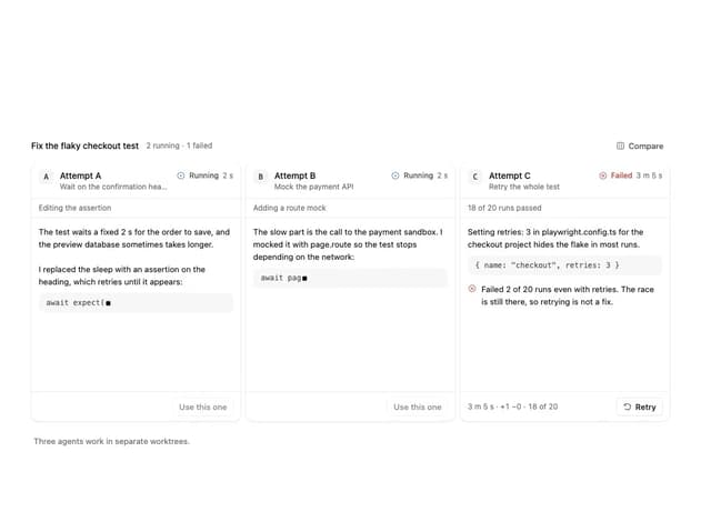
Agent Lanes
6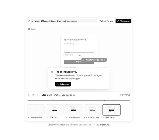
Computer View
3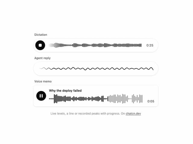
Waveform
2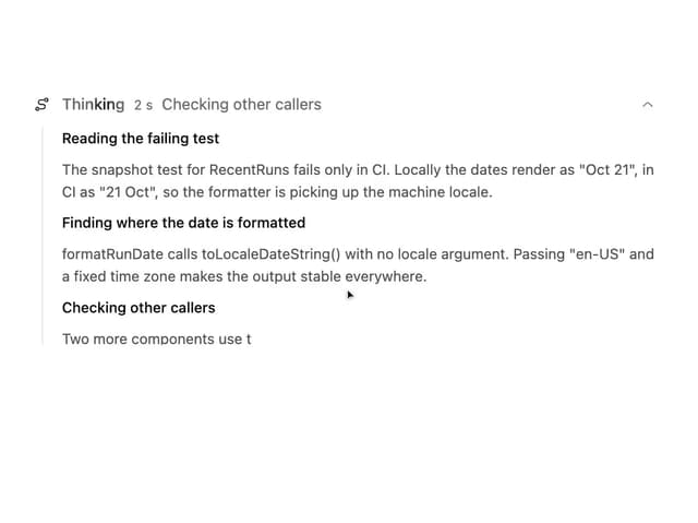
Reasoning
2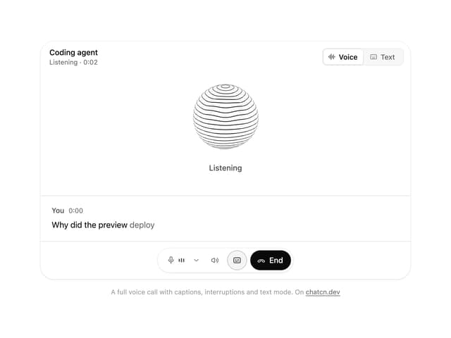
Voice Session
1
More in AI chats
View all

AI Actions
338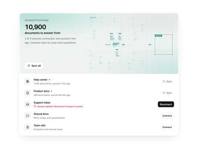

Illos Knowledge Sources
40

Aquarium Prompt
48
Attachments
38
Chat Search
1
Color Picker
171
Commit
32
Chat Bubble
199

