
About
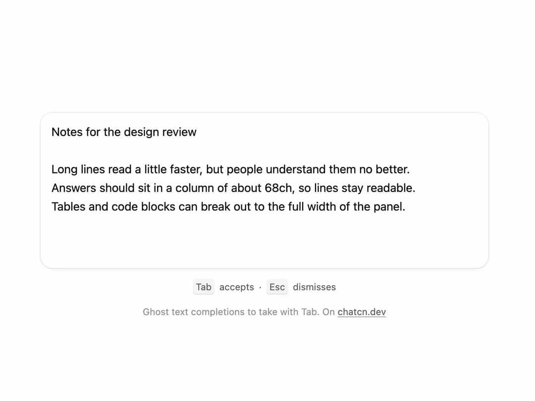
Ghost text completions inside a textarea that you take with Tab and dismiss with Esc.
Built with React and Tailwind. Copy the prompt and paste it into Claude Code, Cursor or Lovable: your agent adds Inline Suggestion to your project and fits it to your theme.
Code
How Inline Suggestion is used: the demo's code. The component's own source comes with a free account.
Usage.tsx
"use client"

import * as React from "react"
import { cn } from "@/lib/utils"
import { InlineSuggestion } from "@/components/ui/inline-suggestion"

const reducedMotion = () => window.matchMedia("(prefers-reduced-motion: reduce)").matches

type Step = { value: string; suggestion: string; ms: number }

const TITLE = "Notes for the design review\n\n"

/** What the writer types, and the rest of the sentence the model offers for each. */
const LINES = [
  {
    typed: "Long lines read",
    rest: " a little faster, but people understand them no better.",
  },
  { typed: "Answers should sit", rest: " in a column of about 68ch, so lines stay readable." },
  { typed: "Tables and code", rest: " blocks can break out to the full width of the panel." },
]

/** The whole tour as frames: type a few words, the ghost appears, Tab takes it, next line. */
function buildTour(): Step[] {
  const steps: Step[] = [{ value: TITLE, suggestion: "", ms: 900 }]
  let doc = TITLE
  LINES.forEach((line, i) => {
    for (let n = 1; n <= line.typed.length; n++) {
      steps.push({ value: doc + line.typed.slice(0, n), suggestion: "", ms: 55 })
    }
    doc += line.typed
    steps.push({ value: doc, suggestion: "", ms: 350 })
    steps.push({ value: doc, suggestion: line.rest, ms: 1500 })
    doc += line.rest
    steps.push({ value: doc, suggestion: "", ms: 700 })
    if (i < LINES.length - 1) doc += "\n"
  })
  steps.push({ value: doc, suggestion: "", ms: 2200 })
  return steps
}

const TOUR = buildTour()

/** Sentences the model can finish once the visitor takes over. */
const COMPLETIONS = LINES.map((l) => l.typed + l.rest)

function complete(text: string) {
  const line = text.slice(text.lastIndexOf("\n") + 1)
  if (line.trim().length < 4) return ""
  const hit = COMPLETIONS.find((c) => c.toLowerCase().startsWith(line.toLowerCase()) && c.length > line.length)
  return hit ? hit.slice(line.length) : ""
}

const LAST = TOUR[TOUR.length - 1]!

const FIT_CSS = "html,body{overflow:hidden}[data-fit-small] [data-fit-hide]{display:none!important}"

/**
 * 21st shows a demo in a small frame: about 674 by 421 on a component page, 358 by 224 on a
 * phone and 245 by 139 on a profile card. A demo taller than its frame gets scrollbars, which
 * render white on dark pages. FitFrame fills the frame exactly instead.
 *
 * - "scale": the content shrinks until it fits, centered. For visuals such as orbs.
 * - "crop": the content stays at full size from the top and fades out at the bottom. For text
 *   that streams in, where a changing scale would make the page breathe.
 *
 * `minWidth` lays out a wide demo (a table, a two column panel) at that width and scales it down
 * to the frame, instead of letting it collapse to a narrow layout. The frame centers it, so it
 * shrinks evenly on both sides.
 *
 * Anything marked `data-fit-hide` (state buttons, the chatcn.dev line) drops out in frames
 * shorter than `hideBelow`, so a profile card shows the visual alone.
 */
function FitFrame({
  children,
  mode = "scale",
  hideBelow = 360,
  minWidth,
}: {
  children: React.ReactNode
  mode?: "scale" | "crop"
  hideBelow?: number
  minWidth?: string
}) {
  const content = React.useRef<HTMLDivElement>(null)
  const [cropped, setCropped] = React.useState(false)

  React.useLayoutEffect(() => {
    const el = content.current
    if (!el) return
    const measure = () => {
      const vw = window.innerWidth
      const vh = window.innerHeight
      el.toggleAttribute("data-fit-small", vh < hideBelow)
      // Layout sizes ignore the transform, so measuring never feeds back.
      const w = Math.max(el.offsetWidth, el.scrollWidth)
      const h = Math.max(el.offsetHeight, el.scrollHeight)
      const scale = mode === "scale" ? Math.min(1, vw / w, vh / h) : 1
      el.style.transform = scale < 1 ? `scale(${scale})` : ""
      setCropped(mode === "crop" && h > vh + 1)
    }
    measure()
    const observer = new ResizeObserver(measure)
    observer.observe(el)
    // Content that changes inside a fixed width box (a headline that cycles words) never resizes
    // the box itself, so changes below it measure again on the next frame.
    let frame = 0
    const mutations = new MutationObserver(() => {
      cancelAnimationFrame(frame)
      frame = requestAnimationFrame(measure)
    })
    mutations.observe(el, { subtree: true, childList: true, characterData: true })
    window.addEventListener("resize", measure)
    return () => {
      observer.disconnect()
      mutations.disconnect()
      cancelAnimationFrame(frame)
      window.removeEventListener("resize", measure)
    }
  }, [mode, hideBelow])

  const fade = "linear-gradient(to bottom, #000 calc(100% - 40px), transparent)"
  return (
    <div
      className="flex w-full justify-center overflow-hidden"
      style={{
        height: "100dvh",
        alignItems: mode === "crop" ? "flex-start" : "center",
        maskImage: cropped ? fade : undefined,
        WebkitMaskImage: cropped ? fade : undefined,
      }}
    >
      <style>{FIT_CSS}</style>
      <div
        ref={content}
        className="w-full shrink-0"
        style={{ transformOrigin: mode === "crop" ? "top center" : "center", minWidth }}
      >
        {children}
      </div>
    </div>
  )
}

function Kbd({ className, ...props }: React.ComponentProps<"kbd">) {
  return (
    <kbd
      data-slot="kbd"
      className={cn(
        "rounded-(--chatcn-radius-xs) bg-(color:--chatcn-fill) text-[0.75rem]/[1rem] text-(color:--chatcn-fg-subtle) inline-flex h-5 min-w-5 items-center justify-center px-1 font-sans tabular-nums shadow-[inset_0_-1px_0_var(--chatcn-alpha-300)]",
        className,
      )}
      {...props}
    />
  )
}

/** The line under each 21st demo that points back to the kit. */
function MoreOn({ slug, children }: { slug: string; children: React.ReactNode }) {
  return (
    <p data-fit-hide className="text-[0.75rem]/[1rem] text-(color:--chatcn-fg-faint) text-center text-balance">
      {children}{" "}
      <a
        href={`https://chatcn.dev/docs/components/${slug}`}
        target="_blank"
        rel="noopener"
        className="text-(color:--chatcn-fg-subtle) hover:text-(color:--chatcn-fg) underline underline-offset-2"
      >
        chatcn.dev
      </a>
    </p>
  )
}

/**
 * Someone writes review notes and the model finishes each sentence as ghost text with a Tab hint;
 * Tab takes it and the next line starts. Loops. Click into the notes to write yourself: Tab
 * accepts, Esc dismisses.
 */
export default function InlineSuggestionPreview() {
  const box = React.useRef<HTMLDivElement>(null)
  const [step, setStep] = React.useState(-1)
  const [own, setOwn] = React.useState<string | null>(null)
  const [ownSuggestion, setOwnSuggestion] = React.useState("")

  // The tour shows the ghost without taking real focus (which would scroll the page that embeds
  // this preview): React's onFocus listens for focusin, so the field believes it is focused.
  React.useEffect(() => {
    const field = box.current?.querySelector("textarea")
    field?.dispatchEvent(new FocusEvent("focusin", { bubbles: true }))
    if (reducedMotion()) return
    setStep(0)
  }, [])

  React.useEffect(() => {
    if (step < 0 || own !== null) return
    const id = window.setTimeout(() => setStep((s) => (s + 1) % TOUR.length), TOUR[step]!.ms)
    return () => window.clearTimeout(id)
  }, [step, own])

  // Once the visitor types, ask for a completion after a short pause, like a real app would.
  React.useEffect(() => {
    if (own === null) return
    const id = window.setTimeout(() => setOwnSuggestion(complete(own)), 250)
    return () => window.clearTimeout(id)
  }, [own])

  const frame = step < 0 ? { ...LAST, suggestion: "" } : TOUR[step]!
  const value = own ?? frame.value
  const suggestion = own !== null ? ownSuggestion : frame.suggestion

  return (
    <FitFrame minWidth="36rem">
      <div className="flex w-full flex-col items-center justify-center gap-3 p-6">
        <div
          ref={box}
          className="bg-(color:--chatcn-card) rounded-(--chatcn-radius-xl) shadow-(--chatcn-shadow-sm) h-[12.5rem] w-full max-w-xl overflow-hidden"
          onPointerDown={() => {
            if (own === null) {
              setOwn(value)
              setOwnSuggestion("")
            }
          }}
        >
          <InlineSuggestion
            value={value}
            onValueChange={setOwn}
            suggestion={suggestion}
            aria-label="Notes"
            placeholder="Write a note…"
          />
        </div>
        <p
          data-fit-hide
          className="text-[0.75rem]/[1rem] text-(color:--chatcn-fg-subtle) flex items-center gap-1.5 leading-6"
        >
          <Kbd>Tab</Kbd> accepts <span aria-hidden="true">·</span> <Kbd>Esc</Kbd> dismisses
        </p>
        <MoreOn slug="inline-suggestion">Ghost text completions to take with Tab. On</MoreOn>
      </div>
    </FitFrame>
  )
}
More by Aadi
View all
Audio Visualizer
29
Stat Card
24
Dither Orb
23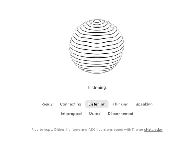
Voice Orb
17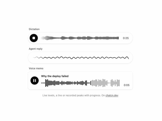
Waveform
13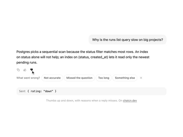
Message Feedback
12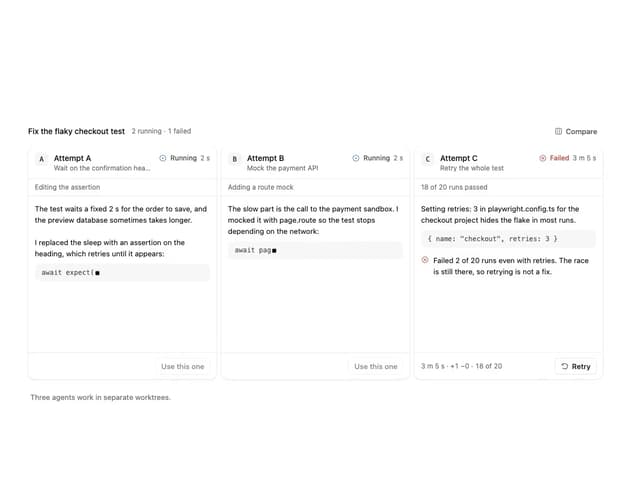
Agent Lanes
11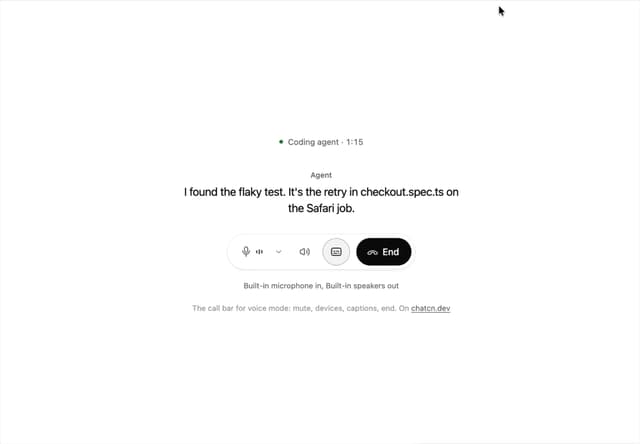
Voice Controls
10
More in AI chats
View all

AI Actions
349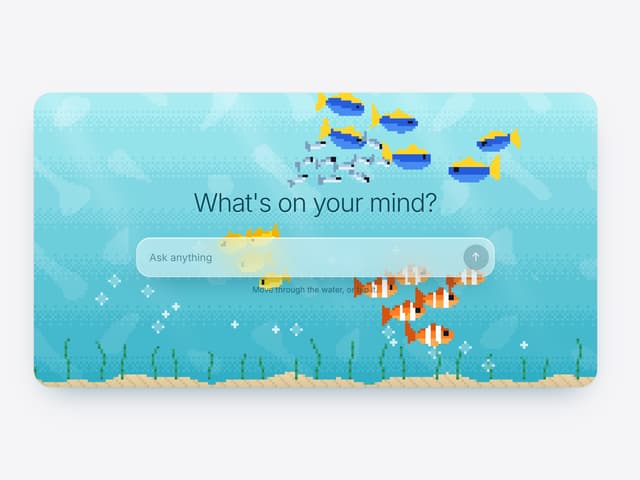

Aquarium Prompt
95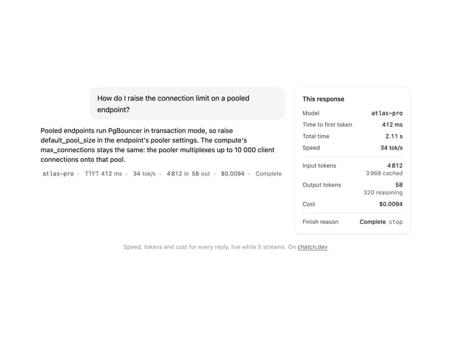
Generation Stats

Chat Bubble
202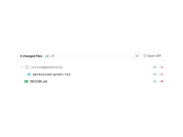
Commit
36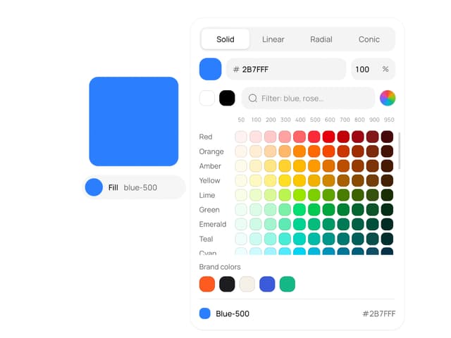
Color Picker
190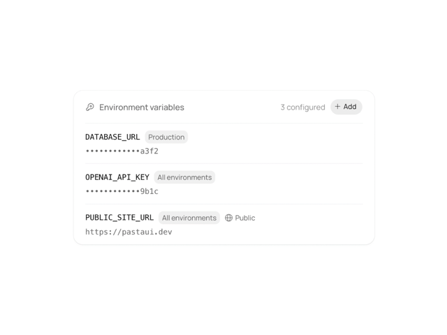
Environment Variables
27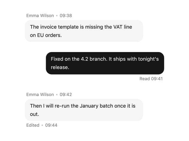

Message With Header And Delivery Status
57

