
About
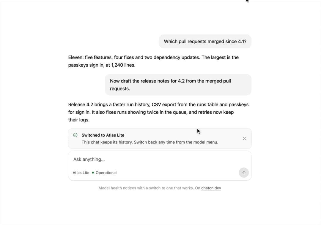
A model health notice for chat: degraded, outage or maintenance, since when, a link to the status page and a switch to a model that works.
Built with React and Tailwind. Copy the prompt and paste it into Claude Code, Cursor or Lovable: your agent adds Model Status to your project and fits it to your theme.
Code
How Model Status is used: the demo's code. The component's own source comes with a free account.
Usage.tsx
"use client"
import * as React from "react"
import { cn } from "@/lib/utils"
import { Icon, IconNode, ModelStatus, ModelStatusDot, createIcon } from "@/components/ui/model-status"
interface GhostState {
x: number
y: number
shown: boolean
down: boolean
}
/**
* A pointer that walks a demo through its clicks, so a preview shows what each control does.
* `stage` is the positioned box the pointer moves in; targets are found inside it. Sizes come
* from layout boxes, so a scaled FitFrame never throws the aim off.
*/
function useGhost(stage: React.RefObject<HTMLElement | null>) {
const [ghost, setGhost] = React.useState<GhostState>({ x: 0, y: 0, shown: false, down: false })
const find = React.useCallback(
(target: string | HTMLElement) =>
typeof target === "string"
? stage.current?.querySelector<HTMLElement>(target) ?? null
: target,
[stage],
)
const moveTo = React.useCallback(
(target: string | HTMLElement, dx = 0.5, dy = 0.6) => {
const root = stage.current
const el = find(target)
if (!root || !el) return null
const rr = root.getBoundingClientRect()
const scale = root.offsetWidth ? rr.width / root.offsetWidth : 1
const er = el.getBoundingClientRect()
const x = (er.left - rr.left + er.width * dx) / scale
const y = (er.top - rr.top + er.height * dy) / scale
// A hidden pointer fades in a short way off its first target instead of flying in from
// wherever it was last.
setGhost((g) => (g.shown ? { x, y, shown: true, down: false } : { x: x + 70, y: y + 46, shown: false, down: false }))
window.requestAnimationFrame(() =>
window.requestAnimationFrame(() => setGhost({ x, y, shown: true, down: false })),
)
return el
},
[stage, find],
)
const press = React.useCallback((down: boolean) => setGhost((g) => ({ ...g, down })), [])
const hide = React.useCallback(() => setGhost((g) => ({ ...g, shown: false, down: false })), [])
return { ghost, moveTo, press, hide, find }
}
type Phase = "idle" | "degraded" | "switched" | "resolved" | "gone"
const PRIMARY = "Atlas Pro"
const ASK = "Now draft the release notes for 4.2 from the merged pull requests."
const REPLY =
"Release 4.2 brings a faster run history, CSV export from the runs table and passkeys for sign in. It also fixes runs showing twice in the queue, and retries now keep their logs."
const WORD_MS = 50
const FALLBACK = "Atlas Lite"
const reducedMotion = () =>
typeof window !== "undefined" && window.matchMedia("(prefers-reduced-motion: reduce)").matches
const STOP = Symbol("stop")
/**
* Runs `script` in a loop with a `wait(ms)` that stops cleanly on unmount or once `active` turns
* false. Reduced motion never starts it.
*/
function useLoop(
script: (wait: (ms: number) => Promise<void>) => Promise<void>,
active = true,
) {
const ref = React.useRef(script)
ref.current = script
React.useEffect(() => {
if (!active || reducedMotion()) return
let alive = true
const timers = new Set<number>()
const wait = (ms: number) =>
new Promise<void>((resolve, reject) => {
const id = window.setTimeout(() => {
timers.delete(id)
if (alive) resolve()
else reject(STOP)
}, ms)
timers.add(id)
})
;(async () => {
try {
while (alive) await ref.current(wait)
} catch (error) {
if (error !== STOP) throw error
}
})()
return () => {
alive = false
for (const id of timers) window.clearTimeout(id)
}
}, [active])
}
/** Moves to a target, presses and clicks it. Returns the element, or null if it is gone. */
async function tap(
g: ReturnType<typeof useGhost>,
target: string | HTMLElement,
wait: (ms: number) => Promise<void>,
travel = 700,
) {
if (!g.moveTo(target)) return null
await wait(travel)
g.press(true)
await wait(130)
const el = g.find(target)
el?.click()
g.press(false)
return el
}
const FIT_CSS = "html,body{overflow:hidden}[data-fit-small] [data-fit-hide]{display:none!important}"
/**
* 21st shows a demo in a small frame: about 674 by 421 on a component page, 358 by 224 on a
* phone and 245 by 139 on a profile card. A demo taller than its frame gets scrollbars, which
* render white on dark pages. FitFrame fills the frame exactly instead.
*
* - "scale": the content shrinks until it fits, centered. For visuals such as orbs.
* - "crop": the content stays at full size from the top and fades out at the bottom. For text
* that streams in, where a changing scale would make the page breathe.
*
* `minWidth` lays out a wide demo (a table, a two column panel) at that width and scales it down
* to the frame, instead of letting it collapse to a narrow layout. The frame centers it, so it
* shrinks evenly on both sides.
*
* Anything marked `data-fit-hide` (state buttons, the chatcn.dev line) drops out in frames
* shorter than `hideBelow`, so a profile card shows the visual alone.
*/
function FitFrame({
children,
mode = "scale",
hideBelow = 360,
minWidth,
}: {
children: React.ReactNode
mode?: "scale" | "crop"
hideBelow?: number
minWidth?: string
}) {
const content = React.useRef<HTMLDivElement>(null)
const [cropped, setCropped] = React.useState(false)
React.useLayoutEffect(() => {
const el = content.current
if (!el) return
const measure = () => {
const vw = window.innerWidth
const vh = window.innerHeight
el.toggleAttribute("data-fit-small", vh < hideBelow)
// Layout sizes ignore the transform, so measuring never feeds back.
const w = Math.max(el.offsetWidth, el.scrollWidth)
const h = Math.max(el.offsetHeight, el.scrollHeight)
const scale = mode === "scale" ? Math.min(1, vw / w, vh / h) : 1
el.style.transform = scale < 1 ? `scale(${scale})` : ""
setCropped(mode === "crop" && h > vh + 1)
}
measure()
const observer = new ResizeObserver(measure)
observer.observe(el)
// Content that changes inside a fixed width box (a headline that cycles words) never resizes
// the box itself, so changes below it measure again on the next frame.
let frame = 0
const mutations = new MutationObserver(() => {
cancelAnimationFrame(frame)
frame = requestAnimationFrame(measure)
})
mutations.observe(el, { subtree: true, childList: true, characterData: true })
window.addEventListener("resize", measure)
return () => {
observer.disconnect()
mutations.disconnect()
cancelAnimationFrame(frame)
window.removeEventListener("resize", measure)
}
}, [mode, hideBelow])
const fade = "linear-gradient(to bottom, #000 calc(100% - 40px), transparent)"
return (
<div
className="flex w-full justify-center overflow-hidden"
style={{
height: "100dvh",
alignItems: mode === "crop" ? "flex-start" : "center",
maskImage: cropped ? fade : undefined,
WebkitMaskImage: cropped ? fade : undefined,
}}
>
<style>{FIT_CSS}</style>
<div
ref={content}
className="w-full shrink-0"
style={{ transformOrigin: mode === "crop" ? "top center" : "center", minWidth }}
>
{children}
</div>
</div>
)
}
/* -------------------------------------------------------------------------------------------------
* Types and context
* -----------------------------------------------------------------------------------------------*/
type MessageRole = "user" | "assistant" | "system"
type MessageLayout = "auto" | "bubble" | "flat" | "compact"
type MessageState = "streaming" | "done" | "edited" | "error" | "stopped" | "queued"
/* -------------------------------------------------------------------------------------------------
* Message
* -----------------------------------------------------------------------------------------------*/
interface MessageProps extends React.ComponentProps<"div"> {
/** Who wrote it. Named `from` so the ARIA `role` attribute stays free. */
from: MessageRole
/**
* `auto` gives users a subtle bubble and assistants a flat, document-style block. `compact`
* is the dense log style for agent traces and side panels. Defaults to `auto`.
*/
layout?: MessageLayout
/** Lifecycle state. Defaults to `done`. */
state?: MessageState
/** Follows a message from the same author: tightens the gap and hides the avatar. */
grouped?: boolean
/** The newest message. Keeps its actions visible instead of revealing them on hover. */
latest?: boolean
/**
* Enter animation. Defaults to animating only messages that arrive after the conversation
* mounted, so restored history appears at once.
*/
animate?: boolean
/** Announce the text to screen readers when streaming finishes. Defaults to true. */
announce?: boolean
}
/** Scroll behavior for imperative calls. `smooth` falls back to instant under reduced motion. */
type ChatcnScrollBehavior = "smooth" | "instant"
/* -------------------------------------------------------------------------------------------------
* Context
* -----------------------------------------------------------------------------------------------*/
interface ConversationContextValue {
scrollRef: (element: HTMLElement | null) => void
contentRef: (element: HTMLElement | null) => void
spacerRef: (element: HTMLElement | null) => void
/** Within the threshold of the bottom. */
isAtBottom: boolean
/** Following new content. */
isSticky: boolean
/** More than one viewport from the bottom. */
isFar: boolean
/** Messages that arrived below while the reader was scrolled up. */
unread: number
scrollToBottom: (options?: { behavior?: ChatcnScrollBehavior }) => void
scrollToTurn: (element: HTMLElement, options?: { behavior?: ChatcnScrollBehavior }) => void
/** Read text to screen readers through the conversation's polite live region. */
announce: (text: string) => void
/** False during the first render, so restored history does not animate in. */
ready: boolean
}
const ConversationContext = React.createContext<ConversationContextValue | null>(null)
/** Scroll state and controls of the nearest `Conversation`. Returns null outside one. */
function useConversation() {
return React.useContext(ConversationContext)
}
interface MessageContextValue {
from: MessageRole
/** Resolved layout: `auto` becomes `bubble` for users and `flat` for everyone else. */
layout: Exclude<MessageLayout, "auto">
state: MessageState
/** The newest message: its actions stay visible. */
latest: boolean
}
const MessageContext = React.createContext<MessageContextValue | null>(null)
/**
* One turn in the conversation. Compose `MessageAvatar`, `MessageContent`, `MessageMeta`,
* `MessageStatus` and `MessageActions` inside it.
*/
function Message({
from,
layout: layoutProp = "auto",
state = "done",
grouped = false,
latest = false,
animate,
announce = true,
className,
children,
...props
}: MessageProps) {
const conversation = useConversation()
const layout: MessageContextValue["layout"] =
layoutProp === "auto" ? (from === "user" ? "bubble" : "flat") : layoutProp
const [enter] = React.useState(() => animate ?? conversation?.ready ?? false)
const ref = React.useRef<HTMLDivElement>(null)
// Screen readers hear the finished reply once, never token by token.
const previous = React.useRef(state)
React.useEffect(() => {
const was = previous.current
previous.current = state
if (!announce || was !== "streaming" || state === "streaming") return
const text = ref.current?.querySelector('[data-slot="message-content"]')?.textContent?.trim()
if (text) conversation?.announce(text)
}, [state, announce, conversation])
const value = React.useMemo(
() => ({ from, layout, state, latest }),
[from, layout, state, latest],
)
return (
<MessageContext.Provider value={value}>
<div
ref={ref}
data-slot="message"
data-role={from}
data-layout={layout}
data-message-state={state}
data-grouped={grouped ? "" : undefined}
data-latest={latest ? "" : undefined}
aria-busy={state === "streaming" || undefined}
className={cn(
"group/message relative flex min-w-0 flex-col",
layout === "compact" ? "gap-1" : "gap-2",
layout === "bubble" ? "items-end" : "items-start",
from === "system" && layout !== "compact" && "items-center text-center",
grouped && (layout === "compact" ? "-mt-2" : "-mt-4"),
// An avatar sits in the start gutter (the end gutter for bubbles).
layout === "bubble"
? "has-[>[data-slot=message-avatar]]:pe-9"
: "has-[>[data-slot=message-avatar]]:ps-9",
enter &&
(from === "user"
? "ease-(--chatcn-ease-out-soft) transition-[opacity,translate] duration-200 starting:translate-y-2 starting:opacity-0 motion-reduce:starting:translate-y-0"
: "ease-(--chatcn-ease-out-soft) transition-opacity duration-150 starting:opacity-0"),
className,
)}
{...props}
>
{children}
</div>
</MessageContext.Provider>
)
}
/** Role, layout and state of the nearest `Message`. Returns null outside one. */
function useMessage() {
return React.useContext(MessageContext)
}
/* -------------------------------------------------------------------------------------------------
* MessageContent
* -----------------------------------------------------------------------------------------------*/
/**
* The text of a message, capped at a 68ch measure. Plain text keeps its line breaks. Markdown
* renderers drop in as children and inherit the 15/24 prose size.
*/
function MessageContent({ className, children, ...props }: React.ComponentProps<"div">) {
const ctx = useMessage()
const layout = ctx?.layout ?? "flat"
const from = ctx?.from ?? "assistant"
const state = ctx?.state ?? "done"
const plain = typeof children === "string"
return (
<div
data-slot="message-content"
className={cn(
"text-(color:--chatcn-fg) min-w-0 [overflow-wrap:anywhere]",
// Bubbles fill their lines: pretty wrapping would leave a wide, half-empty bubble.
layout !== "bubble" && "text-pretty",
plain && "whitespace-pre-wrap",
layout === "bubble" &&
"text-[0.9375rem]/[1.5rem] tracking-[-0.006em] rounded-(--chatcn-radius-xl) bg-(color:--chatcn-fill) max-w-[80%] px-4 py-2.5 text-start",
layout === "flat" && "text-[0.9375rem]/[1.5rem] tracking-[-0.006em] w-full max-w-[68ch]",
layout === "compact" &&
(from === "user"
? "text-[0.875rem]/[1.25rem] tracking-[-0.003em] rounded-(--chatcn-radius-md) bg-(color:--chatcn-fill) max-w-full px-3 py-1.5"
: "text-[0.875rem]/[1.25rem] tracking-[-0.003em] w-full max-w-[68ch]"),
from === "system" && "text-[0.8125rem]/[1.25rem] text-(color:--chatcn-fg-muted) max-w-[60ch]",
// Queued turns are not sent yet: an outline instead of a fill says "pending".
state === "queued" &&
from === "user" &&
"text-(color:--chatcn-fg-muted) border-(color:--chatcn-border-strong) border border-dashed bg-transparent",
state === "error" && from === "user" && "text-(color:--chatcn-fg-muted)",
className,
)}
{...props}
>
{children}
</div>
)
}
/** What the banner says in each phase. Every one is laid out in the same cell to hold the height. */
function Banner({
phase,
onSwitch,
onDismiss,
}: {
phase: Exclude<Phase, "idle" | "gone">
onSwitch?: () => void
onDismiss?: () => void
}) {
if (phase === "degraded")
return (
<ModelStatus
status="degraded"
model={PRIMARY}
time="Since 14:05"
message="Replies may take longer or stop partway. Your messages are safe."
fallbackModel={FALLBACK}
onSwitchModel={onSwitch}
/>
)
if (phase === "switched")
return (
<ModelStatus
status="operational"
model={FALLBACK}
title={`Switched to ${FALLBACK}`}
message="This chat keeps its history. Switch back any time from the model menu."
onDismiss={onDismiss}
/>
)
return (
<ModelStatus
status="operational"
model={PRIMARY}
time="14:32"
message={`Your next message goes to ${PRIMARY} again.`}
onDismiss={onDismiss}
/>
)
}
/* -------------------------------------------------------------------------------------------------
* Types and context
* -----------------------------------------------------------------------------------------------*/
type PromptInputStatus = "idle" | "submitting" | "streaming"
type PromptInputVariant = "default" | "floating" | "minimal" | "hero"
type FileSource = "paste" | "drop" | "picker"
interface FileRejection {
file: File
reason: "type" | "size" | "count"
}
type SubmitOn = "enter" | "mod-enter" | "auto"
/* -------------------------------------------------------------------------------------------------
* PromptInput
* -----------------------------------------------------------------------------------------------*/
interface PromptInputProps
extends Omit<React.ComponentProps<"form">, "onSubmit" | "onChange" | "defaultValue"> {
value?: string
defaultValue?: string
onValueChange?: (value: string) => void
/** Enter, Cmd/Ctrl+Enter or the send button. Not called while empty, disabled or busy. */
onSubmit?: (message: { text: string }) => void
/** `streaming` turns Send into Stop and makes Escape call `onStop`. */
status?: PromptInputStatus
onStop?: () => void
disabled?: boolean
/**
* - `default`: card with a toolbar row under the text.
* - `floating`: translucent with a background blur, for composers over content.
* - `minimal`: one row, text and actions inline.
* - `hero`: larger type and padding for empty states.
*/
variant?: PromptInputVariant
/** Files from paste, drop or the attach button, already filtered by `accept` and limits. */
onFiles?: (files: File[], source: FileSource) => void
/** Files refused by `accept`, `maxFileSize` or `maxFiles`, with the reason. */
onFilesRejected?: (rejections: FileRejection[]) => void
/** Same syntax as `<input accept>`. */
accept?: string
maxFileSize?: number
maxFiles?: number
/** Pasted text this long or longer becomes a `Pasted text.txt` file. Off by default. */
pasteTextAsFileAt?: number
/** Allow sending with empty text, for example when files are attached. */
hasContent?: boolean
submitOn?: SubmitOn
/** Clear the text after sending in uncontrolled mode. Default true. */
clearOnSubmit?: boolean
/** Drop overlay copy. */
dropLabel?: React.ReactNode
dropHint?: React.ReactNode
}
interface UseChatcnFileDropOptions {
/** Same syntax as `<input accept>`: `image/*,.pdf,application/json`. Empty accepts anything. */
accept?: string
/** Largest file in bytes. */
maxSize?: number
/** Most files in one drop. */
maxFiles?: number
disabled?: boolean
onFiles?: (files: File[]) => void
onReject?: (rejections: FileRejection[]) => void
/**
* `element` (default): spread `rootProps` on the drop target.
* `window`: listen on the whole page, for a full-page overlay.
*/
target?: "element" | "window"
}
/** Extensions mapped to MIME types, so `.pdf` can be judged while dragging, before names exist. */
const EXT_MIME: Record<string, string> = {
".pdf": "application/pdf",
".png": "image/png",
".jpg": "image/jpeg",
".jpeg": "image/jpeg",
".gif": "image/gif",
".webp": "image/webp",
".svg": "image/svg+xml",
".csv": "text/csv",
".txt": "text/plain",
".md": "text/markdown",
".json": "application/json",
".zip": "application/zip",
}
/**
* Whether a file (or a dragged item, which has a type but no name yet) matches an accept string.
* Unknown types pass while dragging and are judged again by name on drop.
*/
function matchesAccept(file: { type: string; name?: string }, accept?: string) {
if (!accept) return true
const rules = accept
.split(",")
.map((r) => r.trim().toLowerCase())
.filter(Boolean)
if (rules.length === 0) return true
const type = file.type.toLowerCase()
const name = file.name?.toLowerCase()
if (!type && !name) return true
return rules.some((rule) => {
if (rule.startsWith(".")) {
if (name) return name.endsWith(rule)
return EXT_MIME[rule] === type
}
if (rule.endsWith("/*")) return type.startsWith(rule.slice(0, -1))
return type === rule
})
}
/** Splits dropped or pasted files into accepted and rejected, with a reason for each rejection. */
function sortFiles(
files: File[],
{ accept, maxSize, maxFiles }: Pick<UseChatcnFileDropOptions, "accept" | "maxSize" | "maxFiles">,
) {
const accepted: File[] = []
const rejected: FileRejection[] = []
for (const file of files) {
if (!matchesAccept(file, accept)) rejected.push({ file, reason: "type" })
else if (maxSize !== undefined && file.size > maxSize) rejected.push({ file, reason: "size" })
else if (maxFiles !== undefined && accepted.length >= maxFiles)
rejected.push({ file, reason: "count" })
else accepted.push(file)
}
return { accepted, rejected }
}
type DropState = "idle" | "accept" | "reject"
function hasFiles(event: DragEvent | React.DragEvent) {
return Array.from(event.dataTransfer?.types ?? []).includes("Files")
}
/** Judges the drag from what the browser exposes before the drop: item kinds and MIME types. */
function judgeDrag(event: DragEvent | React.DragEvent, accept?: string, maxFiles?: number) {
const items = Array.from(event.dataTransfer?.items ?? []).filter((i) => i.kind === "file")
if (maxFiles !== undefined && items.length > maxFiles) return "reject" as const
return items.every((i) => matchesAccept({ type: i.type }, accept)) ? "accept" : "reject"
}
/**
* Drag and drop for files. Tracks whether files are over the target and whether they would be
* accepted, so the overlay can say so before the drop. Text drags pass through untouched, so
* dragging a snippet into a textarea still works.
*/
function useChatcnFileDrop(options: UseChatcnFileDropOptions = {}) {
const optionsRef = React.useRef(options)
optionsRef.current = options
const [state, setState] = React.useState<DropState>("idle")
const depth = React.useRef(0)
const handlers = React.useMemo(() => {
const enter = (event: DragEvent | React.DragEvent) => {
const { disabled, accept, maxFiles } = optionsRef.current
if (disabled || !hasFiles(event)) return
event.preventDefault()
depth.current += 1
setState(judgeDrag(event, accept, maxFiles))
}
const over = (event: DragEvent | React.DragEvent) => {
if (optionsRef.current.disabled || !hasFiles(event)) return
event.preventDefault()
if (event.dataTransfer) event.dataTransfer.dropEffect = "copy"
}
const leave = (event: DragEvent | React.DragEvent) => {
if (optionsRef.current.disabled || !hasFiles(event)) return
depth.current = Math.max(0, depth.current - 1)
if (depth.current === 0) setState("idle")
}
const drop = (event: DragEvent | React.DragEvent) => {
const { disabled, onFiles, onReject } = optionsRef.current
if (disabled || !hasFiles(event)) return
event.preventDefault()
depth.current = 0
setState("idle")
const files = Array.from(event.dataTransfer?.files ?? [])
const { accepted, rejected } = sortFiles(files, optionsRef.current)
if (accepted.length) onFiles?.(accepted)
if (rejected.length) onReject?.(rejected)
}
return { enter, over, leave, drop }
}, [])
const target = options.target ?? "element"
React.useEffect(() => {
if (target !== "window") return
const { enter, over, leave, drop } = handlers
window.addEventListener("dragenter", enter)
window.addEventListener("dragover", over)
window.addEventListener("dragleave", leave)
window.addEventListener("drop", drop)
return () => {
window.removeEventListener("dragenter", enter)
window.removeEventListener("dragover", over)
window.removeEventListener("dragleave", leave)
window.removeEventListener("drop", drop)
}
}, [target, handlers])
React.useEffect(() => {
if (options.disabled) {
depth.current = 0
setState("idle")
}
}, [options.disabled])
const rootProps = React.useMemo(
() => ({
onDragEnter: handlers.enter as (event: React.DragEvent) => void,
onDragOver: handlers.over as (event: React.DragEvent) => void,
onDragLeave: handlers.leave as (event: React.DragEvent) => void,
onDrop: handlers.drop as (event: React.DragEvent) => void,
}),
[handlers],
)
return { state, rootProps }
}
interface PromptInputContextValue {
value: string
setValue: (value: string) => void
submit: () => void
stop: () => void
status: PromptInputStatus
disabled: boolean
/** Nothing to send: no text and no `hasContent`. */
empty: boolean
variant: PromptInputVariant
submitOn: SubmitOn
textareaRef: React.RefObject<HTMLTextAreaElement | null>
openFilePicker: () => void
/** False when no `onFiles` handler is set. */
acceptsFiles: boolean
handlePaste: (event: React.ClipboardEvent<HTMLTextAreaElement>) => void
}
const PromptInputContext = React.createContext<PromptInputContextValue | null>(null)
const surface: Record<PromptInputVariant, string> = {
default: "rounded-(--chatcn-radius-xl) bg-(color:--chatcn-card) shadow-(--chatcn-shadow-sm)",
// Floating chrome is the one place translucency is allowed. Solid where blur is unsupported.
floating: cn(
"rounded-(--chatcn-radius-xl) shadow-(--chatcn-shadow-lg) bg-(color:--chatcn-card)",
"supports-[backdrop-filter:blur(0)]:bg-[color-mix(in_oklch,var(--chatcn-card)_80%,transparent)] supports-[backdrop-filter:blur(0)]:backdrop-blur-lg",
),
minimal: "rounded-(--chatcn-radius-2xl) bg-(color:--chatcn-card) shadow-(--chatcn-shadow-sm) flex-row items-end gap-1 p-1.5",
hero: "rounded-(--chatcn-radius-2xl) bg-(color:--chatcn-card) shadow-(--chatcn-shadow-sm)",
}
/** The input-focus ring from the spec: 1 px ink edge plus a 3 px soft halo. Never animated. */
const focusRing =
"focus-within:shadow-[0_0_0_1px_var(--chatcn-gray-900),0_0_0_4px_var(--chatcn-alpha-300)]"
/* -------------------------------------------------------------------------------------------------
* Overlay
* -----------------------------------------------------------------------------------------------*/
interface DropZoneOverlayProps extends React.ComponentProps<"div"> {
state: DropState
/** Accept title. Default "Drop files to attach". */
label?: React.ReactNode
/** Second line under the title, for example the accepted types and size limit. */
hint?: React.ReactNode
/** Reject title. Default says which types are accepted, built from `accept`. */
rejectLabel?: React.ReactNode
accept?: string
/** Files in the drag, so the default copy can count them: "Drop 3 files to attach". */
count?: number
/** The most files one drop takes. With `count` above it, the reject copy says so. */
maxFiles?: number
/** `contained` fills its positioned parent; `page` covers the viewport. */
variant?: "contained" | "page"
}
/* -------------------------------------------------------------------------------------------------
* Helpers
* -----------------------------------------------------------------------------------------------*/
const KINDS: [RegExp, string][] = [
[/^image\/\*$/, "images"],
[/^(\.pdf|application\/pdf)$/, "PDFs"],
[/^video\/\*$/, "videos"],
[/^audio\/\*$/, "audio"],
[/^text\/\*$/, "text files"],
[/^(\.csv|text\/csv)$/, "CSV files"],
[/^(\.md|text\/markdown)$/, "Markdown files"],
[/^(\.txt|text\/plain)$/, "text files"],
[/^(\.json|application\/json)$/, "JSON files"],
]
function joinWords(words: string[]) {
if (words.length <= 1) return words[0] ?? ""
return `${words.slice(0, -1).join(", ")} and ${words[words.length - 1]}`
}
/** Readable list from an accept string: `image/*,.pdf` becomes "images and PDFs". */
function describeAccept(accept?: string) {
if (!accept) return ""
const words: string[] = []
for (const raw of accept.split(",")) {
const rule = raw.trim().toLowerCase()
if (!rule) continue
const kind =
KINDS.find(([re]) => re.test(rule))?.[1] ??
(rule.startsWith(".") ? `${rule.slice(1).toUpperCase()} files` : rule)
if (!words.includes(kind)) words.push(kind)
}
return joinWords(words)
}
function capitalize(text: string) {
return text.charAt(0).toUpperCase() + text.slice(1)
}
const iconNode: IconNode = [
["path", {"d":"M3 12a9 9 0 1 0 18 0 9 9 0 1 0-18 0"}],
["path", {"d":"m7.76 7.76 8.48 8.48"}],
]
const BanIcon: Icon = /* @__PURE__ */ createIcon("ban", iconNode)
const iconNode2: IconNode = [
["path", {"d":"M3.5 15v2.5a3 3 0 0 0 3 3h11a3 3 0 0 0 3-3V15"}],
["path", {"d":"m16.5 8-3.09-3.09a2 2 0 0 0-2.82 0L7.5 8"}],
["path", {"d":"M12 15.5V8"}],
]
const UploadIcon: Icon = /* @__PURE__ */ createIcon("upload", iconNode2)
/**
* What the user sees while dragging files. Fades in over 150 ms with the content settling from
* scale 0.98; says before the drop what will happen, counted ("Drop 3 files to attach"), or that
* the files will be refused, and why: the wrong type, or more than one drop takes.
*/
function DropZoneOverlay({
state,
label,
hint,
rejectLabel,
accept,
count,
maxFiles,
variant = "contained",
className,
...props
}: DropZoneOverlayProps) {
const visible = state !== "idle"
const reject = state === "reject"
const types = describeAccept(accept)
const page = variant === "page"
const tooMany = count !== undefined && maxFiles !== undefined && count > maxFiles
const what = !count ? "files" : count === 1 ? "the file" : `${count.toLocaleString()} files`
const title = reject
? (rejectLabel ??
(tooMany
? `Attach up to ${maxFiles} ${maxFiles === 1 ? "file" : "files"} at a time`
: types
? `Only ${types} can be attached`
: "These files can’t be attached"))
: (label ?? `Drop ${what} ${page ? "anywhere " : ""}to attach`)
const sub = reject
? tooMany && !rejectLabel
? `You’re dragging ${count?.toLocaleString()}.`
: null
: (hint ?? (types ? capitalize(types) : null))
return (
<div
aria-hidden="true"
data-slot="drop-zone-overlay"
data-drop-state={state}
data-variant={variant}
className={cn(
"pointer-events-none grid place-items-center",
page ? "fixed inset-0 z-50 p-3" : "absolute inset-0 z-10 rounded-[inherit] p-2",
page
? "bg-[color-mix(in_oklch,var(--chatcn-bg)_88%,transparent)]"
: "bg-[color-mix(in_oklch,var(--chatcn-card)_94%,transparent)]",
"ease-(--chatcn-ease-out) transition-[opacity,visibility] duration-150 motion-reduce:duration-100",
visible ? "visible opacity-100" : "invisible opacity-0",
className,
)}
{...props}
>
<div
className={cn(
"border-(color:--chatcn-border-strong) grid size-full place-items-center border border-dashed",
// Concentric: 12 px inset plus 12 px radius fits a 24 px window corner; 8 plus 8 fits 16.
page ? "rounded-(--chatcn-radius-lg) border-2" : "rounded-(--chatcn-radius-md)",
reject && "border-solid",
)}
>
<div
className={cn(
"flex flex-col items-center gap-1.5 px-4 text-center",
"ease-(--chatcn-ease-out) transition-[scale] duration-150 motion-reduce:scale-none!",
visible ? "scale-100" : "scale-98",
)}
>
<span
key={reject ? "reject" : "accept"}
className={cn(
"grid place-items-center motion-safe:animate-[chatcn-swap_150ms_var(--chatcn-ease-out)]",
page ? "mb-1 [&_svg]:size-6" : "[&_svg]:size-5",
reject ? "text-(color:--chatcn-red)" : "text-(color:--chatcn-fg)",
)}
>
{reject ? <BanIcon /> : <UploadIcon />}
</span>
<p
className={cn(
"text-(color:--chatcn-fg) font-medium text-balance!",
page ? "text-[1.25rem]/[1.75rem] tracking-[-0.018em]" : "text-[0.875rem]/[1.25rem] tracking-[-0.003em]",
)}
>
{title}
</p>
{sub ? (
<p
className={cn(
"text-(color:--chatcn-fg-subtle) tabular-nums",
page ? "text-[0.875rem]/[1.25rem] tracking-[-0.003em]" : "text-[0.8125rem]/[1.25rem]",
)}
>
{sub}
</p>
) : null}
</div>
</div>
</div>
)
}
/**
* The composer. A form with a growing textarea, slots for attachments and tools, and the send
* button. Enter sends, Shift+Enter adds a line, Cmd/Ctrl+Enter also sends, IME composition never
* sends, Escape stops a streaming response. Images pasted or dropped become files, never a lost
* paste.
*/
function PromptInput({
value: valueProp,
defaultValue = "",
onValueChange,
onSubmit,
status = "idle",
onStop,
disabled = false,
variant = "default",
onFiles,
onFilesRejected,
accept,
maxFileSize,
maxFiles,
pasteTextAsFileAt,
hasContent = false,
submitOn = "auto",
clearOnSubmit = true,
dropLabel,
dropHint,
className,
children,
onKeyDown,
onPointerDown,
...props
}: PromptInputProps) {
const [valueState, setValueState] = React.useState(defaultValue)
const controlled = valueProp !== undefined
const value = controlled ? valueProp : valueState
const textareaRef = React.useRef<HTMLTextAreaElement>(null)
const fileInputRef = React.useRef<HTMLInputElement>(null)
const setValue = React.useCallback(
(next: string) => {
if (!controlled) setValueState(next)
onValueChange?.(next)
},
[controlled, onValueChange],
)
const empty = value.trim().length === 0 && !hasContent
const submit = () => {
if (disabled || status !== "idle" || empty) return
onSubmit?.({ text: value })
if (!controlled && clearOnSubmit) setValueState("")
}
const stop = () => {
if (status === "streaming") onStop?.()
}
const limits = { accept, maxSize: maxFileSize, maxFiles }
const deliver = (files: File[], source: FileSource) => {
const { accepted, rejected } = sortFiles(files, limits)
if (accepted.length) onFiles?.(accepted, source)
if (rejected.length) onFilesRejected?.(rejected)
}
const drop = useChatcnFileDrop({
...limits,
disabled: disabled || !onFiles,
onFiles: (files) => onFiles?.(files, "drop"),
onReject: onFilesRejected,
})
const handlePaste = (event: React.ClipboardEvent<HTMLTextAreaElement>) => {
if (!onFiles) return
const data = event.clipboardData
const files = Array.from(data.files)
const text = data.getData("text/plain")
// Only take over when the paste would otherwise be lost (files, no text) or when the text is
// long enough to be a document. Ordinary text pastes are never blocked.
if (files.length > 0 && text.length === 0) {
event.preventDefault()
deliver(files, "paste")
} else if (pasteTextAsFileAt !== undefined && text.length >= pasteTextAsFileAt) {
event.preventDefault()
deliver([new File([text], "Pasted text.txt", { type: "text/plain" })], "paste")
}
}
const context: PromptInputContextValue = {
value,
setValue,
submit,
stop,
status,
disabled,
empty,
variant,
submitOn,
textareaRef,
openFilePicker: () => fileInputRef.current?.click(),
acceptsFiles: Boolean(onFiles),
handlePaste,
}
// Announce the switch to Stop once, not every token.
const [announcement, setAnnouncement] = React.useState("")
const prevStatus = React.useRef(status)
React.useEffect(() => {
if (prevStatus.current === status) return
if (status === "streaming") setAnnouncement("Generating. Press Escape to stop.")
else if (prevStatus.current === "streaming") setAnnouncement("")
prevStatus.current = status
}, [status])
return (
<PromptInputContext.Provider value={context}>
<form
data-slot="prompt-input"
data-variant={variant}
data-prompt-state={status}
data-disabled={disabled ? "" : undefined}
aria-disabled={disabled || undefined}
className={cn(
"group/prompt-input @container/prompt-input relative flex w-full min-w-0 cursor-text flex-col",
"forced-colors:border forced-colors:border-[CanvasText]",
surface[variant],
!disabled && focusRing,
disabled && "bg-(color:--chatcn-bg-subtle) shadow-(--chatcn-shadow-border) cursor-not-allowed",
className,
)}
onSubmit={(event) => {
event.preventDefault()
if (status === "streaming") return
submit()
}}
onKeyDown={(event) => {
onKeyDown?.(event)
// Escape from anywhere in the composer (not from portalled menus) stops the response.
if (
event.key === "Escape" &&
!event.defaultPrevented &&
status === "streaming" &&
event.currentTarget.contains(event.target as Node)
) {
event.preventDefault()
stop()
}
}}
onPointerDown={(event) => {
onPointerDown?.(event)
// A click on the surface (not a control or editable text) puts the caret in the textarea.
const target = event.target as HTMLElement
if (
event.button === 0 &&
!disabled &&
!target.closest(
"button,a,input,textarea,select,[role=button],[data-slot=attachment],[contenteditable=true]",
)
) {
event.preventDefault()
textareaRef.current?.focus()
}
}}
{...drop.rootProps}
{...props}
>
{children}
{onFiles ? (
<>
<input
ref={fileInputRef}
type="file"
multiple={maxFiles !== 1}
accept={accept}
tabIndex={-1}
aria-hidden="true"
className="hidden"
onChange={(event) => {
deliver(Array.from(event.target.files ?? []), "picker")
event.target.value = ""
}}
/>
<DropZoneOverlay state={drop.state} accept={accept} label={dropLabel} hint={dropHint} />
</>
) : null}
<span aria-live="polite" className="sr-only">
{announcement}
</span>
</form>
</PromptInputContext.Provider>
)
}
interface PromptInputTextareaProps
extends Omit<React.ComponentProps<"textarea">, "value" | "defaultValue"> {}
/** Reads the composer state from inside a `PromptInput`, for custom tools and actions. */
function usePromptInput() {
const context = React.useContext(PromptInputContext)
if (!context) throw new Error("usePromptInput must be used inside <PromptInput>.")
return context
}
interface UseChatcnAutoResizeOptions {
/** The controlled value. Pass it so the textarea re-measures when the value changes in code. */
value?: string
/** Turn sizing off, for example for a fixed-height variant. Default true. */
enabled?: boolean
}
const useIsoLayoutEffect = typeof window === "undefined" ? React.useEffect : React.useLayoutEffect
let fieldSizing: boolean | undefined
/** True where the browser sizes textareas to their content on its own (`field-sizing: content`). */
function supportsFieldSizing() {
if (fieldSizing === undefined) {
fieldSizing = typeof CSS !== "undefined" && CSS.supports?.("field-sizing", "content") === true
}
return fieldSizing
}
/**
* Sizes a textarea to its content. Pair it with a CSS `max-height` (chatcn uses 40vh) and
* `overflow-y: auto`: past the cap the textarea scrolls instead of growing.
*/
function resizeTextarea(el: HTMLTextAreaElement) {
// Measuring resets the scroll position; put it back so the caret stays where the user is.
const { scrollTop } = el
const style = window.getComputedStyle(el)
const borders =
Number.parseFloat(style.borderTopWidth) + Number.parseFloat(style.borderBottomWidth)
el.style.height = "auto"
el.style.height = `${el.scrollHeight + borders}px`
el.scrollTop = scrollTop
}
/**
* Grows a textarea with its content and shrinks it back when cleared. Uses native
* `field-sizing: content` where supported (no JS, no layout reads) and measures `scrollHeight`
* elsewhere, on input, on value changes and when the width changes the wrapping.
*/
function useChatcnAutoResize(
ref: React.RefObject<HTMLTextAreaElement | null>,
{ value, enabled = true }: UseChatcnAutoResizeOptions = {},
) {
// Value changes made in code (clear after send, insert a transcript).
useIsoLayoutEffect(() => {
const el = ref.current
if (!el || !enabled || supportsFieldSizing()) return
resizeTextarea(el)
}, [ref, value, enabled])
// Typing in uncontrolled mode, and width changes that re-wrap the text.
React.useEffect(() => {
const el = ref.current
if (!el || !enabled || supportsFieldSizing()) return
const onInput = () => resizeTextarea(el)
el.addEventListener("input", onInput)
let width = el.offsetWidth
const observer = new ResizeObserver(() => {
if (el.offsetWidth === width) return
width = el.offsetWidth
resizeTextarea(el)
})
observer.observe(el)
return () => {
el.removeEventListener("input", onInput)
observer.disconnect()
el.style.height = ""
}
}, [ref, enabled])
}
/**
* Which edges of a scrolled textarea hide text. Read on scroll, on value changes and on resize;
* the attributes only change when an edge flips, so typing never re-renders for it.
*/
function useScrollEdges(ref: React.RefObject<HTMLTextAreaElement | null>, value: string) {
const [edges, setEdges] = React.useState({ top: false, bottom: false })
const update = React.useCallback(() => {
const el = ref.current
if (!el) return
const top = el.scrollTop > 1
const bottom = el.scrollHeight - el.clientHeight - el.scrollTop > 1
setEdges((prev) => (prev.top === top && prev.bottom === bottom ? prev : { top, bottom }))
}, [ref])
React.useLayoutEffect(update, [update, value])
React.useEffect(() => {
const el = ref.current
if (!el || typeof ResizeObserver === "undefined") return
const observer = new ResizeObserver(update)
observer.observe(el)
return () => observer.disconnect()
}, [ref, update])
return { ...edges, update }
}
interface UseChatcnImeSubmitOptions {
/** Called on Enter (or Cmd/Ctrl+Enter). Never called while an IME is composing. */
onSubmit: () => void
/** Called on Escape while `streaming` is true. */
onStop?: () => void
streaming?: boolean
/**
* Which key sends.
* - `enter`: Enter sends, Shift+Enter inserts a newline. Cmd/Ctrl+Enter also sends.
* - `mod-enter`: Enter inserts a newline, Cmd/Ctrl+Enter sends.
* - `auto` (default): `enter` on fine pointers, `mod-enter` on touch screens, where the
* on-screen keyboard has no Shift+Enter and the send button is right there.
*/
submitOn?: SubmitOn
/** Swallow Enter without sending. */
disabled?: boolean
}
function isCoarsePointer() {
return typeof window !== "undefined" && window.matchMedia?.("(pointer: coarse)").matches === true
}
/**
* Keyboard handling for chat inputs that is safe with input method editors (Japanese, Chinese,
* Korean and others). Enter that confirms a composition never sends.
*
* Safari fires `compositionend` before the confirming `keydown`, so `isComposing` is already
* false there. The hook also checks `keyCode === 229` and holds a flag until the next task.
*
* Spread the returned handlers on a textarea or input.
*/
function useChatcnImeSubmit(options: UseChatcnImeSubmitOptions) {
const optionsRef = React.useRef(options)
optionsRef.current = options
const composing = React.useRef(false)
const onCompositionStart = React.useCallback(() => {
composing.current = true
}, [])
const onCompositionEnd = React.useCallback(() => {
window.setTimeout(() => {
composing.current = false
}, 0)
}, [])
const onKeyDown = React.useCallback(
(event: React.KeyboardEvent<HTMLTextAreaElement | HTMLInputElement>) => {
if (event.defaultPrevented) return
const native = event.nativeEvent
// biome-ignore lint/suspicious/noExplicitAny: keyCode 229 is the only Safari IME signal
if (native.isComposing || composing.current || (native as any).keyCode === 229) return
const { onSubmit, onStop, streaming, submitOn = "auto", disabled } = optionsRef.current
if (event.key === "Escape" && streaming && onStop) {
event.preventDefault()
onStop()
return
}
if (event.key !== "Enter" || event.shiftKey || event.altKey) return
const mod = event.metaKey || event.ctrlKey
const mode = submitOn === "auto" ? (isCoarsePointer() ? "mod-enter" : "enter") : submitOn
if (mode === "mod-enter" && !mod) return
event.preventDefault()
if (disabled) return
onSubmit()
},
[],
)
return { onKeyDown, onCompositionStart, onCompositionEnd }
}
/* -------------------------------------------------------------------------------------------------
* Textarea
* -----------------------------------------------------------------------------------------------*/
const textareaVariant: Record<PromptInputVariant, string> = {
default: "text-[0.9375rem]/[1.5rem] tracking-[-0.006em] min-h-12 px-4 pt-3.5 pb-1.5",
floating: "text-[0.9375rem]/[1.5rem] tracking-[-0.006em] min-h-12 px-4 pt-3.5 pb-1.5",
minimal: "text-[0.9375rem]/[1.5rem] tracking-[-0.006em] min-h-9 flex-1 px-2.5 py-1.5",
hero: "text-[1.125rem]/[1.625rem] tracking-[-0.015em] min-h-24 px-5 pt-5 pb-2 tracking-[-0.005em]",
}
/**
* Grows with its content up to 40% of the viewport, then scrolls. On touch screens the type is
* at least 16 px so iOS never zooms in on focus.
*/
function PromptInputTextarea({
className,
placeholder = "Ask anything…",
onChange,
onKeyDown,
onPaste,
onScroll,
onCompositionStart,
onCompositionEnd,
ref,
...props
}: PromptInputTextareaProps) {
const {
value,
setValue,
submit,
stop,
status,
disabled,
variant,
submitOn,
textareaRef,
handlePaste,
} = usePromptInput()
useChatcnAutoResize(textareaRef, { value })
const edges = useScrollEdges(textareaRef, value)
const ime = useChatcnImeSubmit({
onSubmit: () => {
if (status === "idle") submit()
},
onStop: stop,
streaming: status === "streaming",
submitOn,
disabled,
})
const setRefs = (node: HTMLTextAreaElement | null) => {
textareaRef.current = node
if (typeof ref === "function") ref(node)
else if (ref) ref.current = node
}
return (
<textarea
ref={setRefs}
data-slot="prompt-input-textarea"
name="message"
rows={1}
aria-label={props["aria-label"] ?? "Message"}
autoComplete="off"
placeholder={placeholder}
disabled={disabled}
value={value}
onChange={(event) => {
onChange?.(event)
setValue(event.target.value)
}}
onKeyDown={(event) => {
onKeyDown?.(event)
ime.onKeyDown(event)
}}
onPaste={(event) => {
onPaste?.(event)
if (!event.defaultPrevented) handlePaste(event)
}}
onScroll={(event) => {
onScroll?.(event)
edges.update()
}}
data-fade-top={edges.top ? "" : undefined}
data-fade-bottom={edges.bottom ? "" : undefined}
onCompositionStart={(event) => {
onCompositionStart?.(event)
ime.onCompositionStart()
}}
onCompositionEnd={(event) => {
onCompositionEnd?.(event)
ime.onCompositionEnd()
}}
className={cn(
"text-(color:--chatcn-fg) placeholder:text-(color:--chatcn-fg-subtle) block w-full resize-none bg-transparent outline-none",
"chatcn-scroll field-sizing-content max-h-[40vh] overflow-y-auto [overflow-wrap:anywhere]",
// Past the 40vh cap, the line cut by an edge fades out instead of ending mid-glyph.
"data-[fade-bottom]:[--chatcn-fade-bottom:20px] data-[fade-top]:[--chatcn-fade-top:20px]",
"[mask-image:linear-gradient(to_bottom,transparent,#000_var(--chatcn-fade-top,0px),#000_calc(100%-var(--chatcn-fade-bottom,0px)),transparent)]",
"pointer-coarse:text-[1rem]/[1.5rem] pointer-coarse:tracking-[-0.01em] disabled:cursor-not-allowed disabled:opacity-60",
textareaVariant[variant],
className,
)}
{...props}
/>
)
}
/** The row under the text. Put `PromptInputTools` first and `PromptInputActions` last. */
function PromptInputToolbar({ className, ...props }: React.ComponentProps<"div">) {
const { variant } = usePromptInput()
return (
<div
data-slot="prompt-input-toolbar"
className={cn(
"flex min-w-0 items-center gap-1",
variant === "hero" ? "p-3 pt-1" : "p-2 pt-1",
className,
)}
{...props}
/>
)
}
/**
* Leading group: attach, tools menu, mode chips. It never gets narrower than its controls (mode
* chips fold to their icons first), so in a tight composer the model name truncates instead of
* sliding under the chips.
*/
function PromptInputTools({ className, ...props }: React.ComponentProps<"div">) {
return (
<div
data-slot="prompt-input-tools"
className={cn("flex min-w-fit flex-1 items-center gap-1", className)}
{...props}
/>
)
}
/** Trailing group: model picker, dictation, send. Only a truncating model name ever shrinks. */
function PromptInputActions({ className, ...props }: React.ComponentProps<"div">) {
return (
<div
data-slot="prompt-input-actions"
className={cn("ms-auto flex min-w-0 items-center gap-1", className)}
{...props}
/>
)
}
type SendButtonStatus = "idle" | "submitting" | "streaming"
interface SendButtonProps extends Omit<React.ComponentProps<"button">, "children"> {
/**
* - `idle`: Send. Disabled only when `empty`.
* - `submitting`: a spinner while the request is on its way (or files are still uploading).
* - `streaming`: Stop. Clicking calls `onStop`.
*/
status?: SendButtonStatus
/** Nothing to send. The one reason Send is ever disabled. */
empty?: boolean
onStop?: () => void
shape?: "round" | "square"
/** 28, 32 or 36 px. Touch screens get a 44 px hit area either way. */
size?: "sm" | "md" | "lg"
/** Accessible names. Defaults: Send message, Stop generating, Sending. */
labels?: { send?: string; stop?: string; submitting?: string }
}
const sizes = {
sm: { box: "size-7", icon: "size-3.5", square: "size-2" },
md: { box: "size-8", icon: "size-4", square: "size-2.5" },
lg: { box: "size-9", icon: "size-4", square: "size-2.5" },
}
// Each glyph is its own layer; state changes crossfade them with a 2 px blur so the button reads
// as one object changing, never as a swap. Same footprint, so nothing around it moves.
const layer = cn(
"pointer-events-none absolute grid place-items-center",
"ease-(--chatcn-ease-out) transition-[opacity,scale,translate,filter] duration-150",
"motion-reduce:translate-none! motion-reduce:scale-none! motion-reduce:blur-none!",
)
const shown = "opacity-100 blur-0 scale-100 translate-y-0"
const iconNode3: IconNode = [
["path", {"d":"m18.5 11.5-4.73-4.73a2.5 2.5 0 0 0-3.54 0L5.5 11.5"}],
["path", {"d":"M12 19v-9"}],
]
const ArrowUpIcon: Icon = /* @__PURE__ */ createIcon("arrow-up", iconNode3)
/** The kit's one spinner. 0.8 s per turn, slowed to 1.2 s under reduced motion. */
function Spinner({ className, label }: { className?: string; label?: string }) {
return (
<svg
viewBox="0 0 16 16"
fill="none"
role={label ? "img" : undefined}
aria-label={label}
aria-hidden={label ? undefined : true}
data-slot="spinner"
className={cn("chatcn-spin size-3.5 shrink-0", className)}
>
<circle cx="8" cy="8" r="6.25" stroke="currentColor" strokeOpacity="0.2" strokeWidth="1.5" />
<path
d="M8 1.75A6.25 6.25 0 0 1 14.25 8"
stroke="currentColor"
strokeWidth="1.5"
strokeLinecap="round"
/>
</svg>
)
}
/**
* Send that becomes Stop in the same footprint. The arrow lifts away with the message and blurs
* out while the kit's signature mark settles in: the same rounded square as the streaming caret,
* so the thing that is writing is the thing you press to stop it. When the turn ends the next
* arrow rises in from below, never back down from where the last one left. Escape in the composer
* does the same as clicking Stop.
*/
function SendButton({
status = "idle",
empty = false,
onStop,
shape = "round",
size = "md",
labels,
type = "submit",
className,
onClick,
disabled,
...props
}: SendButtonProps) {
const s = sizes[size]
const streaming = status === "streaming"
const submitting = status === "submitting"
const inactive = !streaming && !submitting && empty
// Count returns to idle. The arrow layer remounts on each one, so its @starting-style places the
// fresh arrow below the centre and it rises into place: the old one left upward with the message.
const [seen, setSeen] = React.useState(status)
const [returns, setReturns] = React.useState(0)
if (seen !== status) {
setSeen(status)
if (status === "idle") setReturns((n) => n + 1)
}
const label = streaming
? (labels?.stop ?? "Stop generating")
: submitting
? (labels?.submitting ?? "Sending")
: (labels?.send ?? "Send message")
return (
<button
type={streaming ? "button" : type}
aria-label={label}
aria-keyshortcuts={streaming ? "Escape" : "Enter"}
// Empty stays focusable (aria-disabled, not disabled): after Stop the input is often empty,
// and a disabled button would drop keyboard focus onto the page.
aria-disabled={submitting || inactive || undefined}
disabled={disabled}
data-slot="send-button"
data-send-state={status}
data-empty={inactive ? "" : undefined}
onClick={(event) => {
if (submitting || inactive) {
event.preventDefault()
return
}
if (streaming) {
event.preventDefault()
onStop?.()
}
onClick?.(event)
}}
className={cn(
"chatcn-focus relative grid shrink-0 place-items-center select-none",
"ease-(--chatcn-ease-standard) transition-[background-color,color,scale] duration-150",
"active:scale-(--chatcn-press-scale-icon) active:duration-100",
"bg-(color:--chatcn-primary) text-(color:--chatcn-primary-fg) hover:bg-(color:--chatcn-primary-hover)",
"data-[empty]:bg-(color:--chatcn-fill-active) data-[empty]:text-(color:--chatcn-fg-faint) data-[empty]:hover:bg-(color:--chatcn-fill-active) data-[empty]:active:scale-100",
"disabled:cursor-default disabled:opacity-50 aria-disabled:cursor-default data-[send-state=submitting]:cursor-progress",
// 44 px hit area on touch without changing the visual size.
"after:absolute after:-inset-1.5 after:content-[''] pointer-fine:after:hidden",
"forced-colors:border forced-colors:border-[ButtonText]",
s.box,
shape === "round" ? "rounded-full" : "rounded-(--chatcn-radius-md)",
className,
)}
{...props}
>
<span
key={returns}
aria-hidden="true"
data-send-layer="arrow"
className={cn(
layer,
streaming || submitting ? "-translate-y-1 scale-90 opacity-0 blur-[2px]" : shown,
returns > 0 &&
"starting:translate-y-1 starting:scale-90 starting:opacity-0 starting:blur-[2px]",
)}
>
<ArrowUpIcon strokeWidth={2} className={s.icon} />
</span>
<span
aria-hidden="true"
className={cn(layer, submitting ? shown : "scale-75 opacity-0 blur-[2px]")}
>
{submitting ? <Spinner className={s.icon} /> : null}
</span>
<span
aria-hidden="true"
className={cn(layer, streaming ? shown : "scale-50 opacity-0 blur-[2px]")}
>
{/* 22% corners: the streaming caret's ratio (0.12em on 0.55em), at every size. */}
<span className={cn("rounded-[22%] bg-current", s.square)} />
</span>
</button>
)
}
/** The send button, wired to the composer: disabled while empty, Stop while streaming. */
function PromptInputSubmit(props: Omit<SendButtonProps, "status" | "empty" | "onStop">) {
const { status, empty, stop, disabled, variant } = usePromptInput()
return (
<SendButton
status={status}
empty={empty}
onStop={stop}
disabled={disabled}
size={variant === "hero" ? "lg" : "md"}
{...props}
/>
)
}
/** The pointer itself. Put it last inside the stage, which must be `relative`. */
function Ghost({ ghost }: { ghost: GhostState }) {
return (
<div
aria-hidden
className="pointer-events-none absolute top-0 left-0 z-20"
style={{
transform: `translate(${ghost.x}px, ${ghost.y}px)`,
opacity: ghost.shown ? 1 : 0,
// Hidden, it jumps; shown, it glides.
transition: ghost.shown
? "transform 620ms cubic-bezier(0.4, 0, 0.2, 1), opacity 220ms ease-out"
: "opacity 220ms ease-out",
}}
>
<svg
width="18"
height="20"
viewBox="0 0 18 20"
className="drop-shadow-[0_1px_2px_rgb(0_0_0/0.25)]"
style={{
transform: ghost.down ? "scale(0.86)" : "scale(1)",
transformOrigin: "2px 2px",
transition: "transform 120ms ease-out",
}}
>
<path
d="M2 1.5 L2 16 L5.9 12.4 L8.6 18.3 L11.2 17.1 L8.6 11.3 L13.9 11.1 Z"
className="fill-[oklch(0.2_0_0)] stroke-white dark:fill-white dark:stroke-[oklch(0.2_0_0)]"
strokeWidth="1.3"
strokeLinejoin="round"
/>
</svg>
</div>
)
}
/** The line under each 21st demo that points back to the kit. */
function MoreOn({ slug, children }: { slug: string; children: React.ReactNode }) {
return (
<p data-fit-hide className="text-[0.75rem]/[1rem] text-(color:--chatcn-fg-faint) text-center text-balance">
{children}{" "}
<a
href={`https://chatcn.dev/docs/components/${slug}`}
target="_blank"
rel="noopener"
className="text-(color:--chatcn-fg-subtle) hover:text-(color:--chatcn-fg) underline underline-offset-2"
>
chatcn.dev
</a>
</p>
)
}
/**
* A chat whose model slows down: the notice says since when and offers a model that works. The
* pointer switches to it, sends, and the reply streams in. Then the first model recovers, the
* notice says so and is dismissed. Loops. Click anything to take over.
*/
export default function ModelStatusPreview() {
const stage = React.useRef<HTMLDivElement>(null)
const g = useGhost(stage)
const [touring, setTouring] = React.useState(true)
const [phase, setPhase] = React.useState<Phase>("idle")
const [model, setModel] = React.useState(PRIMARY)
const [draft, setDraft] = React.useState(ASK)
const [sent, setSent] = React.useState(false)
const [reply, setReply] = React.useState("")
const streamId = React.useRef(0)
React.useEffect(() => () => window.clearInterval(streamId.current), [])
const send = () => {
if (sent) return
setSent(true)
setDraft("")
const words = REPLY.split(" ")
let n = 0
window.clearInterval(streamId.current)
streamId.current = window.setInterval(() => {
n += 1
setReply(words.slice(0, n).join(" "))
if (n >= words.length) window.clearInterval(streamId.current)
}, WORD_MS)
}
const switchModel = () => {
setModel(FALLBACK)
setPhase("switched")
}
useLoop(async (wait) => {
window.clearInterval(streamId.current)
setPhase("idle")
setModel(PRIMARY)
setDraft(ASK)
setSent(false)
setReply("")
await wait(700)
setPhase("degraded")
await wait(1500)
await tap(g, '[data-demo="banner"] button:not([aria-label])', wait)
await wait(1100)
await tap(g, 'button[aria-label="Send message"]', wait)
g.moveTo('[data-demo="reply"]', 0.7, 1.2)
await wait(REPLY.split(" ").length * WORD_MS + 900)
g.hide()
setModel(PRIMARY)
setPhase("resolved")
await wait(2400)
await tap(g, '[data-demo="banner"] button[aria-label="Dismiss"]', wait)
setPhase("gone")
await wait(300)
g.hide()
await wait(1600)
}, touring)
const shownPhase = phase === "idle" || phase === "gone" ? null : phase
return (
<FitFrame minWidth="36rem">
<div className="flex w-full flex-col items-center justify-center gap-4 p-6">
<div
ref={stage}
className="relative flex w-full max-w-xl flex-col gap-4"
onPointerDown={() => {
if (!touring) return
setTouring(false)
g.hide()
}}
>
<Message from="user">
<MessageContent>Which pull requests merged since 4.1?</MessageContent>
</Message>
<Message from="assistant">
<MessageContent>
Eleven: five features, four fixes and two dependency updates. The largest is the
passkeys sign in, at 1,240 lines.
</MessageContent>
</Message>
{/* The new turn keeps its space from the start, so nothing shifts when it arrives. */}
<div className="grid gap-4 [&>*]:col-start-1">
<div className={sent ? "row-start-1" : "invisible row-start-1"}>
<Message from="user">
<MessageContent>{ASK}</MessageContent>
</Message>
</div>
<div data-demo="reply" className="row-start-2 grid [&>*]:col-start-1 [&>*]:row-start-1">
<div aria-hidden className="invisible">
<Message from="assistant">
<MessageContent>{REPLY}</MessageContent>
</Message>
</div>
{sent ? (
<Message from="assistant" latest>
<MessageContent>{reply}</MessageContent>
</Message>
) : null}
</div>
</div>
<div className="flex flex-col gap-2">
<div data-demo="banner" className="grid [&>*]:col-start-1 [&>*]:row-start-1">
<div aria-hidden className="invisible">
<Banner phase="degraded" />
</div>
{shownPhase ? (
<div key={shownPhase} className="self-end">
<Banner
phase={shownPhase}
onSwitch={switchModel}
onDismiss={() => setPhase("gone")}
/>
</div>
) : null}
</div>
<PromptInput
value={draft}
onValueChange={setDraft}
onSubmit={() => send()}
status={sent && reply.length < REPLY.length ? "streaming" : "idle"}
>
<PromptInputTextarea placeholder="Ask anything…" />
<PromptInputToolbar>
<PromptInputTools>
<span className="text-[0.75rem]/[1rem] text-(color:--chatcn-fg-muted) flex items-center gap-2 px-1.5">
{model}
<ModelStatusDot
status={model === PRIMARY && phase === "degraded" ? "degraded" : "operational"}
/>
</span>
</PromptInputTools>
<PromptInputActions>
<PromptInputSubmit />
</PromptInputActions>
</PromptInputToolbar>
</PromptInput>
</div>
<Ghost ghost={g.ghost} />
</div>
<MoreOn slug="model-status">Model health notices with a switch to one that works. On</MoreOn>
</div>
</FitFrame>
)
}
More by Aadi
View all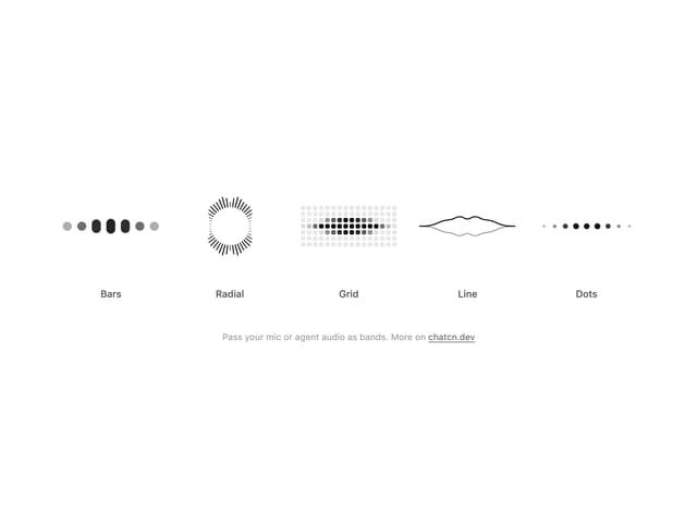
Audio Visualizer
29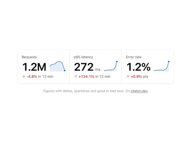
Stat Card
24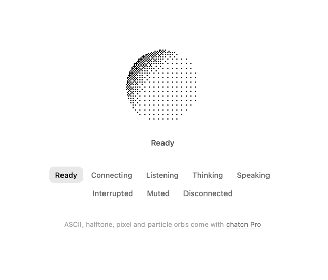
Dither Orb
23
Voice Orb
17
Waveform
13
Message Feedback
12
Agent Lanes
11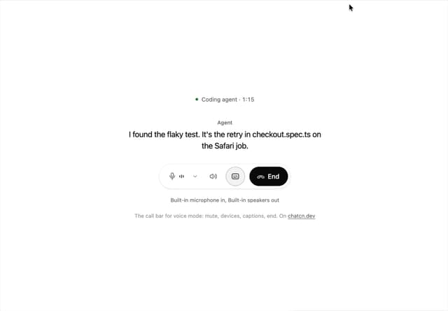
Voice Controls
10
More in AI chats
View all

AI Actions
349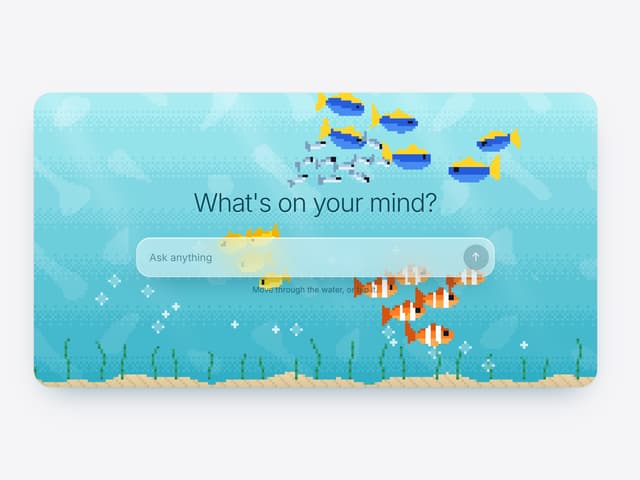

Aquarium Prompt
95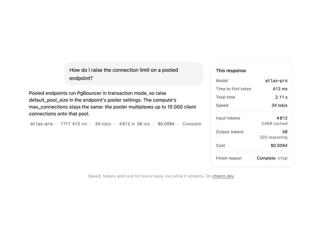
Generation Stats

Chat Bubble
202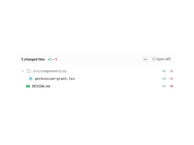
Commit
36
Color Picker
190
Environment Variables
27

Message With Header And Delivery Status
57

