
About
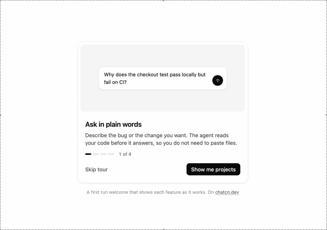
A first run welcome that steps through each feature with a small live picture of it, as a dialog or a card.
Built with React and Tailwind. Copy the prompt and paste it into Claude Code, Cursor or Lovable: your agent adds Onboarding to your project and fits it to your theme.
Code
How Onboarding is used: the demo's code. The component's own source comes with a free account.
Usage.tsx
"use client"

import * as React from "react"
import { cn } from "@/lib/utils"
import { CheckIcon, Icon, IconNode, Onboarding, OnboardingStep, createIcon } from "@/components/ui/onboarding"

interface GhostState {
  x: number
  y: number
  shown: boolean
  down: boolean
}

/**
 * A pointer that walks a demo through its clicks, so a preview shows what each control does.
 * `stage` is the positioned box the pointer moves in; targets are found inside it. Sizes come
 * from layout boxes, so a scaled FitFrame never throws the aim off.
 */
function useGhost(stage: React.RefObject<HTMLElement | null>) {
  const [ghost, setGhost] = React.useState<GhostState>({ x: 0, y: 0, shown: false, down: false })

  const find = React.useCallback(
    (target: string | HTMLElement) =>
      typeof target === "string"
        ? stage.current?.querySelector<HTMLElement>(target) ?? null
        : target,
    [stage],
  )

  const moveTo = React.useCallback(
    (target: string | HTMLElement, dx = 0.5, dy = 0.6) => {
      const root = stage.current
      const el = find(target)
      if (!root || !el) return null
      const rr = root.getBoundingClientRect()
      const scale = root.offsetWidth ? rr.width / root.offsetWidth : 1
      const er = el.getBoundingClientRect()
      const x = (er.left - rr.left + er.width * dx) / scale
      const y = (er.top - rr.top + er.height * dy) / scale
      // A hidden pointer fades in a short way off its first target instead of flying in from
      // wherever it was last.
      setGhost((g) => (g.shown ? { x, y, shown: true, down: false } : { x: x + 70, y: y + 46, shown: false, down: false }))
      window.requestAnimationFrame(() =>
        window.requestAnimationFrame(() => setGhost({ x, y, shown: true, down: false })),
      )
      return el
    },
    [stage, find],
  )

  const press = React.useCallback((down: boolean) => setGhost((g) => ({ ...g, down })), [])
  const hide = React.useCallback(() => setGhost((g) => ({ ...g, shown: false, down: false })), [])

  return { ghost, moveTo, press, hide, find }
}

const reducedMotion = () =>
  typeof window !== "undefined" && window.matchMedia("(prefers-reduced-motion: reduce)").matches

const STOP = Symbol("stop")

/**
 * Runs `script` in a loop with a `wait(ms)` that stops cleanly on unmount or once `active` turns
 * false. Reduced motion never starts it.
 */
function useLoop(
  script: (wait: (ms: number) => Promise<void>) => Promise<void>,
  active = true,
) {
  const ref = React.useRef(script)
  ref.current = script
  React.useEffect(() => {
    if (!active || reducedMotion()) return
    let alive = true
    const timers = new Set<number>()
    const wait = (ms: number) =>
      new Promise<void>((resolve, reject) => {
        const id = window.setTimeout(() => {
          timers.delete(id)
          if (alive) resolve()
          else reject(STOP)
        }, ms)
        timers.add(id)
      })
    ;(async () => {
      try {
        while (alive) await ref.current(wait)
      } catch (error) {
        if (error !== STOP) throw error
      }
    })()
    return () => {
      alive = false
      for (const id of timers) window.clearTimeout(id)
    }
  }, [active])
}

const STEP_MS = 2300

const iconNode: IconNode = [
  ["path", {"d":"m18.5 11.5-4.73-4.73a2.5 2.5 0 0 0-3.54 0L5.5 11.5"}],
  ["path", {"d":"M12 19v-9"}],
]

const ArrowUpIcon: Icon = /* @__PURE__ */ createIcon("arrow-up", iconNode)

/*
 * A four-step welcome for a coding agent. Each step shows a small live vignette of the capability,
 * drawn from the same parts as the product, so the tour looks like the app it introduces.
 */

function ComposerVignette() {
  return (
    <div className="bg-(color:--chatcn-card) shadow-(--chatcn-shadow-sm) rounded-(--chatcn-radius-lg) flex w-[78%] items-end gap-2 p-2.5 ps-3.5">
      <p className="text-[0.8125rem]/[1.25rem] text-(color:--chatcn-fg) min-w-0 flex-1 text-pretty">
        Why does the checkout test pass locally but fail on CI?
      </p>
      <span className="bg-(color:--chatcn-fg) text-(color:--chatcn-bg) grid size-7 shrink-0 place-items-center rounded-full">
        <ArrowUpIcon className="size-3.5" />
      </span>
    </div>
  )
}

const iconNode2: IconNode = [
  ["path", {"d":"M7 2.5h5.88a1.5 1.5 0 0 1 1.06.44l5.12 5.12a1.5 1.5 0 0 1 .44 1.06V19a2.5 2.5 0 0 1-2.5 2.5H7A2.5 2.5 0 0 1 4.5 19V5A2.5 2.5 0 0 1 7 2.5"}],
  ["path", {"d":"M13.5 3.25v3.5a1.75 1.75 0 0 0 1.75 1.75h3.5"}],
  ["path", {"d":"M8.25 12.5h7.5"}],
  ["path", {"d":"M8.25 16.5h7.5"}],
  ["path", {"d":"M8.25 8.5H10"}],
]

const FileTextIcon: Icon = /* @__PURE__ */ createIcon("file-text", iconNode2)

const iconNode3: IconNode = [
  ["path", {"d":"M4.75 4h3.24a1.5 1.5 0 0 1 1.21.62l1.1 1.51a1.5 1.5 0 0 0 1.21.62h7.24a2.5 2.5 0 0 1 2.5 2.5v8.25a2.5 2.5 0 0 1-2.5 2.5H5.25a2.5 2.5 0 0 1-2.5-2.5V6a2 2 0 0 1 2-2"}],
]

const FolderIcon: Icon = /* @__PURE__ */ createIcon("folder", iconNode3)

function ProjectVignette() {
  const rows = [
    {
      icon: <FileTextIcon />,
      name: "Instructions",
      meta: "Answer in TypeScript, prefer server actions",
    },
    { icon: <FileTextIcon />, name: "schema.prisma", meta: "14 KB" },
    { icon: <FileTextIcon />, name: "runbook.md", meta: "6 KB" },
  ]
  return (
    <div className="bg-(color:--chatcn-card) shadow-(--chatcn-shadow-sm) rounded-(--chatcn-radius-lg) flex w-[78%] flex-col p-1.5">
      <div className="text-[0.8125rem]/[1.25rem] text-(color:--chatcn-fg) flex items-center gap-2 px-2 py-1.5 font-medium">
        <FolderIcon className="text-(color:--chatcn-fg-subtle) size-3.5" />
        Checkout service
      </div>
      {rows.map((row) => (
        <div key={row.name} className="text-[0.75rem]/[1rem] flex items-center gap-2 px-2 py-1">
          <span className="text-(color:--chatcn-fg-subtle) [&>svg]:size-3.5">{row.icon}</span>
          <span className="text-(color:--chatcn-fg) shrink-0">{row.name}</span>
          <span className="text-(color:--chatcn-fg-subtle) min-w-0 truncate">{row.meta}</span>
        </div>
      ))}
    </div>
  )
}

/** The kit's one spinner. 0.8 s per turn, slowed to 1.2 s under reduced motion. */
function Spinner({ className, label }: { className?: string; label?: string }) {
  return (
    <svg
      viewBox="0 0 16 16"
      fill="none"
      role={label ? "img" : undefined}
      aria-label={label}
      aria-hidden={label ? undefined : true}
      data-slot="spinner"
      className={cn("chatcn-spin size-3.5 shrink-0", className)}
    >
      <circle cx="8" cy="8" r="6.25" stroke="currentColor" strokeOpacity="0.2" strokeWidth="1.5" />
      <path
        d="M8 1.75A6.25 6.25 0 0 1 14.25 8"
        stroke="currentColor"
        strokeWidth="1.5"
        strokeLinecap="round"
      />
    </svg>
  )
}

function AgentVignette() {
  return (
    <div className="flex w-[78%] flex-col gap-2">
      <div className="text-[0.8125rem]/[1.25rem] text-(color:--chatcn-fg-muted) flex items-center gap-2">
        <CheckIcon className="text-(color:--chatcn-fg-subtle) size-3.5" />
        Read
        <span className="text-(color:--chatcn-fg) text-[0.75rem]/[1rem] font-mono">src/lib/checkout.ts</span>
      </div>
      <div className="text-[0.8125rem]/[1.25rem] text-(color:--chatcn-fg-muted) flex items-center gap-2">
        <CheckIcon className="text-(color:--chatcn-fg-subtle) size-3.5" />
        Edited
        <span className="text-(color:--chatcn-fg) text-[0.75rem]/[1rem] font-mono">tests/checkout.test.ts</span>
      </div>
      <div className="text-[0.8125rem]/[1.25rem] text-(color:--chatcn-fg) flex items-center gap-2">
        <Spinner className="text-(color:--chatcn-fg-subtle)" />
        Running
        <span className="text-[0.75rem]/[1rem] font-mono">pnpm test --filter checkout</span>
      </div>
    </div>
  )
}

function Kbd({ className, ...props }: React.ComponentProps<"kbd">) {
  return (
    <kbd
      data-slot="kbd"
      className={cn(
        "rounded-(--chatcn-radius-xs) bg-(color:--chatcn-fill) text-[0.75rem]/[1rem] text-(color:--chatcn-fg-subtle) inline-flex h-5 min-w-5 items-center justify-center px-1 font-sans tabular-nums shadow-[inset_0_-1px_0_var(--chatcn-alpha-300)]",
        className,
      )}
      {...props}
    />
  )
}

const iconNode4: IconNode = [
  ["path", {"d":"M4 10.75a6.75 6.75 0 1 0 13.5 0 6.75 6.75 0 1 0-13.5 0"}],
  ["path", {"d":"m15.75 15.75 4.5 4.5"}],
]

const SearchIcon: Icon = /* @__PURE__ */ createIcon("search", iconNode4)

function PaletteVignette() {
  return (
    <div className="flex flex-col items-center gap-4">
      <div className="flex items-center gap-1.5">
        <Kbd className="text-[0.875rem]/[1.25rem] tracking-[-0.003em] h-8 min-w-8 px-2">⌘</Kbd>
        <Kbd className="text-[0.875rem]/[1.25rem] tracking-[-0.003em] h-8 min-w-8 px-2">K</Kbd>
      </div>
      <div className="bg-(color:--chatcn-card) shadow-(--chatcn-shadow-sm) rounded-(--chatcn-radius-lg) text-[0.8125rem]/[1.25rem] text-(color:--chatcn-fg-subtle) flex w-56 items-center gap-2 px-3 py-2">
        <SearchIcon className="size-3.5" />
        Search chats, actions and models…
      </div>
    </div>
  )
}

const steps: OnboardingStep[] = [
  {
    id: "ask",
    title: "Ask in plain words",
    description:
      "Describe the bug or the change you want. The agent reads your code before it answers, so you do not need to paste files.",
    media: <ComposerVignette />,
    action: "Show me projects",
  },
  {
    id: "projects",
    title: "Projects keep the context",
    description:
      "Instructions and files you add to a project apply to every chat in it. Set them once instead of in every message.",
    media: <ProjectVignette />,
    action: "How the agent works",
  },
  {
    id: "agent",
    title: "Watch it work, step in any time",
    description:
      "Each file it reads and each command it runs shows up as it happens. Edits that touch your code wait for your approval.",
    media: <AgentVignette />,
    action: "One last thing",
  },
  {
    id: "palette",
    title: "Everything is one shortcut away",
    description:
      "Press ⌘K to jump to a chat, switch models or start a new project without leaving the keyboard.",
    media: <PaletteVignette />,
  },
]

/** Moves to a target, presses and clicks it. Returns the element, or null if it is gone. */
async function tap(
  g: ReturnType<typeof useGhost>,
  target: string | HTMLElement,
  wait: (ms: number) => Promise<void>,
  travel = 700,
) {
  if (!g.moveTo(target)) return null
  await wait(travel)
  g.press(true)
  await wait(130)
  const el = g.find(target)
  el?.click()
  g.press(false)
  return el
}

const FIT_CSS = "html,body{overflow:hidden}[data-fit-small] [data-fit-hide]{display:none!important}"

/**
 * 21st shows a demo in a small frame: about 674 by 421 on a component page, 358 by 224 on a
 * phone and 245 by 139 on a profile card. A demo taller than its frame gets scrollbars, which
 * render white on dark pages. FitFrame fills the frame exactly instead.
 *
 * - "scale": the content shrinks until it fits, centered. For visuals such as orbs.
 * - "crop": the content stays at full size from the top and fades out at the bottom. For text
 *   that streams in, where a changing scale would make the page breathe.
 *
 * `minWidth` lays out a wide demo (a table, a two column panel) at that width and scales it down
 * to the frame, instead of letting it collapse to a narrow layout. The frame centers it, so it
 * shrinks evenly on both sides.
 *
 * Anything marked `data-fit-hide` (state buttons, the chatcn.dev line) drops out in frames
 * shorter than `hideBelow`, so a profile card shows the visual alone.
 */
function FitFrame({
  children,
  mode = "scale",
  hideBelow = 360,
  minWidth,
}: {
  children: React.ReactNode
  mode?: "scale" | "crop"
  hideBelow?: number
  minWidth?: string
}) {
  const content = React.useRef<HTMLDivElement>(null)
  const [cropped, setCropped] = React.useState(false)

  React.useLayoutEffect(() => {
    const el = content.current
    if (!el) return
    const measure = () => {
      const vw = window.innerWidth
      const vh = window.innerHeight
      el.toggleAttribute("data-fit-small", vh < hideBelow)
      // Layout sizes ignore the transform, so measuring never feeds back.
      const w = Math.max(el.offsetWidth, el.scrollWidth)
      const h = Math.max(el.offsetHeight, el.scrollHeight)
      const scale = mode === "scale" ? Math.min(1, vw / w, vh / h) : 1
      el.style.transform = scale < 1 ? `scale(${scale})` : ""
      setCropped(mode === "crop" && h > vh + 1)
    }
    measure()
    const observer = new ResizeObserver(measure)
    observer.observe(el)
    // Content that changes inside a fixed width box (a headline that cycles words) never resizes
    // the box itself, so changes below it measure again on the next frame.
    let frame = 0
    const mutations = new MutationObserver(() => {
      cancelAnimationFrame(frame)
      frame = requestAnimationFrame(measure)
    })
    mutations.observe(el, { subtree: true, childList: true, characterData: true })
    window.addEventListener("resize", measure)
    return () => {
      observer.disconnect()
      mutations.disconnect()
      cancelAnimationFrame(frame)
      window.removeEventListener("resize", measure)
    }
  }, [mode, hideBelow])

  const fade = "linear-gradient(to bottom, #000 calc(100% - 40px), transparent)"
  return (
    <div
      className="flex w-full justify-center overflow-hidden"
      style={{
        height: "100dvh",
        alignItems: mode === "crop" ? "flex-start" : "center",
        maskImage: cropped ? fade : undefined,
        WebkitMaskImage: cropped ? fade : undefined,
      }}
    >
      <style>{FIT_CSS}</style>
      <div
        ref={content}
        className="w-full shrink-0"
        style={{ transformOrigin: mode === "crop" ? "top center" : "center", minWidth }}
      >
        {children}
      </div>
    </div>
  )
}

/** The pointer itself. Put it last inside the stage, which must be `relative`. */
function Ghost({ ghost }: { ghost: GhostState }) {
  return (
    <div
      aria-hidden
      className="pointer-events-none absolute top-0 left-0 z-20"
      style={{
        transform: `translate(${ghost.x}px, ${ghost.y}px)`,
        opacity: ghost.shown ? 1 : 0,
        // Hidden, it jumps; shown, it glides.
        transition: ghost.shown
          ? "transform 620ms cubic-bezier(0.4, 0, 0.2, 1), opacity 220ms ease-out"
          : "opacity 220ms ease-out",
      }}
    >
      <svg
        width="18"
        height="20"
        viewBox="0 0 18 20"
        className="drop-shadow-[0_1px_2px_rgb(0_0_0/0.25)]"
        style={{
          transform: ghost.down ? "scale(0.86)" : "scale(1)",
          transformOrigin: "2px 2px",
          transition: "transform 120ms ease-out",
        }}
      >
        <path
          d="M2 1.5 L2 16 L5.9 12.4 L8.6 18.3 L11.2 17.1 L8.6 11.3 L13.9 11.1 Z"
          className="fill-[oklch(0.2_0_0)] stroke-white dark:fill-white dark:stroke-[oklch(0.2_0_0)]"
          strokeWidth="1.3"
          strokeLinejoin="round"
        />
      </svg>
    </div>
  )
}

/** The line under each 21st demo that points back to the kit. */
function MoreOn({ slug, children }: { slug: string; children: React.ReactNode }) {
  return (
    <p data-fit-hide className="text-[0.75rem]/[1rem] text-(color:--chatcn-fg-faint) text-center text-balance">
      {children}{" "}
      <a
        href={`https://chatcn.dev/docs/components/${slug}`}
        target="_blank"
        rel="noopener"
        className="text-(color:--chatcn-fg-subtle) hover:text-(color:--chatcn-fg) underline underline-offset-2"
      >
        chatcn.dev
      </a>
    </p>
  )
}

/**
 * A coding agent's welcome, as a card in the empty state. The pointer walks through the four
 * steps, each with a small live picture of the feature, then the tour starts over. Click
 * anything to stop the tour and step through it yourself, with the arrow keys too.
 */
export default function OnboardingPreview() {
  const stage = React.useRef<HTMLDivElement>(null)
  const g = useGhost(stage)
  const [touring, setTouring] = React.useState(true)
  const [step, setStep] = React.useState(0)
  const [round, setRound] = React.useState(0)

  useLoop(async (wait) => {
    setStep(0)
    setRound((r) => r + 1)
    await wait(STEP_MS)
    for (let i = 1; i < steps.length; i += 1) {
      await tap(g, '[data-slot="onboarding-forward"]', wait)
      ;(document.activeElement as HTMLElement | null)?.blur()
      await wait(STEP_MS)
    }
    g.hide()
    await wait(900)
  }, touring)

  return (
    <FitFrame>
      <div className="flex w-full flex-col items-center justify-center gap-4 p-5">
        <div
          ref={stage}
          className="relative flex w-full justify-center"
          onPointerDown={() => {
            if (!touring) return
            setTouring(false)
            g.hide()
          }}
        >
          <div key={round} className="flex w-full justify-center transition-opacity duration-300 starting:opacity-0">
            <Onboarding
              variant="inline"
              steps={steps}
              step={step}
              onStepChange={setStep}
              onComplete={() => setStep(0)}
              onSkip={() => setStep(0)}
            />
          </div>
          <Ghost ghost={g.ghost} />
        </div>
        <MoreOn slug="onboarding">A first run welcome that shows each feature as it works. On</MoreOn>
      </div>
    </FitFrame>
  )
}
Dependencies
More by Aadi
View all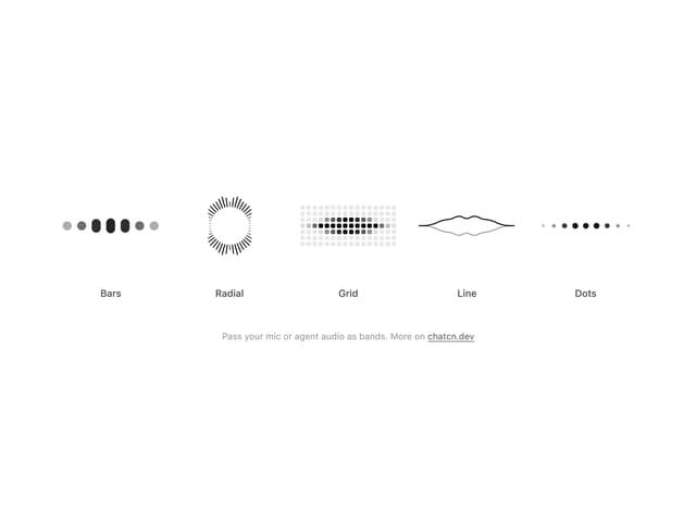
Audio Visualizer
29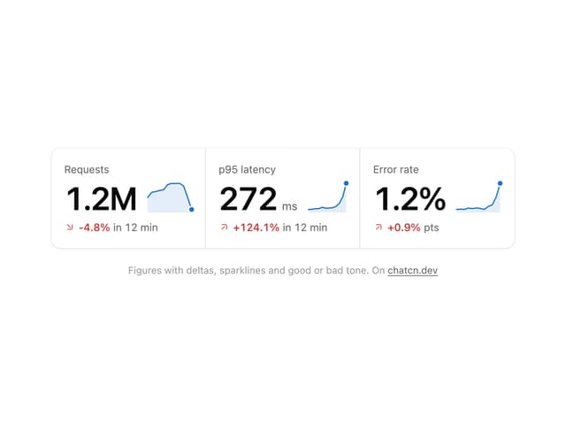
Stat Card
24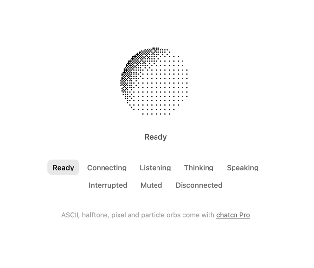
Dither Orb
23
Voice Orb
17
Waveform
13
Message Feedback
12
Agent Lanes
11
Voice Controls
10
More in AI chats
View all

AI Actions
349

Aquarium Prompt
95
Generation Stats

Chat Bubble
202
Commit
36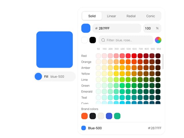
Color Picker
190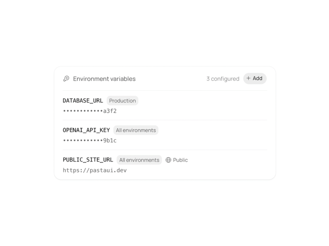
Environment Variables
27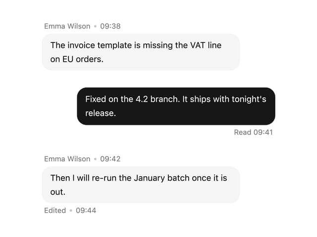

Message With Header And Delivery Status
57

