
About
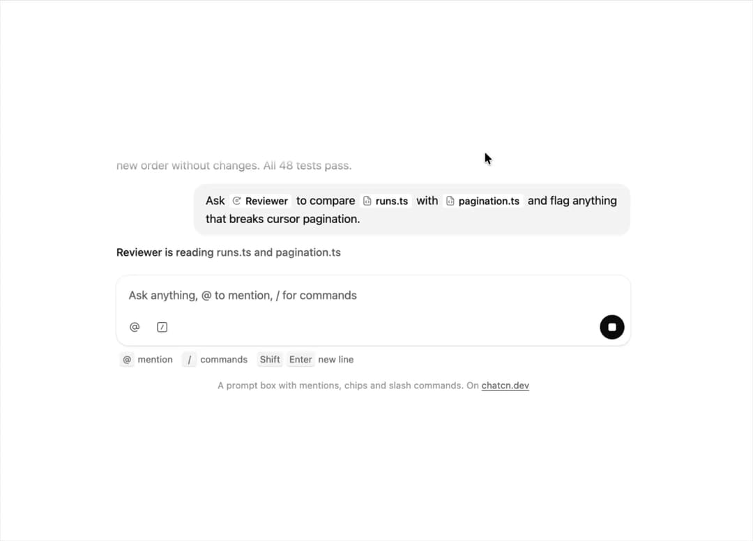
A prompt box with inline mention chips for people and files, slash commands and keyboard hints.
Built with React and Tailwind. Copy the prompt and paste it into Claude Code, Cursor or Lovable: your agent adds Rich Prompt Input to your project and fits it to your theme.
Code
How Rich Prompt Input is used: the demo's code. The component's own source comes with a free account.
Usage.tsx
"use client"

import * as React from "react"
import { cn } from "@/lib/utils"
import { Tooltip as TooltipPrimitive } from "@base-ui/react/tooltip"
import { Icon, IconNode, InlineChip, Kbd, MentionItem, PromptInputStatus, RichPromptInput, RichPromptInputEditor, RichPromptInputHandle, RichPromptJSON, SlashCommand, Spinner, createIcon, usePromptInput, useRichPromptInput } from "@/components/ui/rich-prompt-input"

const reducedMotion = () => window.matchMedia("(prefers-reduced-motion: reduce)").matches

type Piece = { text: string } | { mention: string }

/** The prompt the tour types: words arrive a few letters at a time, chips land whole. */
const PROMPT: Piece[] = [
  { text: "Ask " },
  { mention: "a-reviewer" },
  { text: " to compare " },
  { mention: "f-runs" },
  { text: " with " },
  { mention: "f-pagination" },
  { text: " and flag anything that breaks cursor pagination." },
]

/* A coding agent working on a runs API: what can be mentioned and run from the prompt. */

const mentions: MentionItem[] = [
  { id: "f-runs", kind: "file", label: "runs.ts", detail: "src/server", value: "src/server/runs.ts" },
  {
    id: "f-pagination",
    kind: "file",
    label: "pagination.ts",
    detail: "src/lib",
    value: "src/lib/pagination.ts",
  },
  { id: "f-page", kind: "file", label: "page.tsx", detail: "src/app/runs", value: "src/app/runs/page.tsx" },
  { id: "d-tests", kind: "folder", label: "tests", value: "tests/" },
  {
    id: "a-reviewer",
    kind: "agent",
    label: "Reviewer",
    detail: "Reads diffs for regressions",
    value: "agent:reviewer",
  },
  {
    id: "a-tests",
    kind: "agent",
    label: "Test runner",
    detail: "Runs the suite and fixes failures",
    value: "agent:test-runner",
  },
  { id: "p-tomas", kind: "person", label: "Tomás Ferreira", detail: "Owns the runs API", value: "tomas" },
  { id: "c-sentry", kind: "connector", label: "Sentry", detail: "Errors and traces", value: "sentry" },
]

const mentionNode = (id: string) => {
  const m = mentions.find((x) => x.id === id)!
  return { type: "mention", attrs: { id: m.id, kind: m.kind, label: m.label, value: m.value } }
}

/** Every intermediate document, from empty to the full prompt, and whether a chip just landed. */
const FRAMES: { doc: RichPromptJSON; chip: boolean }[] = (() => {
  const frames: { doc: RichPromptJSON; chip: boolean }[] = []
  const done: Record<string, unknown>[] = []
  const doc = (content: Record<string, unknown>[]) =>
    ({ type: "doc", content: [{ type: "paragraph", content }] }) as unknown as RichPromptJSON
  for (const piece of PROMPT) {
    if ("mention" in piece) {
      done.push(mentionNode(piece.mention))
      frames.push({ doc: doc([...done]), chip: true })
      continue
    }
    for (let at = 3; at < piece.text.length + 3; at += 3) {
      frames.push({ doc: doc([...done, { type: "text", text: piece.text.slice(0, at) }]), chip: false })
    }
    done.push({ type: "text", text: piece.text })
  }
  return frames
})()

const TYPE_MS = 45

const CHIP_MS = 260

const READ_MS = 1100

const AGENT_MS = 2600

const FIT_CSS = "html,body{overflow:hidden}[data-fit-small] [data-fit-hide]{display:none!important}"

/**
 * 21st shows a demo in a small frame: about 674 by 421 on a component page, 358 by 224 on a
 * phone and 245 by 139 on a profile card. A demo taller than its frame gets scrollbars, which
 * render white on dark pages. FitFrame fills the frame exactly instead.
 *
 * - "scale": the content shrinks until it fits, centered. For visuals such as orbs.
 * - "crop": the content stays at full size from the top and fades out at the bottom. For text
 *   that streams in, where a changing scale would make the page breathe.
 *
 * `minWidth` lays out a wide demo (a table, a two column panel) at that width and scales it down
 * to the frame, instead of letting it collapse to a narrow layout. The frame centers it, so it
 * shrinks evenly on both sides.
 *
 * Anything marked `data-fit-hide` (state buttons, the chatcn.dev line) drops out in frames
 * shorter than `hideBelow`, so a profile card shows the visual alone.
 */
function FitFrame({
  children,
  mode = "scale",
  hideBelow = 360,
  minWidth,
}: {
  children: React.ReactNode
  mode?: "scale" | "crop"
  hideBelow?: number
  minWidth?: string
}) {
  const content = React.useRef<HTMLDivElement>(null)
  const [cropped, setCropped] = React.useState(false)

  React.useLayoutEffect(() => {
    const el = content.current
    if (!el) return
    const measure = () => {
      const vw = window.innerWidth
      const vh = window.innerHeight
      el.toggleAttribute("data-fit-small", vh < hideBelow)
      // Layout sizes ignore the transform, so measuring never feeds back.
      const w = Math.max(el.offsetWidth, el.scrollWidth)
      const h = Math.max(el.offsetHeight, el.scrollHeight)
      const scale = mode === "scale" ? Math.min(1, vw / w, vh / h) : 1
      el.style.transform = scale < 1 ? `scale(${scale})` : ""
      setCropped(mode === "crop" && h > vh + 1)
    }
    measure()
    const observer = new ResizeObserver(measure)
    observer.observe(el)
    // Content that changes inside a fixed width box (a headline that cycles words) never resizes
    // the box itself, so changes below it measure again on the next frame.
    let frame = 0
    const mutations = new MutationObserver(() => {
      cancelAnimationFrame(frame)
      frame = requestAnimationFrame(measure)
    })
    mutations.observe(el, { subtree: true, childList: true, characterData: true })
    window.addEventListener("resize", measure)
    return () => {
      observer.disconnect()
      mutations.disconnect()
      cancelAnimationFrame(frame)
      window.removeEventListener("resize", measure)
    }
  }, [mode, hideBelow])

  const fade = "linear-gradient(to bottom, #000 calc(100% - 40px), transparent)"
  return (
    <div
      className="flex w-full justify-center overflow-hidden"
      style={{
        height: "100dvh",
        alignItems: mode === "crop" ? "flex-start" : "center",
        maskImage: cropped ? fade : undefined,
        WebkitMaskImage: cropped ? fade : undefined,
      }}
    >
      <style>{FIT_CSS}</style>
      <div
        ref={content}
        className="w-full shrink-0"
        style={{ transformOrigin: mode === "crop" ? "top center" : "center", minWidth }}
      >
        {children}
      </div>
    </div>
  )
}

const SENT = PROMPT.map((p) => ("text" in p ? p.text : null))

/**
 * The only shimmer in chatcn: a status label such as "Thinking". Static under reduced motion.
 * Pass `active={false}` to settle it into plain subtle text.
 */
function ShimmerText({
  active = true,
  className,
  ...props
}: React.ComponentProps<"span"> & { active?: boolean }) {
  return (
    <span
      data-slot="shimmer-text"
      className={cn("font-medium", active ? "chatcn-shimmer" : "text-(color:--chatcn-fg-subtle)", className)}
      {...props}
    />
  )
}

const commands: SlashCommand[] = [
  { name: "review", description: "Review the current diff or a pull request", category: "Code" },
  { name: "test", description: "Run tests and fix what fails", category: "Code" },
  {
    name: "explain",
    description: "Walk through how a module works",
    category: "Prompts",
    template: "Explain how {{module}} works, from the entry point to storage.",
  },
  { name: "compact", description: "Summarize the conversation to free up context", category: "Session" },
]

/** The row under the text. Put `PromptInputTools` first and `PromptInputActions` last. */
function PromptInputToolbar({ className, ...props }: React.ComponentProps<"div">) {
  const { variant } = usePromptInput()
  return (
    <div
      data-slot="prompt-input-toolbar"
      className={cn(
        "flex min-w-0 items-center gap-1",
        variant === "hero" ? "p-3 pt-1" : "p-2 pt-1",
        className,
      )}
      {...props}
    />
  )
}

/**
 * Leading group: attach, tools menu, mode chips. It never gets narrower than its controls (mode
 * chips fold to their icons first), so in a tight composer the model name truncates instead of
 * sliding under the chips.
 */
function PromptInputTools({ className, ...props }: React.ComponentProps<"div">) {
  return (
    <div
      data-slot="prompt-input-tools"
      className={cn("flex min-w-fit flex-1 items-center gap-1", className)}
      {...props}
    />
  )
}

type ButtonVariant = "solid" | "outline" | "ghost" | "subtle"

type ButtonSize = "xs" | "sm" | "md" | "lg" | "icon-xs" | "icon-sm" | "icon-md" | "icon-lg"

interface ButtonProps extends React.ComponentProps<"button"> {
  variant?: ButtonVariant
  size?: ButtonSize
}

/* -------------------------------------------------------------------------------------------------
 * Controls
 * -----------------------------------------------------------------------------------------------*/

interface PromptInputButtonProps extends ButtonProps {
  /** Accessible name and tooltip for icon-only buttons. */
  tooltip?: string
  /** Shortcut shown in the tooltip, for example `⌘U`. */
  shortcut?: string
}

const base = cn(
  "chatcn-focus inline-flex shrink-0 items-center justify-center gap-1.5 font-medium whitespace-nowrap select-none",
  "ease-(--chatcn-ease-standard) transition-[background-color,color,box-shadow,scale] duration-150",
  "active:scale-(--chatcn-press-scale) active:duration-100 disabled:pointer-events-none disabled:opacity-50",
  "[&_svg]:pointer-events-none [&_svg]:shrink-0",
)

const variants: Record<ButtonVariant, string> = {
  solid: "bg-(color:--chatcn-primary) text-(color:--chatcn-primary-fg) hover:bg-(color:--chatcn-primary-hover)",
  outline: "bg-(color:--chatcn-card) text-(color:--chatcn-fg) shadow-(--chatcn-shadow-xs) hover:bg-(color:--chatcn-fill-hover)",
  ghost: "text-(color:--chatcn-fg-muted) hover:bg-(color:--chatcn-fill-hover) hover:text-(color:--chatcn-fg)",
  subtle: "bg-(color:--chatcn-fill) text-(color:--chatcn-fg) hover:bg-(color:--chatcn-fill-hover)",
}

// Heights follow the control scale: 24, 28, 32, 36. Radii stay concentric inside 12 px surfaces.
const sizes: Record<ButtonSize, string> = {
  xs: "h-6 rounded-(--chatcn-radius-sm) px-2 text-[0.75rem]/[1rem] [&_svg]:size-3.5",
  sm: "h-7 rounded-(--chatcn-radius-sm) px-2.5 text-[0.8125rem]/[1.25rem] [&_svg]:size-3.5",
  md: "h-8 rounded-(--chatcn-radius-md) px-3 text-[0.875rem]/[1.25rem] tracking-[-0.003em] [&_svg]:size-4",
  lg: "h-9 rounded-(--chatcn-radius-md) px-3.5 text-[0.875rem]/[1.25rem] tracking-[-0.003em] [&_svg]:size-4",
  "icon-xs": "size-6 rounded-(--chatcn-radius-sm) active:scale-(--chatcn-press-scale-icon) [&_svg]:size-3.5",
  "icon-sm": "size-7 rounded-(--chatcn-radius-sm) active:scale-(--chatcn-press-scale-icon) [&_svg]:size-3.5",
  "icon-md": "size-8 rounded-(--chatcn-radius-md) active:scale-(--chatcn-press-scale-icon) [&_svg]:size-4",
  "icon-lg": "size-9 rounded-(--chatcn-radius-md) active:scale-(--chatcn-press-scale-icon) [&_svg]:size-4",
}

/** Class names for anything that should look like a button, such as a link. */
function buttonVariants({
  variant = "ghost",
  size = "md",
}: {
  variant?: ButtonVariant
  size?: ButtonSize
} = {}) {
  return cn(base, variants[variant], sizes[size])
}

function Button({
  variant = "ghost",
  size = "md",
  type = "button",
  className,
  ...props
}: ButtonProps) {
  return (
    <button
      type={type}
      data-slot="button"
      data-variant={variant}
      className={cn(buttonVariants({ variant, size }), className)}
      {...props}
    />
  )
}

interface TooltipProps {
  content: React.ReactNode
  children: React.ReactElement
  side?: "top" | "bottom" | "left" | "right"
  align?: "start" | "center" | "end"
  /** A shortcut hint shown after the label, for example `⌘C`. */
  shortcut?: React.ReactNode
}

function Tooltip({ content, children, side = "top", align = "center", shortcut }: TooltipProps) {
  return (
    <TooltipPrimitive.Root>
      <TooltipPrimitive.Trigger render={children} />
      <TooltipPrimitive.Portal>
        <TooltipPrimitive.Positioner side={side} align={align} sideOffset={6} className="z-50">
          <TooltipPrimitive.Popup
            data-slot="tooltip"
            className={cn(
              "rounded-(--chatcn-radius-sm) bg-(color:--chatcn-fg) text-[0.75rem]/[1rem] text-(color:--chatcn-bg) shadow-(--chatcn-shadow-md) flex max-w-xs origin-(--transform-origin) items-center gap-2 px-2 py-1 font-medium text-pretty",
              "ease-(--chatcn-ease-out) transition-[opacity,scale] duration-125",
              "data-[ending-style]:scale-97 data-[ending-style]:opacity-0 data-[ending-style]:duration-100 data-[starting-style]:scale-97 data-[starting-style]:opacity-0",
              // Once one tooltip is open, the next appears without animation. Reduced motion keeps
              // only the fade.
              "data-[instant]:transition-none motion-reduce:transition-opacity motion-reduce:data-[ending-style]:scale-100 motion-reduce:data-[starting-style]:scale-100",
            )}
          >
            {content}
            {shortcut ? <span className="font-normal opacity-60">{shortcut}</span> : null}
          </TooltipPrimitive.Popup>
        </TooltipPrimitive.Positioner>
      </TooltipPrimitive.Portal>
    </TooltipPrimitive.Root>
  )
}

/** A quiet toolbar button. Icon-only by default; pass text children for a labelled one. */
function PromptInputButton({
  tooltip,
  shortcut,
  size = "icon-md",
  variant = "ghost",
  className,
  ...props
}: PromptInputButtonProps) {
  const button = (
    <Button
      data-slot="prompt-input-button"
      aria-label={props["aria-label"] ?? tooltip}
      size={size}
      variant={variant}
      className={cn(
        size.startsWith("icon") ? "pointer-coarse:size-11" : "pointer-coarse:h-11",
        className,
      )}
      {...props}
    />
  )
  return tooltip ? (
    <Tooltip content={tooltip} shortcut={shortcut}>
      {button}
    </Tooltip>
  ) : (
    button
  )
}

const iconNode: IconNode = [
  ["path", {"d":"m14.81 7.92-6.36 6.36a1.75 1.75 0 0 0 0 2.47 1.75 1.75 0 0 0 2.47 0l7.07-7.07a3.5 3.5 0 0 0 0-4.95 3.5 3.5 0 0 0-4.95 0L5.97 11.8a5.25 5.25 0 0 0 0 7.43 5.25 5.25 0 0 0 7.43 0l4.95-4.95"}],
]

const PaperclipIcon: Icon = /* @__PURE__ */ createIcon("paperclip", iconNode)

/** Opens the file picker. Results go to `onFiles` on the `PromptInput`. */
function PromptInputAttachButton({
  tooltip = "Attach files",
  children,
  ...props
}: PromptInputButtonProps) {
  const { openFilePicker, acceptsFiles, disabled } = usePromptInput()
  if (!acceptsFiles) return null
  return (
    <PromptInputButton
      tooltip={tooltip}
      disabled={disabled}
      onClick={openFilePicker}
      data-slot="prompt-input-attach"
      {...props}
    >
      {children ?? <PaperclipIcon />}
    </PromptInputButton>
  )
}

const iconNode2: IconNode = [
  ["path", {"d":"M8.25 12a3.75 3.75 0 1 0 7.5 0 3.75 3.75 0 1 0-7.5 0"}],
  ["path", {"d":"M15.75 8.25V13a2.38 2.38 0 0 0 4.75 0v-1a8.5 8.5 0 1 0-3.62 6.96"}],
]

const AtSignIcon: Icon = /* @__PURE__ */ createIcon("at-sign", iconNode2)

const iconNode3: IconNode = [
  ["path", {"d":"M6 3h12a3 3 0 0 1 3 3v12a3 3 0 0 1-3 3H6a3 3 0 0 1-3-3V6a3 3 0 0 1 3-3"}],
  ["path", {"d":"m14 8-4 8"}],
]

const SlashCommandIcon: Icon = /* @__PURE__ */ createIcon("slash-command", iconNode3)

/** The toolbar buttons that open the @ and / menus. */
function TriggerButtons() {
  const rich = useRichPromptInput()
  return (
    <>
      <PromptInputButton tooltip="Mention a file, agent or person" shortcut="@" onClick={() => rich.openMenu("@")}>
        <AtSignIcon />
      </PromptInputButton>
      <PromptInputButton tooltip="Run a command" shortcut="/" onClick={() => rich.openMenu("/")}>
        <SlashCommandIcon />
      </PromptInputButton>
    </>
  )
}

/** Trailing group: model picker, dictation, send. Only a truncating model name ever shrinks. */
function PromptInputActions({ className, ...props }: React.ComponentProps<"div">) {
  return (
    <div
      data-slot="prompt-input-actions"
      className={cn("ms-auto flex min-w-0 items-center gap-1", className)}
      {...props}
    />
  )
}

type SendButtonStatus = "idle" | "submitting" | "streaming"

interface SendButtonProps extends Omit<React.ComponentProps<"button">, "children"> {
  /**
   * - `idle`: Send. Disabled only when `empty`.
   * - `submitting`: a spinner while the request is on its way (or files are still uploading).
   * - `streaming`: Stop. Clicking calls `onStop`.
   */
  status?: SendButtonStatus
  /** Nothing to send. The one reason Send is ever disabled. */
  empty?: boolean
  onStop?: () => void
  shape?: "round" | "square"
  /** 28, 32 or 36 px. Touch screens get a 44 px hit area either way. */
  size?: "sm" | "md" | "lg"
  /** Accessible names. Defaults: Send message, Stop generating, Sending. */
  labels?: { send?: string; stop?: string; submitting?: string }
}

const sizes2 = {
  sm: { box: "size-7", icon: "size-3.5", square: "size-2" },
  md: { box: "size-8", icon: "size-4", square: "size-2.5" },
  lg: { box: "size-9", icon: "size-4", square: "size-2.5" },
}

// Each glyph is its own layer; state changes crossfade them with a 2 px blur so the button reads
// as one object changing, never as a swap. Same footprint, so nothing around it moves.
const layer = cn(
  "pointer-events-none absolute grid place-items-center",
  "ease-(--chatcn-ease-out) transition-[opacity,scale,translate,filter] duration-150",
  "motion-reduce:translate-none! motion-reduce:scale-none! motion-reduce:blur-none!",
)

const shown = "opacity-100 blur-0 scale-100 translate-y-0"

const iconNode4: IconNode = [
  ["path", {"d":"m18.5 11.5-4.73-4.73a2.5 2.5 0 0 0-3.54 0L5.5 11.5"}],
  ["path", {"d":"M12 19v-9"}],
]

const ArrowUpIcon: Icon = /* @__PURE__ */ createIcon("arrow-up", iconNode4)

/**
 * Send that becomes Stop in the same footprint. The arrow lifts away with the message and blurs
 * out while the kit's signature mark settles in: the same rounded square as the streaming caret,
 * so the thing that is writing is the thing you press to stop it. When the turn ends the next
 * arrow rises in from below, never back down from where the last one left. Escape in the composer
 * does the same as clicking Stop.
 */
function SendButton({
  status = "idle",
  empty = false,
  onStop,
  shape = "round",
  size = "md",
  labels,
  type = "submit",
  className,
  onClick,
  disabled,
  ...props
}: SendButtonProps) {
  const s = sizes2[size]
  const streaming = status === "streaming"
  const submitting = status === "submitting"
  const inactive = !streaming && !submitting && empty

  // Count returns to idle. The arrow layer remounts on each one, so its @starting-style places the
  // fresh arrow below the centre and it rises into place: the old one left upward with the message.
  const [seen, setSeen] = React.useState(status)
  const [returns, setReturns] = React.useState(0)
  if (seen !== status) {
    setSeen(status)
    if (status === "idle") setReturns((n) => n + 1)
  }

  const label = streaming
    ? (labels?.stop ?? "Stop generating")
    : submitting
      ? (labels?.submitting ?? "Sending")
      : (labels?.send ?? "Send message")

  return (
    <button
      type={streaming ? "button" : type}
      aria-label={label}
      aria-keyshortcuts={streaming ? "Escape" : "Enter"}
      // Empty stays focusable (aria-disabled, not disabled): after Stop the input is often empty,
      // and a disabled button would drop keyboard focus onto the page.
      aria-disabled={submitting || inactive || undefined}
      disabled={disabled}
      data-slot="send-button"
      data-send-state={status}
      data-empty={inactive ? "" : undefined}
      onClick={(event) => {
        if (submitting || inactive) {
          event.preventDefault()
          return
        }
        if (streaming) {
          event.preventDefault()
          onStop?.()
        }
        onClick?.(event)
      }}
      className={cn(
        "chatcn-focus relative grid shrink-0 place-items-center select-none",
        "ease-(--chatcn-ease-standard) transition-[background-color,color,scale] duration-150",
        "active:scale-(--chatcn-press-scale-icon) active:duration-100",
        "bg-(color:--chatcn-primary) text-(color:--chatcn-primary-fg) hover:bg-(color:--chatcn-primary-hover)",
        "data-[empty]:bg-(color:--chatcn-fill-active) data-[empty]:text-(color:--chatcn-fg-faint) data-[empty]:hover:bg-(color:--chatcn-fill-active) data-[empty]:active:scale-100",
        "disabled:cursor-default disabled:opacity-50 aria-disabled:cursor-default data-[send-state=submitting]:cursor-progress",
        // 44 px hit area on touch without changing the visual size.
        "after:absolute after:-inset-1.5 after:content-[''] pointer-fine:after:hidden",
        "forced-colors:border forced-colors:border-[ButtonText]",
        s.box,
        shape === "round" ? "rounded-full" : "rounded-(--chatcn-radius-md)",
        className,
      )}
      {...props}
    >
      <span
        key={returns}
        aria-hidden="true"
        data-send-layer="arrow"
        className={cn(
          layer,
          streaming || submitting ? "-translate-y-1 scale-90 opacity-0 blur-[2px]" : shown,
          returns > 0 &&
            "starting:translate-y-1 starting:scale-90 starting:opacity-0 starting:blur-[2px]",
        )}
      >
        <ArrowUpIcon strokeWidth={2} className={s.icon} />
      </span>
      <span
        aria-hidden="true"
        className={cn(layer, submitting ? shown : "scale-75 opacity-0 blur-[2px]")}
      >
        {submitting ? <Spinner className={s.icon} /> : null}
      </span>
      <span
        aria-hidden="true"
        className={cn(layer, streaming ? shown : "scale-50 opacity-0 blur-[2px]")}
      >
        {/* 22% corners: the streaming caret's ratio (0.12em on 0.55em), at every size. */}
        <span className={cn("rounded-[22%] bg-current", s.square)} />
      </span>
    </button>
  )
}

/** The send button, wired to the composer: disabled while empty, Stop while streaming. */
function PromptInputSubmit(props: Omit<SendButtonProps, "status" | "empty" | "onStop">) {
  const { status, empty, stop, disabled, variant } = usePromptInput()
  return (
    <SendButton
      status={status}
      empty={empty}
      onStop={stop}
      disabled={disabled}
      size={variant === "hero" ? "lg" : "md"}
      {...props}
    />
  )
}

/** The line under each 21st demo that points back to the kit. */
function MoreOn({ slug, children }: { slug: string; children: React.ReactNode }) {
  return (
    <p data-fit-hide className="text-[0.75rem]/[1rem] text-(color:--chatcn-fg-faint) text-center text-balance">
      {children}{" "}
      <a
        href={`https://chatcn.dev/docs/components/${slug}`}
        target="_blank"
        rel="noopener"
        className="text-(color:--chatcn-fg-subtle) hover:text-(color:--chatcn-fg) underline underline-offset-2"
      >
        chatcn.dev
      </a>
    </p>
  )
}

/**
 * A prompt gets written with an agent and two files mentioned as chips, then sent: it moves into
 * the thread and the agent starts reading the files. Loops. Click into the box and the tour stops
 * so you can type, with @ for mentions and / for commands.
 */
export default function RichPromptInputPreview() {
  const editor = React.useRef<RichPromptInputHandle>(null)
  const [frame, setFrame] = React.useState(-1)
  const [phase, setPhase] = React.useState<"typing" | "sending" | "sent">("typing")
  const [user, setUser] = React.useState(false)

  React.useEffect(() => {
    if (user) return
    if (reducedMotion()) {
      editor.current?.setContent(FRAMES[FRAMES.length - 1]!.doc)
      return
    }
    let delay = TYPE_MS
    let next: () => void
    if (phase === "typing" && frame < FRAMES.length - 1) {
      const nextFrame = FRAMES[frame + 1]!
      delay = frame < 0 ? 700 : nextFrame.chip ? CHIP_MS : TYPE_MS
      next = () => {
        editor.current?.setContent(nextFrame.doc)
        setFrame(frame + 1)
      }
    } else if (phase === "typing") {
      delay = READ_MS
      next = () => setPhase("sending")
    } else if (phase === "sending") {
      delay = 380
      next = () => {
        editor.current?.setContent("")
        setPhase("sent")
      }
    } else {
      delay = AGENT_MS
      next = () => {
        setFrame(-1)
        setPhase("typing")
      }
    }
    const id = window.setTimeout(next, delay)
    return () => window.clearTimeout(id)
  }, [frame, phase, user])

  const status: PromptInputStatus = phase === "sending" ? "submitting" : phase === "sent" ? "streaming" : "idle"

  return (
    <FitFrame minWidth="40rem">
      <div className="flex w-full flex-col items-center justify-center gap-4 p-6">
        <div
          className="flex w-full max-w-2xl flex-col gap-5"
          onPointerDownCapture={() => setUser(true)}
          onKeyDownCapture={() => setUser(true)}
        >
          {/* A fixed height thread, so sending never resizes the frame. The last reply sits in
              it, and the sent prompt pushes it up under a fade. */}
          <div
            className="flex h-[8.5rem] flex-col justify-end gap-3 overflow-hidden [mask-image:linear-gradient(to_bottom,transparent,black_2.5rem)]"
            aria-live="polite"
          >
            <div className="flex justify-end">
              <p className="bg-(color:--chatcn-fill) rounded-(--chatcn-radius-xl) text-[0.9375rem]/[1.5rem] tracking-[-0.006em] text-(color:--chatcn-fg) max-w-[85%] px-4 py-2.5">
                Sort the runs list newest first.
              </p>
            </div>
            <p className="text-[0.9375rem]/[1.5rem] tracking-[-0.006em] text-(color:--chatcn-fg) leading-6 text-pretty">
              Done. listRuns now sorts by created_at, so the newest runs come first, and the runs
              page reads the new order without changes. All 48 tests pass.
            </p>
            {phase === "sent" && !user ? (
              <>
                <div className="flex justify-end">
                  <p className="bg-(color:--chatcn-fill) rounded-(--chatcn-radius-xl) text-[0.9375rem]/[1.5rem] tracking-[-0.006em] text-(color:--chatcn-fg) max-w-[85%] px-4 py-2.5 text-pretty">
                    {PROMPT.map((p, i) =>
                      "text" in p ? (
                        <React.Fragment key={i}>{SENT[i]}</React.Fragment>
                      ) : (
                        <InlineChip
                          key={i}
                          kind={mentionNode(p.mention).attrs.kind}
                          label={mentionNode(p.mention).attrs.label}
                          value={mentionNode(p.mention).attrs.value}
                          className="bg-(color:--chatcn-bg)"
                        />
                      ),
                    )}
                  </p>
                </div>
                <ShimmerText className="text-[0.875rem]/[1.25rem] tracking-[-0.003em]">Reviewer is reading runs.ts and pagination.ts</ShimmerText>
              </>
            ) : null}
          </div>
          <div className="flex flex-col gap-2">
            <RichPromptInput
              editorRef={editor}
              mentions={mentions}
              recentMentions={["f-runs", "a-reviewer"]}
              commands={commands}
              status={user ? "idle" : status}
              onStop={() => setUser(true)}
              onSubmit={() => editor.current?.clear()}
            >
              <RichPromptInputEditor placeholder="Ask anything, @ to mention, / for commands" />
              <PromptInputToolbar>
                <PromptInputTools>
                  <PromptInputAttachButton />
                  <TriggerButtons />
                </PromptInputTools>
                <PromptInputActions>
                  <PromptInputSubmit />
                </PromptInputActions>
              </PromptInputToolbar>
            </RichPromptInput>
            <p className="text-[0.75rem]/[1rem] text-(color:--chatcn-fg-subtle) flex min-h-5 flex-wrap items-center gap-x-3 gap-y-1 px-1">
              <span className="flex items-center gap-1">
                <Kbd>@</Kbd> mention
              </span>
              <span className="flex items-center gap-1">
                <Kbd>/</Kbd> commands
              </span>
              <span className="flex items-center gap-1">
                <Kbd>Shift</Kbd>
                <Kbd>Enter</Kbd> new line
              </span>
            </p>
          </div>
        </div>
        <MoreOn slug="rich-prompt-input">A prompt box with mentions, chips and slash commands. On</MoreOn>
      </div>
    </FitFrame>
  )
}
Dependencies
More by Aadi
View all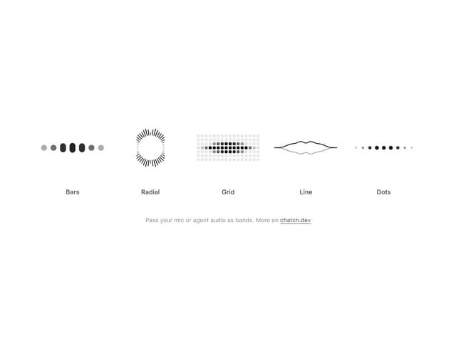
Audio Visualizer
29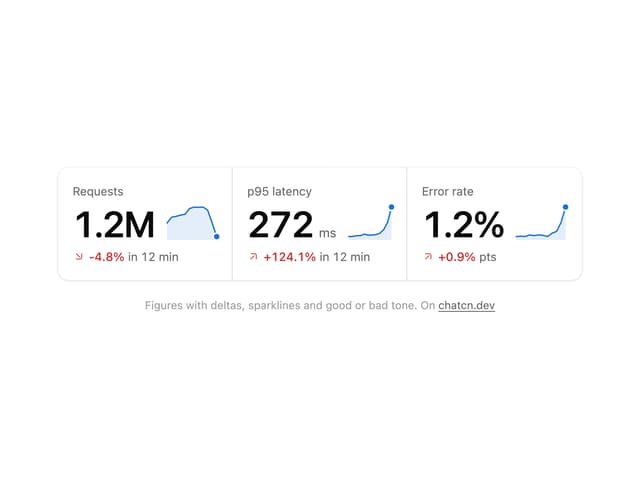
Stat Card
24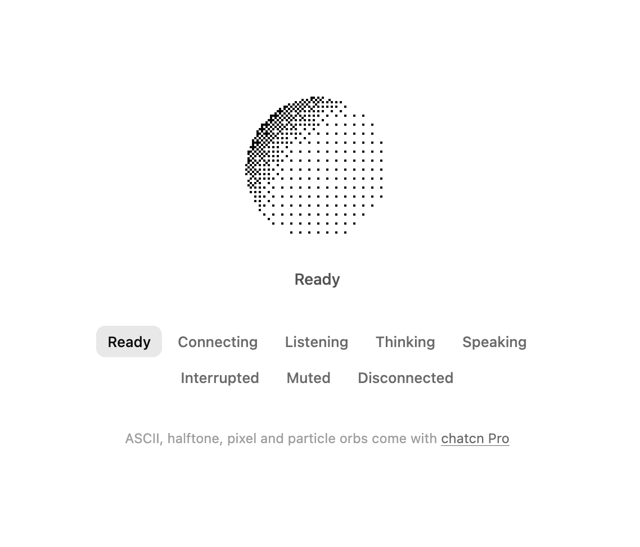
Dither Orb
23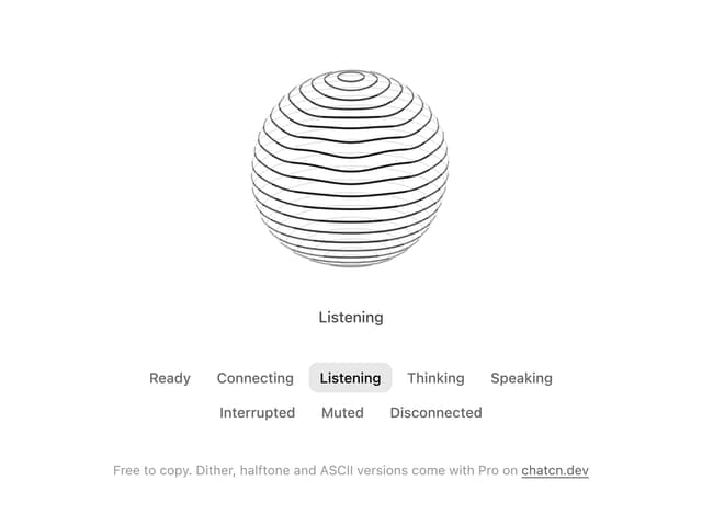
Voice Orb
17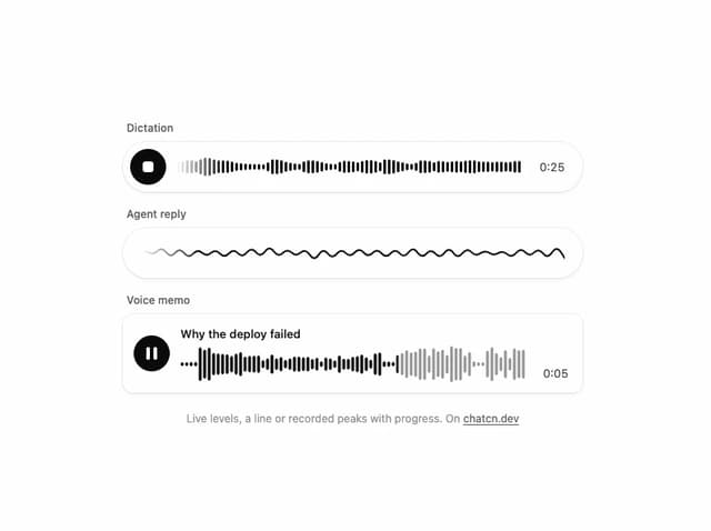
Waveform
13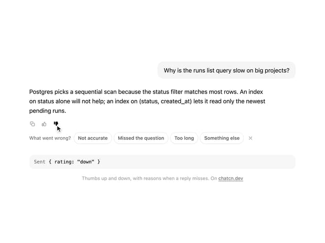
Message Feedback
12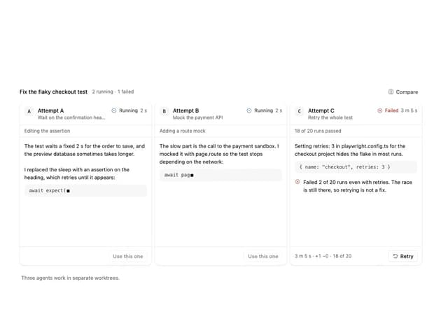
Agent Lanes
11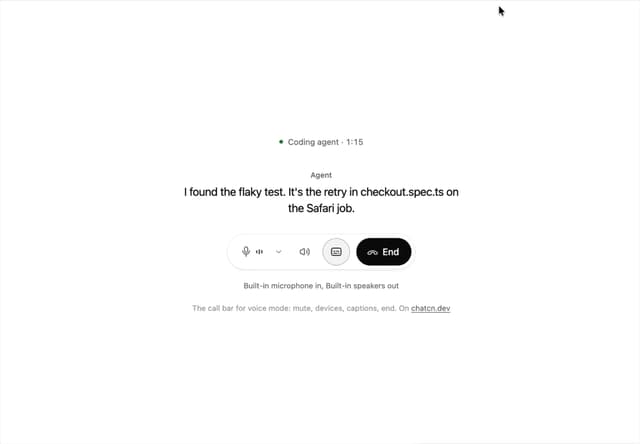
Voice Controls
10
More in AI chats
View all

AI Actions
349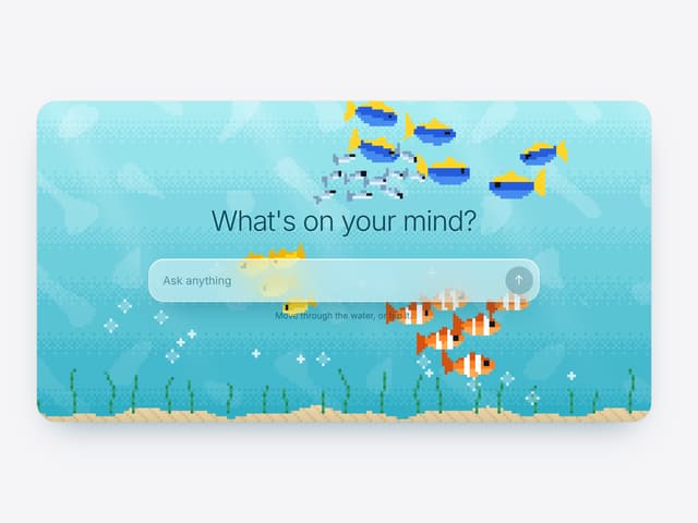

Aquarium Prompt
95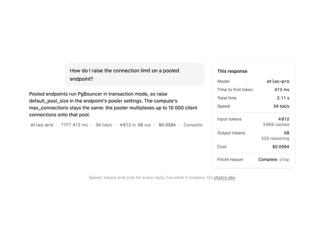
Generation Stats

Chat Bubble
202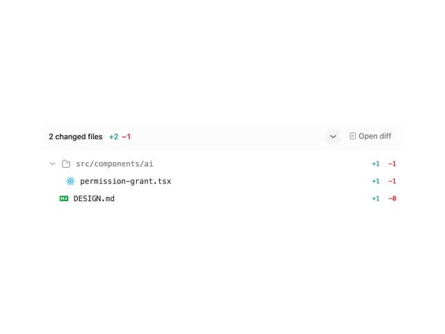
Commit
36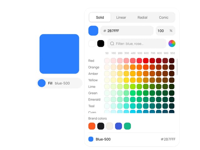
Color Picker
190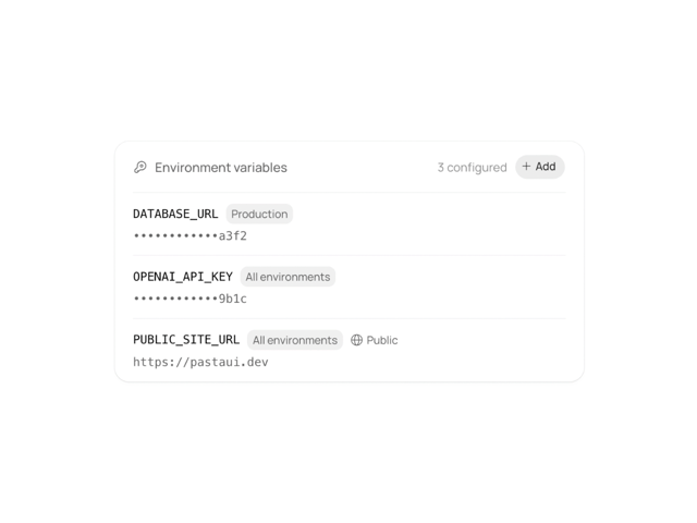
Environment Variables
27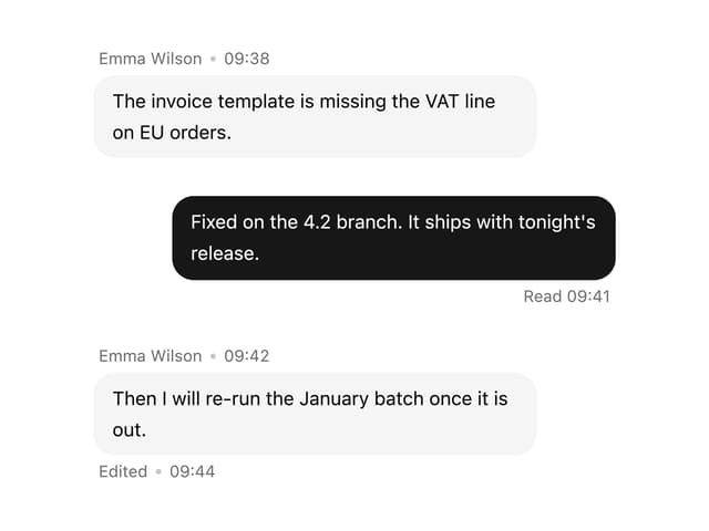

Message With Header And Delivery Status
57

