About
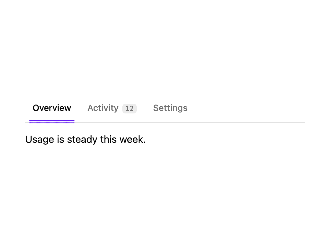
Accessible tabs whose underline is made of dots that stream across from the previously selected tab to the new one, with panel content that slides in from the side it was selected from.
Built with React and Tailwind. Copy the prompt and paste it into Claude Code, Cursor or Lovable: your agent adds Pixel Tabs to your project and fits it to your theme.
Code
How Pixel Tabs is used: the demo's code. The component's own source comes with a free account.
Usage.tsx
import { PxTabs } from "@/components/ui/px-tabs";

export default function PxTabsDemo() {
  return (
    <div className="w-full max-w-md">
      <PxTabs
        items={[
          { label: "Overview", content: "Usage is steady this week." },
          { label: "Activity", count: 12, content: "12 events since Monday." },
          {
            label: "Settings",
            content: "Default model, retention and notifications.",
          },
        ]}
      />
    </div>
  );
}
More by lumesec
View all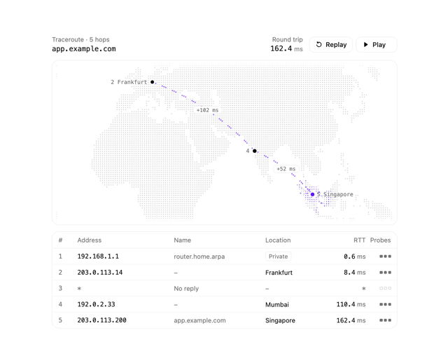

Geo Traceroute
56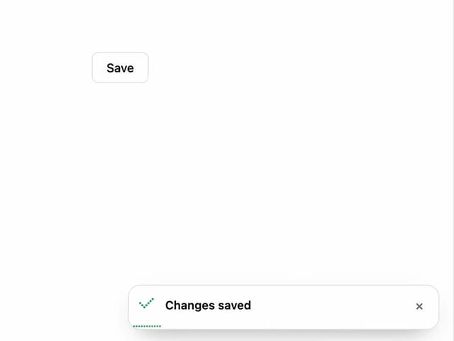
Pixel Toaster
1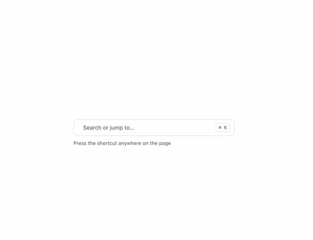
Command Palette
1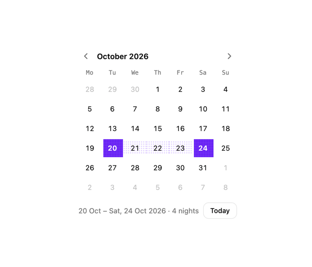
Date Picker
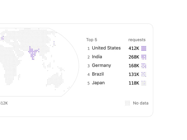
Choropleth Map
Copy Button
More in Navigation
View all

Sidebar
342

Pagination
99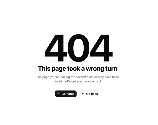
Oversized 404 Numeral
68
Stacked Circular Footer
443
Navbar
6

Navbar
75

Tabs
33
Tabs like bookmark
73


