
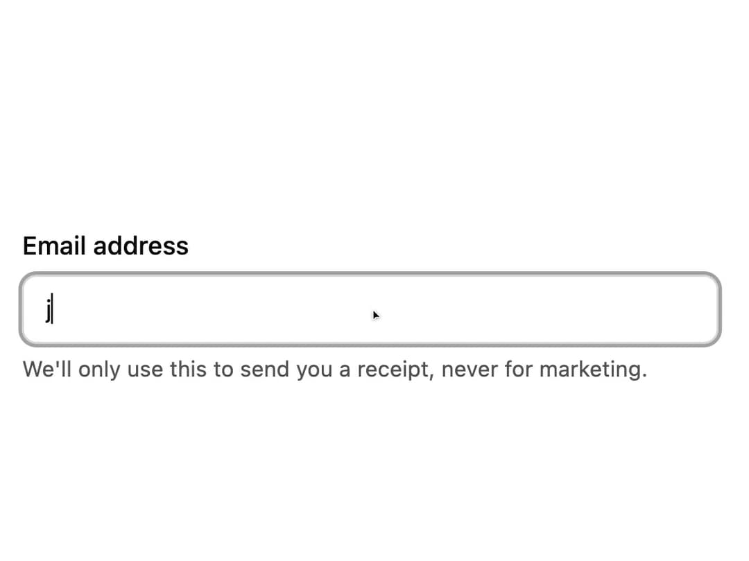
About
A small helper text element placed under a form field to show hints like the expected input format, linked via aria-describedby for accessibility.
Built with React and Tailwind. Copy the prompt and paste it into Claude Code, Cursor or Lovable: your agent adds Form Description to your project and fits it to your theme.
Code
How Form Description is used: the demo's code. The component's own source comes with a free account.
Usage.tsx
import FormDescription from "@/components/ui/form-description";
export default function FormDescriptionDemo() {
return (
<div className="w-full max-w-sm space-y-1.5">
<label
className="block text-sm font-medium text-foreground"
htmlFor="email-demo"
>
Email address
</label>
<input
id="email-demo"
type="email"
aria-describedby="email-demo-description"
placeholder="jane@example.com"
className="w-full rounded-md border border-neutral-300 bg-transparent px-3 py-2 text-sm text-foreground outline-none focus:ring-2 focus:ring-neutral-400 dark:border-neutral-700"
/>
<FormDescription id="email-demo-description">
We'll only use this to send you a receipt, never for marketing.
</FormDescription>
</div>
);
}
More by robertlib
View all
Timeline
1
Avatar
Collapsible Content
Chip
Switch
Form Error
Select
Spinner
More in Forms
View all

Premium Auth
504

Login 1
52
Authentication Card
47

Book A Demo 3
83

Contact Card
1K
Book A Demo 1
70
Book A Demo 4
52

Form
136
