
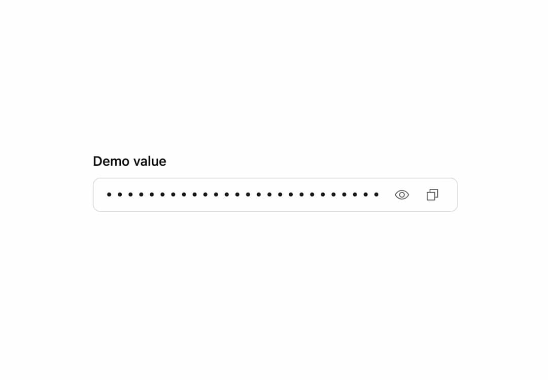
About
A password-style input that masks a sensitive value by default, with a toggle to reveal it and an optional button to copy it to the clipboard.
Built with React and Tailwind. Copy the prompt and paste it into Claude Code, Cursor or Lovable: your agent adds Sensitive Input to your project and fits it to your theme.
Code
How Sensitive Input is used: the demo's code. The component's own source comes with a free account.
Usage.tsx
"use client";

import * as React from "react";
import SensitiveInput from "@/components/ui/sensitive-input";

export default function SensitiveInputDemo() {
  return (
    <div className="flex w-full max-w-sm flex-col gap-2">
      <label
        htmlFor="demo-sensitive"
        className="text-sm font-medium text-foreground"
      >
        Demo value
      </label>
      <SensitiveInput
        id="demo-sensitive"
        defaultValue="demo_value_not_a_credential"
        showCopy
      />
    </div>
  );
}
Dependencies
More by russellbloxwich
View all
Switch
Bubble
Meter
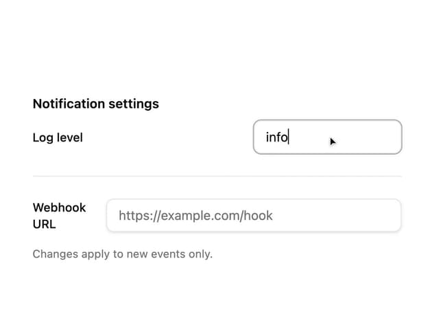
Field
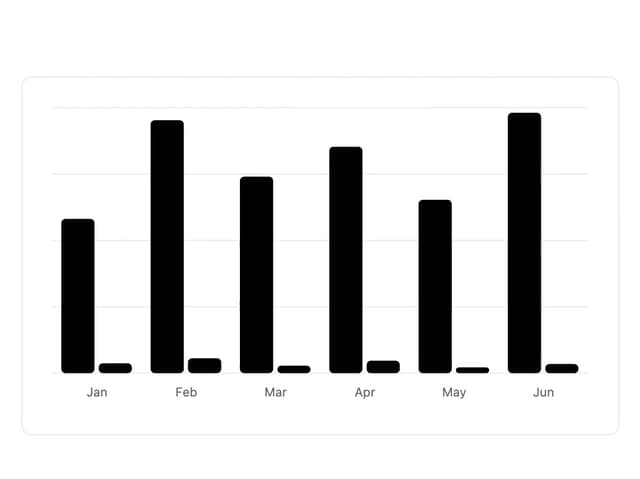
Chart
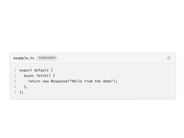
Code Block
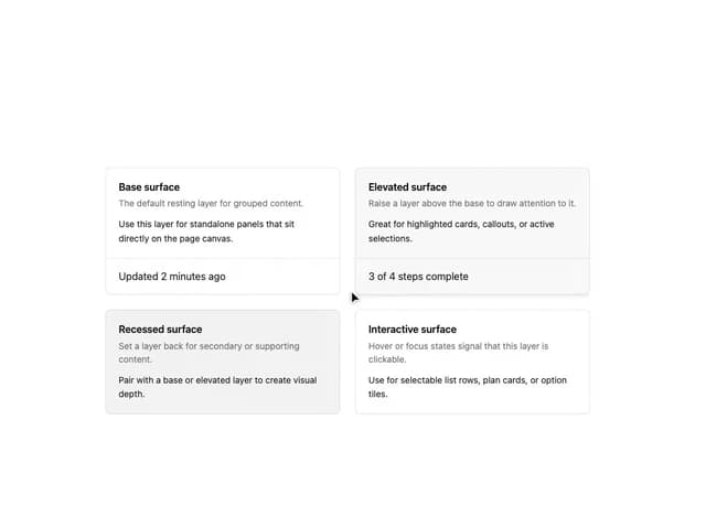
Layer Card
Direction Provider