
About
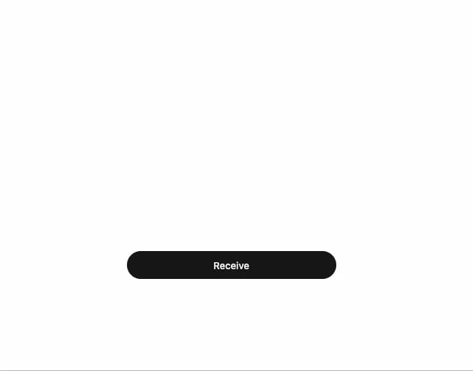
A button that morphs in place into an inline confirmation card with a cancel/confirm action, for destructive or sensitive actions that need a quick inline double-check.
Built with React and Tailwind. Copy the prompt and paste it into Claude Code, Cursor or Lovable: your agent adds Morph Confirm to your project and fits it to your theme.
Code
How Morph Confirm is used: the demo's code. The component's own source comes with a free account.
Usage.tsx
import { MorphConfirm } from "@/components/ui/morph-confirm";
import { FingerprintIcon } from "lucide-react";
import { Toaster, toast } from "sonner";

export default function MorphConfirmDemo() {
  return (
    <div className="flex h-72 w-full items-end justify-center pb-6">
      <Toaster position="top-center" />
      <MorphConfirm
        label="Receive"
        title="Confirm"
        icon={<FingerprintIcon className="text-[var(--dx-blue-3)]" />}
        description="Approve this transfer of 2.4 ETH to your main wallet?"
        onConfirm={() => toast.success("Transfer approved")}
      />
    </div>
  );
}
Dependencies
More by sidiora-labs
View all
Preview Rail
2
Expandable Tabs
1
Morphing Modal
1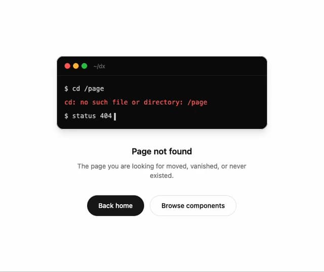
Not Found
Text Cascade
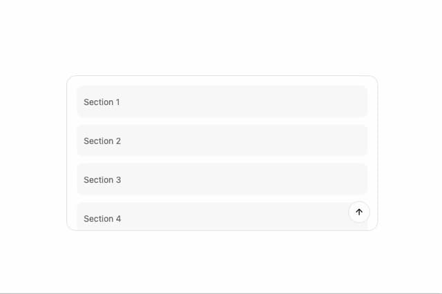
Smooth Scroll
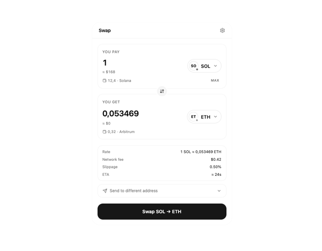
Swap
Motion Breadcrumb
More in Buttons
View all
Texture Button
95

Eclipse Button
6

App Store Button
457

Button Group


Button
14

Button
32
Button
65

HeroUI Button Group
9
