
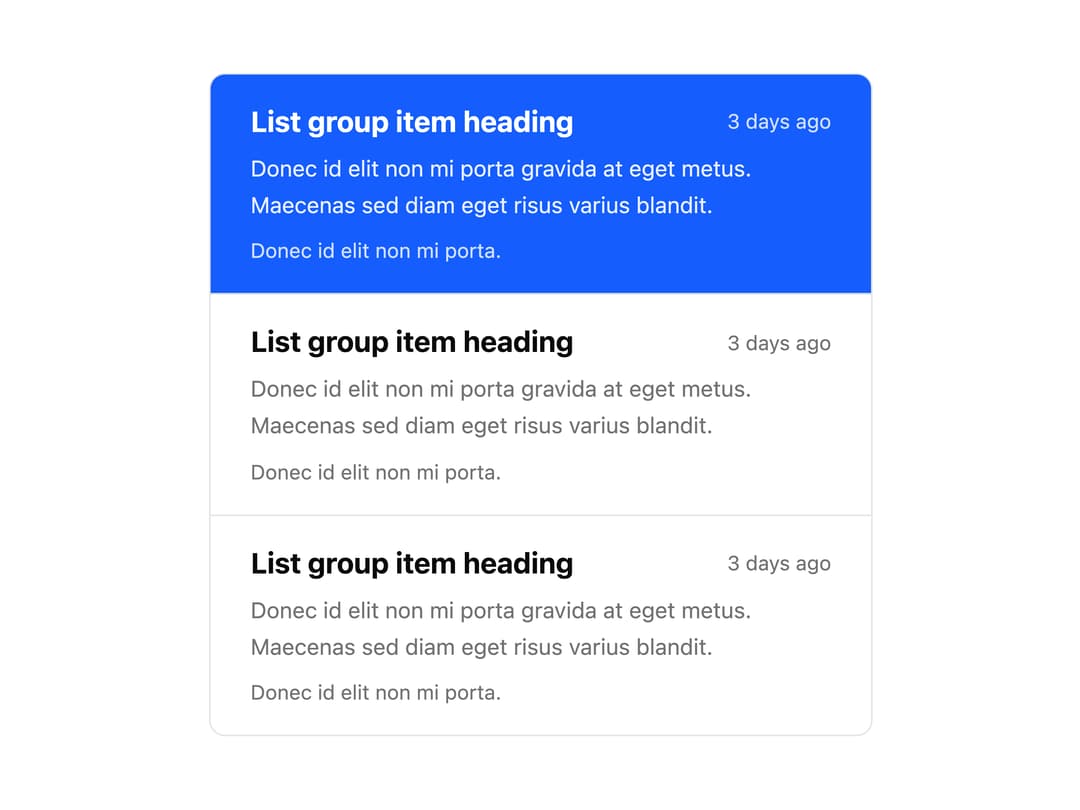
About
A vertically stacked list of linked items where each entry can show a heading, timestamp, and supporting text, with the active item highlighted in a solid accent color.
Built with React and Tailwind. Copy the prompt and paste it into Claude Code, Cursor or Lovable: your agent adds List Group Custom Content to your project and fits it to your theme.
Code
How List Group Custom Content is used: the demo's code. The component's own source comes with a free account.
Usage.tsx
import ListGroupCustomContent from "@/components/ui/list-group-custom-content";

export default function ListGroupCustomContentDemo() {
  return (
    <div className="w-full max-w-md p-4">
      <ListGroupCustomContent />
    </div>
  );
}
More by uiable
View all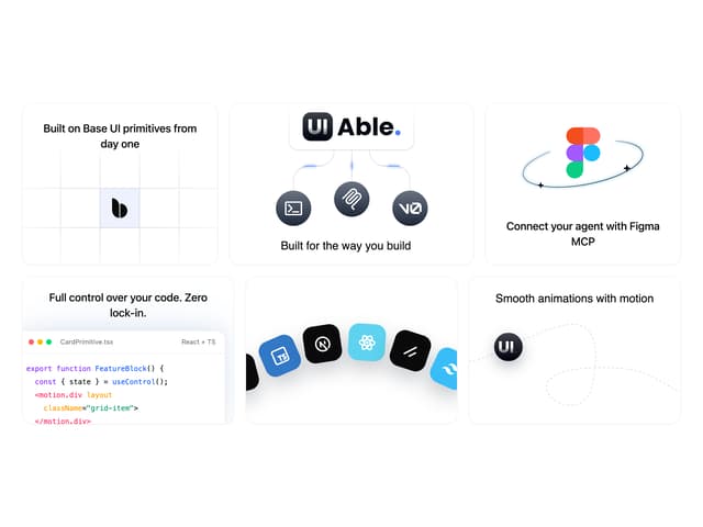

Feature Highlights Grid
417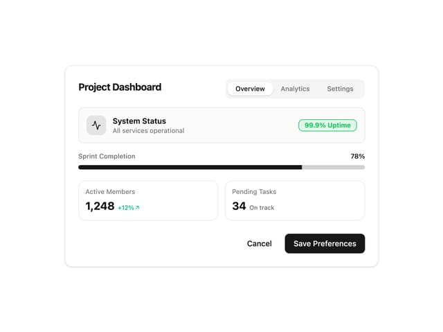
Card Tabs
113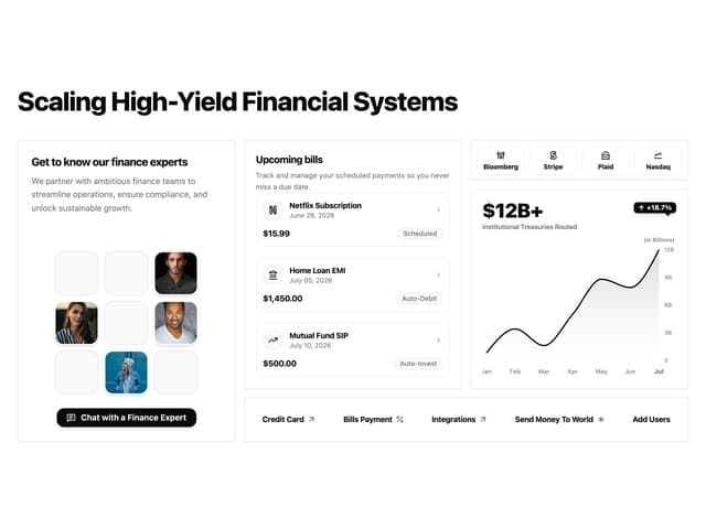
Financial Bento Grid
94
Chart Tooltip
75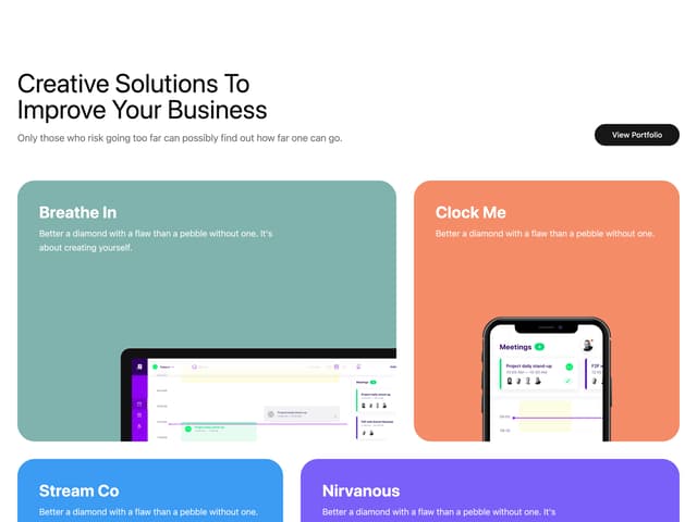
Portfolio Showcase Grid
71
Marketing Hero Section
69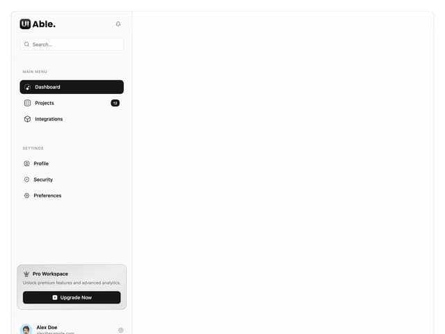
Sidebar with Search and Profile
58
Position Sonner
48
More in Navigation
View all

Sidebar
309
Navbar
3
Navbar with Theme Toggle
47
Stacked Circular Footer
434
Tabs like bookmark
68

Progress Bar Stepper
48

NavBar
1

Breadrcrumb
12


