
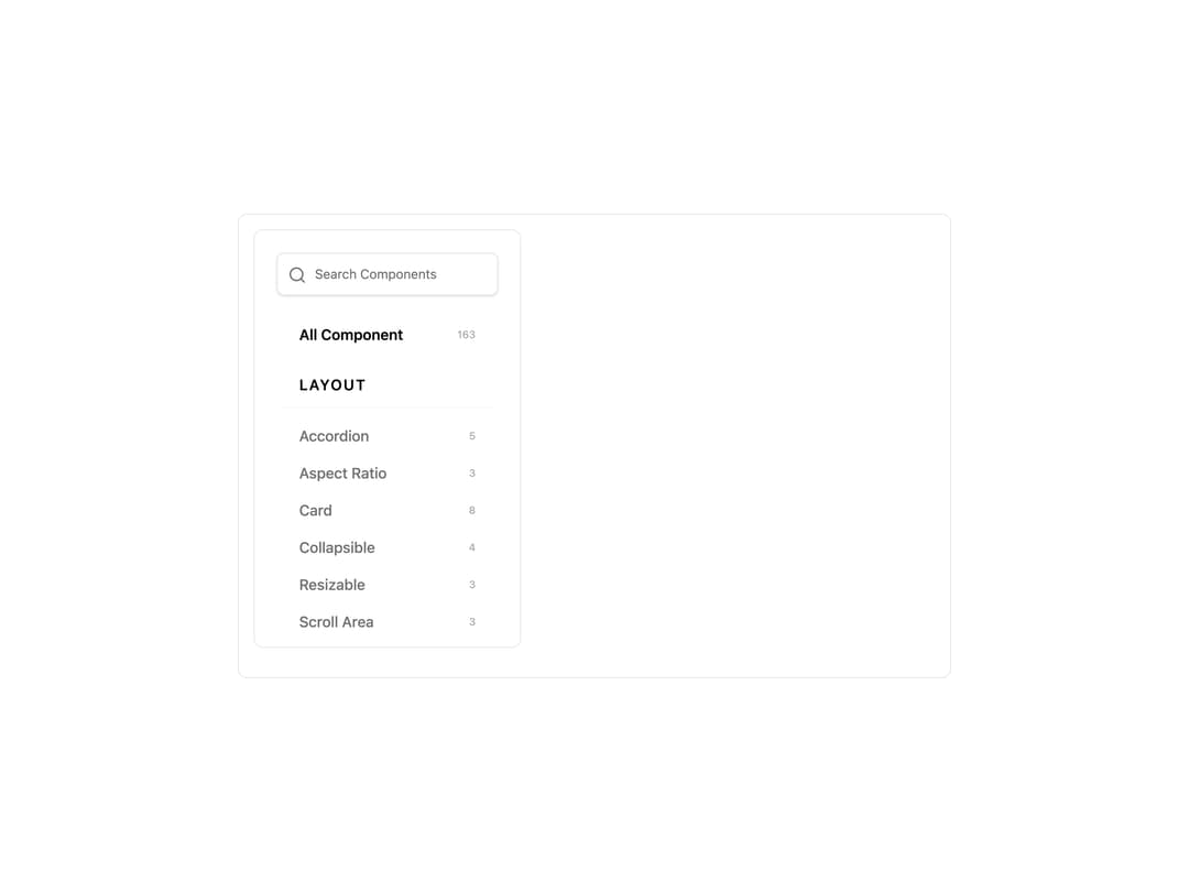
About
A searchable component navigation sidebar with grouped, scrollable sections and item counts.
Built with React and Tailwind. Copy the prompt and paste it into Claude Code, Cursor or Lovable: your agent adds Sidebar 1 to your project and fits it to your theme.
Code
How Sidebar 1 is used: the demo's code. The component's own source comes with a free account.
Usage.tsx
import Sidebar1 from "@/components/ui/uiable-sidebar-1";

export default function DemoSidebar1() {
  return (
    <div className="flex min-h-[560px] w-full items-center justify-center p-6">
      <div className="w-full max-w-sm">
        <Sidebar1 />
      </div>
    </div>
  );
}
Dependencies
More by uiable
View all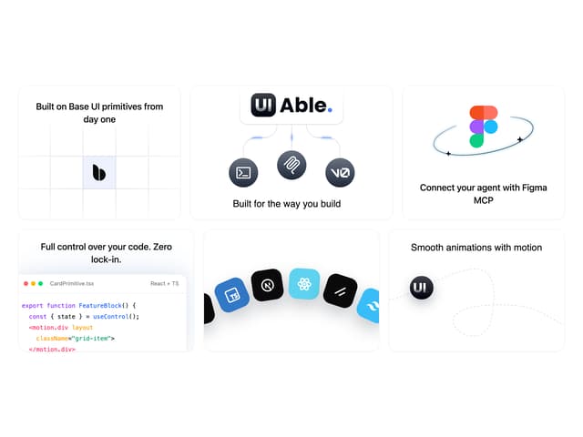

Feature Highlights Grid
472
Card Tabs
127
Financial Bento Grid
113
Chart Tooltip
85
Portfolio Showcase Grid
82
Marketing Hero Section
79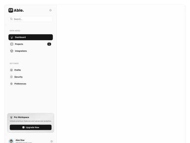
Sidebar with Search and Profile
67
Attachment States
51
More in Navigation
View all

Sidebar
354
Navbar with Theme Toggle
57

Pagination
34
Pagination with Ellipsis
20

Oversized 404 Numeral
71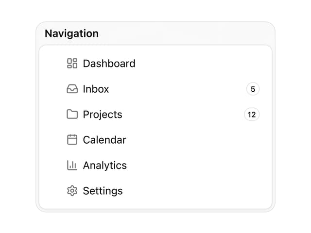

Sortable Sidebar Navigation
73
Navbar
8
Breadcramb
41
