
About
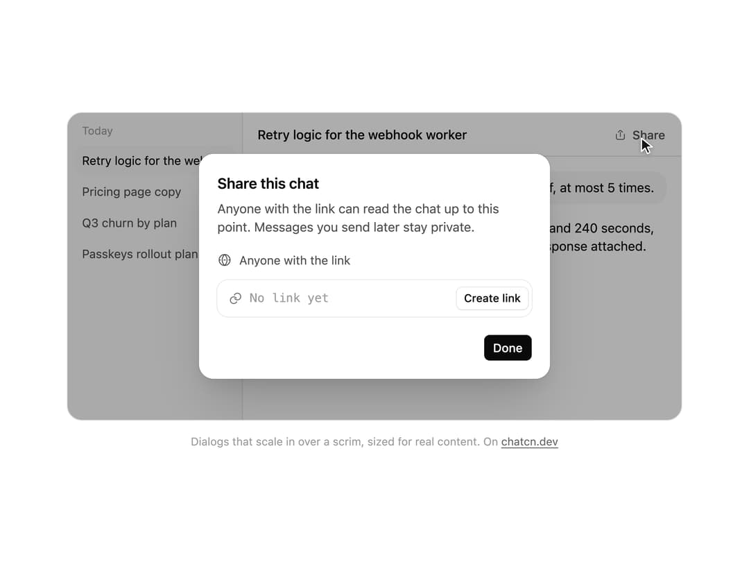
A dialog that scales in over a scrim, with header, body and footer slots sized for real content like sharing a chat.
Built with React and Tailwind. Copy the prompt and paste it into Claude Code, Cursor or Lovable: your agent adds Dialog to your project and fits it to your theme.
Code
How Dialog is used: the demo's code. The component's own source comes with a free account.
Usage.tsx
"use client"

import * as React from "react"
import { cn } from "@/lib/utils"
import { ButtonSize, ButtonVariant, Dialog, DialogContent, DialogDescription, DialogFooter, DialogHeader, DialogTitle, Icon, IconNode, buttonVariants, createIcon } from "@/components/ui/dialog"

interface GhostState {
  x: number
  y: number
  shown: boolean
  down: boolean
}

/**
 * A pointer that walks a demo through its clicks, so a preview shows what each control does.
 * `stage` is the positioned box the pointer moves in; targets are found inside it. Sizes come
 * from layout boxes, so a scaled FitFrame never throws the aim off.
 */
function useGhost(stage: React.RefObject<HTMLElement | null>) {
  const [ghost, setGhost] = React.useState<GhostState>({ x: 0, y: 0, shown: false, down: false })

  const find = React.useCallback(
    (target: string | HTMLElement) =>
      typeof target === "string"
        ? stage.current?.querySelector<HTMLElement>(target) ?? null
        : target,
    [stage],
  )

  const moveTo = React.useCallback(
    (target: string | HTMLElement, dx = 0.5, dy = 0.6) => {
      const root = stage.current
      const el = find(target)
      if (!root || !el) return null
      const rr = root.getBoundingClientRect()
      const scale = root.offsetWidth ? rr.width / root.offsetWidth : 1
      const er = el.getBoundingClientRect()
      const x = (er.left - rr.left + er.width * dx) / scale
      const y = (er.top - rr.top + er.height * dy) / scale
      // A hidden pointer fades in a short way off its first target instead of flying in from
      // wherever it was last.
      setGhost((g) => (g.shown ? { x, y, shown: true, down: false } : { x: x + 70, y: y + 46, shown: false, down: false }))
      window.requestAnimationFrame(() =>
        window.requestAnimationFrame(() => setGhost({ x, y, shown: true, down: false })),
      )
      return el
    },
    [stage, find],
  )

  const press = React.useCallback((down: boolean) => setGhost((g) => ({ ...g, down })), [])
  const hide = React.useCallback(() => setGhost((g) => ({ ...g, shown: false, down: false })), [])

  return { ghost, moveTo, press, hide, find }
}

const reducedMotion = () =>
  typeof window !== "undefined" && window.matchMedia("(prefers-reduced-motion: reduce)").matches

const STOP = Symbol("stop")

/**
 * Runs `script` in a loop with a `wait(ms)` that stops cleanly on unmount or once `active` turns
 * false. Reduced motion never starts it.
 */
function useLoop(
  script: (wait: (ms: number) => Promise<void>) => Promise<void>,
  active = true,
) {
  const ref = React.useRef(script)
  ref.current = script
  React.useEffect(() => {
    if (!active || reducedMotion()) return
    let alive = true
    const timers = new Set<number>()
    const wait = (ms: number) =>
      new Promise<void>((resolve, reject) => {
        const id = window.setTimeout(() => {
          timers.delete(id)
          if (alive) resolve()
          else reject(STOP)
        }, ms)
        timers.add(id)
      })
    ;(async () => {
      try {
        while (alive) await ref.current(wait)
      } catch (error) {
        if (error !== STOP) throw error
      }
    })()
    return () => {
      alive = false
      for (const id of timers) window.clearTimeout(id)
    }
  }, [active])
}

/** Clicks a control inside the window the way a pointer would, with the pointer drawn on top. */
async function press(
  g: ReturnType<typeof useGhost>,
  el: HTMLElement | null | undefined,
  wait: (ms: number) => Promise<void>,
  scripted: React.RefObject<boolean>,
  travel = 700,
) {
  if (!el) return
  g.moveTo(el)
  await wait(travel)
  g.press(true)
  await wait(130)
  scripted.current = true
  el.click()
  scripted.current = false
  g.press(false)
}

const FIT_CSS = "html,body{overflow:hidden}[data-fit-small] [data-fit-hide]{display:none!important}"

/**
 * 21st shows a demo in a small frame: about 674 by 421 on a component page, 358 by 224 on a
 * phone and 245 by 139 on a profile card. A demo taller than its frame gets scrollbars, which
 * render white on dark pages. FitFrame fills the frame exactly instead.
 *
 * - "scale": the content shrinks until it fits, centered. For visuals such as orbs.
 * - "crop": the content stays at full size from the top and fades out at the bottom. For text
 *   that streams in, where a changing scale would make the page breathe.
 *
 * `minWidth` lays out a wide demo (a table, a two column panel) at that width and scales it down
 * to the frame, instead of letting it collapse to a narrow layout. The frame centers it, so it
 * shrinks evenly on both sides.
 *
 * Anything marked `data-fit-hide` (state buttons, the chatcn.dev line) drops out in frames
 * shorter than `hideBelow`, so a profile card shows the visual alone.
 */
function FitFrame({
  children,
  mode = "scale",
  hideBelow = 360,
  minWidth,
}: {
  children: React.ReactNode
  mode?: "scale" | "crop"
  hideBelow?: number
  minWidth?: string
}) {
  const content = React.useRef<HTMLDivElement>(null)
  const [cropped, setCropped] = React.useState(false)

  React.useLayoutEffect(() => {
    const el = content.current
    if (!el) return
    const measure = () => {
      const vw = window.innerWidth
      const vh = window.innerHeight
      el.toggleAttribute("data-fit-small", vh < hideBelow)
      // Layout sizes ignore the transform, so measuring never feeds back.
      const w = Math.max(el.offsetWidth, el.scrollWidth)
      const h = Math.max(el.offsetHeight, el.scrollHeight)
      const scale = mode === "scale" ? Math.min(1, vw / w, vh / h) : 1
      el.style.transform = scale < 1 ? `scale(${scale})` : ""
      setCropped(mode === "crop" && h > vh + 1)
    }
    measure()
    const observer = new ResizeObserver(measure)
    observer.observe(el)
    // Content that changes inside a fixed width box (a headline that cycles words) never resizes
    // the box itself, so changes below it measure again on the next frame.
    let frame = 0
    const mutations = new MutationObserver(() => {
      cancelAnimationFrame(frame)
      frame = requestAnimationFrame(measure)
    })
    mutations.observe(el, { subtree: true, childList: true, characterData: true })
    window.addEventListener("resize", measure)
    return () => {
      observer.disconnect()
      mutations.disconnect()
      cancelAnimationFrame(frame)
      window.removeEventListener("resize", measure)
    }
  }, [mode, hideBelow])

  const fade = "linear-gradient(to bottom, #000 calc(100% - 40px), transparent)"
  return (
    <div
      className="flex w-full justify-center overflow-hidden"
      style={{
        height: "100dvh",
        alignItems: mode === "crop" ? "flex-start" : "center",
        maskImage: cropped ? fade : undefined,
        WebkitMaskImage: cropped ? fade : undefined,
      }}
    >
      <style>{FIT_CSS}</style>
      <div
        ref={content}
        className="w-full shrink-0"
        style={{ transformOrigin: mode === "crop" ? "top center" : "center", minWidth }}
      >
        {children}
      </div>
    </div>
  )
}

const CHATS = ["Retry logic for the webhook worker", "Pricing page copy", "Q3 churn by plan", "Passkeys rollout plan"]

interface ButtonProps extends React.ComponentProps<"button"> {
  variant?: ButtonVariant
  size?: ButtonSize
}

function Button({
  variant = "ghost",
  size = "md",
  type = "button",
  className,
  ...props
}: ButtonProps) {
  return (
    <button
      type={type}
      data-slot="button"
      data-variant={variant}
      className={cn(buttonVariants({ variant, size }), className)}
      {...props}
    />
  )
}

const iconNode: IconNode = [
  ["path", {"d":"M4.5 11v6.75a3 3 0 0 0 3 3h9a3 3 0 0 0 3-3V11"}],
  ["path", {"d":"m16 7.25-2.59-2.59a2 2 0 0 0-2.82 0L8 7.25"}],
  ["path", {"d":"M12 15.25v-7.5"}],
]

const ShareIcon: Icon = /* @__PURE__ */ createIcon("share", iconNode)

const iconNode2: IconNode = [
  ["path", {"d":"M3 12a9 9 0 1 0 18 0 9 9 0 1 0-18 0"}],
  ["path", {"d":"M12.72 3.8a11.9 11.9 0 0 1 0 16.4 1 1 0 0 1-1.44 0 11.9 11.9 0 0 1 0-16.4 1 1 0 0 1 1.44 0"}],
  ["path", {"d":"M3 12h2.25"}],
  ["path", {"d":"M10.75 12h2.5"}],
  ["path", {"d":"M18.75 12H21"}],
]

const GlobeIcon: Icon = /* @__PURE__ */ createIcon("globe", iconNode2)

const iconNode3: IconNode = [
  ["path", {"d":"M13.93 17.44a5.5 5.5 0 1 1-.56-5.77"}],
  ["path", {"d":"M10.07 6.56a5.5 5.5 0 1 1 .56 5.77"}],
]

const LinkIcon: Icon = /* @__PURE__ */ createIcon("link", iconNode3)

const iconNode4: IconNode = [
  ["path", {"d":"m4.5 12.75 3.23 3.23a2.5 2.5 0 0 0 3.54 0l8.48-8.48"}],
]

const CheckIcon: Icon = /* @__PURE__ */ createIcon("check", iconNode4)

const iconNode5: IconNode = [
  ["path", {"d":"M11.5 9h7a2.5 2.5 0 0 1 2.5 2.5v7a2.5 2.5 0 0 1-2.5 2.5h-7A2.5 2.5 0 0 1 9 18.5v-7A2.5 2.5 0 0 1 11.5 9"}],
  ["path", {"d":"M6 15h-.5A2.5 2.5 0 0 1 3 12.5v-7A2.5 2.5 0 0 1 5.5 3h7A2.5 2.5 0 0 1 15 5.5V6"}],
]

const CopyIcon: Icon = /* @__PURE__ */ createIcon("copy", iconNode5)

/** The pointer itself. Put it last inside the stage, which must be `relative`. */
function Ghost({ ghost }: { ghost: GhostState }) {
  return (
    <div
      aria-hidden
      className="pointer-events-none absolute top-0 left-0 z-20"
      style={{
        transform: `translate(${ghost.x}px, ${ghost.y}px)`,
        opacity: ghost.shown ? 1 : 0,
        // Hidden, it jumps; shown, it glides.
        transition: ghost.shown
          ? "transform 620ms cubic-bezier(0.4, 0, 0.2, 1), opacity 220ms ease-out"
          : "opacity 220ms ease-out",
      }}
    >
      <svg
        width="18"
        height="20"
        viewBox="0 0 18 20"
        className="drop-shadow-[0_1px_2px_rgb(0_0_0/0.25)]"
        style={{
          transform: ghost.down ? "scale(0.86)" : "scale(1)",
          transformOrigin: "2px 2px",
          transition: "transform 120ms ease-out",
        }}
      >
        <path
          d="M2 1.5 L2 16 L5.9 12.4 L8.6 18.3 L11.2 17.1 L8.6 11.3 L13.9 11.1 Z"
          className="fill-[oklch(0.2_0_0)] stroke-white dark:fill-white dark:stroke-[oklch(0.2_0_0)]"
          strokeWidth="1.3"
          strokeLinejoin="round"
        />
      </svg>
    </div>
  )
}

/** The line under each 21st demo that points back to the kit. */
function MoreOn({ slug, children }: { slug: string; children: React.ReactNode }) {
  return (
    <p data-fit-hide className="text-[0.75rem]/[1rem] text-(color:--chatcn-fg-faint) text-center text-balance">
      {children}{" "}
      <a
        href={`https://chatcn.dev/docs/components/${slug}`}
        target="_blank"
        rel="noopener"
        className="text-(color:--chatcn-fg-subtle) hover:text-(color:--chatcn-fg) underline underline-offset-2"
      >
        chatcn.dev
      </a>
    </p>
  )
}

/**
 * A chat app window. The pointer opens Share, the dialog scales in over a scrim that stays
 * inside the window, a link is created and copied, and Done closes it. Loops. Click anything
 * to stop the tour and try it yourself.
 */
export default function DialogPreview() {
  const stage = React.useRef<HTMLDivElement>(null)
  const [win, setWin] = React.useState<HTMLDivElement | null>(null)
  const g = useGhost(stage)
  const scripted = React.useRef(false)
  const [touring, setTouring] = React.useState(true)
  const [open, setOpen] = React.useState(false)
  const [link, setLink] = React.useState(false)
  const [copied, setCopied] = React.useState(false)

  useLoop(async (wait) => {
    setLink(false)
    setCopied(false)
    await wait(1200)
    await press(g, stage.current?.querySelector<HTMLElement>('[data-demo="share"]'), wait, scripted)
    setOpen(true)
    await wait(1300)
    await press(g, win?.querySelector<HTMLElement>('[data-demo="create"]'), wait, scripted, 650)
    setLink(true)
    await wait(1000)
    await press(g, win?.querySelector<HTMLElement>('[data-demo="copy"]'), wait, scripted, 600)
    setCopied(true)
    await wait(1500)
    await press(g, win?.querySelector<HTMLElement>('[data-demo="done"]'), wait, scripted, 600)
    setOpen(false)
    g.hide()
    await wait(2600)
  }, touring && win !== null)

  return (
    <FitFrame minWidth="40rem">
      <div className="flex w-full flex-col items-center justify-center gap-4 px-6 pt-5 pb-5">
        <div
          ref={stage}
          className="relative w-full max-w-2xl"
          onPointerDownCapture={(e) => {
            if (!touring || !e.isTrusted) return
            setTouring(false)
            g.hide()
          }}
        >
          <div
            ref={setWin}
            className="rounded-(--chatcn-radius-xl) bg-(color:--chatcn-bg) shadow-(--chatcn-shadow-border) relative flex h-[21rem] overflow-hidden [transform:translateZ(0)]"
          >
            <aside className="border-(color:--chatcn-border) bg-(color:--chatcn-bg-subtle) flex w-48 shrink-0 flex-col gap-0.5 border-e p-2">
              <p className="text-[0.75rem]/[1rem] text-(color:--chatcn-fg-faint) px-2 pt-1 pb-1.5">Today</p>
              {CHATS.map((c, i) => (
                <p
                  key={c}
                  className={cn(
                    "text-[0.8125rem]/[1.25rem] rounded-(--chatcn-radius-md) truncate px-2 py-1.5",
                    i === 0 ? "bg-(color:--chatcn-fill) text-(color:--chatcn-fg)" : "text-(color:--chatcn-fg-muted)",
                  )}
                >
                  {c}
                </p>
              ))}
            </aside>
            <div className="flex min-w-0 flex-1 flex-col">
              <div className="border-(color:--chatcn-border) flex h-12 shrink-0 items-center justify-between border-b ps-4 pe-2">
                <span className="text-[0.875rem]/[1.25rem] tracking-[-0.003em] text-(color:--chatcn-fg) truncate font-medium">Retry logic for the webhook worker</span>
                <Button variant="ghost" size="sm" data-demo="share" onClick={() => setOpen(true)}>
                  <ShareIcon />
                  Share
                </Button>
              </div>
              <div className="text-[0.875rem]/[1.25rem] tracking-[-0.003em] text-(color:--chatcn-fg) flex flex-col gap-4 p-4">
                <div className="flex justify-end">
                  <p className="bg-(color:--chatcn-fill) rounded-(--chatcn-radius-xl) px-3.5 py-2">Retry failed webhooks with backoff, at most 5 times.</p>
                </div>
                <p className="text-pretty">
                  Done. Failed deliveries now retry after 1, 4, 16, 60 and 240 seconds, then land in the
                  dead letter queue with the last response attached. The worker tests pass.
                </p>
              </div>
            </div>
            {win ? (
              <Dialog open={open} onOpenChange={setOpen} modal={false}>
                <DialogContent size="sm" className="max-h-[19rem]" container={win} initialFocus={false} finalFocus={false} showClose={false}>
                  <DialogHeader>
                    <DialogTitle>Share this chat</DialogTitle>
                    <DialogDescription>
                      Anyone with the link can read the chat up to this point. Messages you send later stay private.
                    </DialogDescription>
                  </DialogHeader>
                  <div className="flex flex-col gap-3 px-5 pt-4">
                    <div className="text-[0.8125rem]/[1.25rem] text-(color:--chatcn-fg-muted) flex items-center gap-2">
                      <GlobeIcon className="size-4" />
                      Anyone with the link
                    </div>
                    <div className="rounded-(--chatcn-radius-lg) shadow-(--chatcn-shadow-border) flex h-10 items-center gap-2 ps-3 pe-1">
                      <LinkIcon className="text-(color:--chatcn-fg-subtle) size-4 shrink-0" />
                      <span
                        className={cn(
                          "text-[0.8125rem]/[1.25rem] flex-1 truncate font-mono transition-colors duration-200",
                          link ? "text-(color:--chatcn-fg)" : "text-(color:--chatcn-fg-faint)",
                        )}
                      >
                        {link ? "harbor.chat/s/8KQ2rT" : "No link yet"}
                      </span>
                      {link ? (
                        <Button variant="ghost" size="xs" data-demo="copy" onClick={() => setCopied(true)}>
                          {copied ? <CheckIcon /> : <CopyIcon />}
                          {copied ? "Copied" : "Copy"}
                        </Button>
                      ) : (
                        <Button variant="outline" size="xs" data-demo="create" onClick={() => setLink(true)}>
                          Create link
                        </Button>
                      )}
                    </div>
                  </div>
                  <DialogFooter className="pt-5">
                    <Button variant="solid" size="sm" data-demo="done" onClick={() => setOpen(false)}>
                      Done
                    </Button>
                  </DialogFooter>
                </DialogContent>
              </Dialog>
            ) : null}
          </div>
          <Ghost ghost={g.ghost} />
        </div>
        <MoreOn slug="dialog">Dialogs that scale in over a scrim, sized for real content. On</MoreOn>
      </div>
    </FitFrame>
  )
}
Dependencies
More by Aadi
View all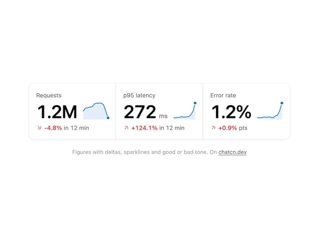
Stat Card
46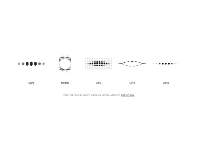
Audio Visualizer
32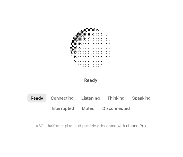
Dither Orb
24
Voice Orb
20
Weather Card
18
Waveform
15
Ticker Card
15
Message Feedback
13
More in AI chats
View all

AI Actions
351

Aquarium Prompt
113
Agent Chat
21

Message With Header And Delivery Status
60
Research Report
7
Tool Web Fetch
4
Color Picker
201
Suggestions
40

